Overview
In order to gain some familiarity with the method, this notebook will work through the EOF method step by step on some synthetic data. We will also see clearly some of the limitations of the method, including mode mixing Chen et al., 2017 and the generation of unphysical modes Dommenget & Latif, 2002.
Prerequisites
| Concepts | Importance | Notes |
|---|---|---|
| Foundations NumPy section | Necessary | |
| Intro to EOFs | Helpful |
Time to learn: 20 minutes
Imports
import numpy as np
import matplotlib.pyplot as plt
from matplotlib.colors import CenteredNorm
Set the domain
Assume a domain with two spatial dimensions, and , and time . For simplicity, we will start all dimensions at zero and increment by one up to some arbitrary maximum, here , , and . Different dimension lengths will help highlight the shape of the data as we work through the EOF analysis. We are using numpy.mgrid to create our 3-dimensional domain.
x, y, t = np.mgrid[0:10, 0:20, 0:50]
nx, ny, nt = x.shape[0], x.shape[1], x.shape[2]x.shape(10, 20, 50)Generate some data
Let’s generate some “modes of variability” in the domain. We will combine them and then use an EOF analysis to pull them back apart. First, here is a 2-dimensional Gaussian that oscillates between positive and negative with a period of 25 time steps:
mode_1 = 4*np.exp(-((x - np.mean(x))**2)/3 - ((y - np.mean(y))**2)/5) * np.cos(2*np.pi*t/25)plt.pcolormesh(x[:, :, 0], y[:, :, 0], mode_1[:, :, 0], cmap='RdBu_r', norm=CenteredNorm())
plt.colorbar()
plt.ylabel('$y$')
plt.xlabel('$x$')
plt.title('Mode 1 at $t=0$')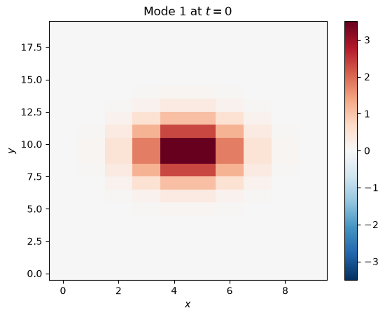
To see how this mode changes over time, we can take the mean over the x-axis (a “zonal” mean), and plot it as a function of and :
plt.pcolormesh(t[0, :, :], y[0, :, :], mode_1.mean(axis=0), cmap='RdBu_r', norm=CenteredNorm())
plt.colorbar()
plt.ylabel('$y$')
plt.xlabel('$t$')
plt.title('Mode 1 zonal mean over time')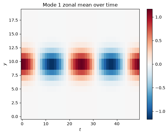
Here is a second mode, which is the sum of cosines in and and oscillates between positive and negative with a period of 15 time steps:
mode_2 = (np.cos(2*np.pi*x/(0.5*nx) + 0.5*nx) + np.cos(2*np.pi*y/(0.5*ny) + 0.5*ny)) * np.sin(2*np.pi*t/15)plt.pcolormesh(x[:, :, 2], y[:, :, 2], mode_2[:, :, 2], cmap='RdBu_r', norm=CenteredNorm())
plt.colorbar()
plt.ylabel('$y$')
plt.xlabel('$x$')
plt.title('Mode 2 at $t=0$')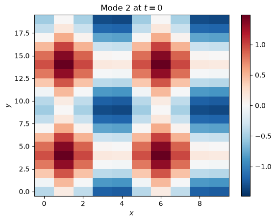
plt.pcolormesh(t[0, :, :], y[0, :, :], mode_2.mean(axis=0), cmap='RdBu_r', norm=CenteredNorm())
plt.colorbar()
plt.ylabel('$y$')
plt.xlabel('$t$')
plt.title('Mode 2 zonal mean over time')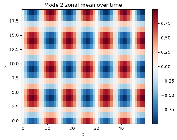
Now, let’s add the modes together to get our full dataset:
data = mode_1 + mode_2Visualize at :
plt.pcolormesh(x[:, :, 2], y[:, :, 2], data[:, :, 2], cmap='RdBu_r', norm=CenteredNorm())
plt.colorbar()
plt.ylabel('$y$')
plt.xlabel('$x$')
plt.title('Data at $t=0$')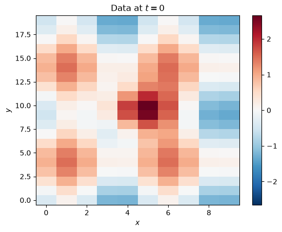
Prepare data for analysis
You can see that the modes of variability have mixed, just like in real geophysical data. The next step is to take the time-mean out of every location. Since we just constructed the data and know its dimensions, we know time is axis=2. We also have to reshape the data before subtracting for the array broadcasting to work properly (we are trying subtracting an array of shape [10, 20] from an array of shape [10, 20, 50], but we need [10, 20] to be the final dimensions; with labeled Xarray data this would be simpler).
data = (data.reshape(50, 10, 20) - data.mean(axis=2)).reshape(10, 20, 50)The data then needs to be in the shape (space, time), so we stack the spatial dimensions into one dimension . Knowing the size of and gives us the size of : :
data_2d = data.reshape(200, 50)Do the analysis
First, compute the covariance matrix of the 2-dimensional data:
R = np.cov(data_2d)R.shape(200, 200)Now, we use numpy.linalg.eig() to find the eigenvalues eigval and eigenvectors eigvec of . The eigenvectors will give us the EOFs and PCs, while the eigenvalues tell us about the variance explained by the corresponding eigenvectors.
(eigval, eigvec) = np.linalg.eig(R)The eigenpairs are by default not sorted. We want to sort by the eigenvalues, since they tell us how important the eigenvectors are. Here, we first create an index i that can sort an array by the eigenvalues eigval. Then we sort both eigval and eigvec:
i = np.argsort(-eigval)
eigval = -np.sort(-eigval)
eigvec = eigvec[:,i]
The eigendecomposition resulted in 200 eigenpairs, which is the size of :
eigval.shape, eigvec.shape((200,), (200, 200))Not all of these modes will be important. There are more objective ways to find out how many we should keep, but for now, we will just look at the eigenvalues and look for any clear separation or “drop-off”:
plt.bar(range(10), np.real(eigval[0:10]))<BarContainer object of 10 artists>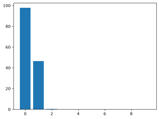
There is a pretty clear drop-off after the second eigenvalue, but let’s keep the first four to see the difference. And before truncating, we will sum over the eigenvalues for the next step.
eigval_sum = np.real(np.sum(eigval))

r = 4
eigval = eigval[:r]
eigvec = eigvec[:, :r]
To transform the eigenvalues into explained variance, we need to divide by the sum of all eigenvalues and optionally multiply by 100 to get percentages:
pvar = np.real(eigval/eigval_sum*100)
pvar
array([6.75819377e+01, 3.21033246e+01, 2.54528647e-01, 6.02090872e-02])Note that we could have also divided by the trace of :
np.real(eigval/np.trace(R)*100)array([6.75819377e+01, 3.21033246e+01, 2.54528647e-01, 6.02090872e-02])To get the PCs, we multiply the 2-dimensional data by the eigenvectors. Looking at the shape of the arrays can help us figure out if we need to transpose (.T) anything. What shape do we expect the PC data to have? There are four of them with 50 time steps each, so (4, 50) or (50, 4).
data_2d.shape, eigvec.shape((200, 50), (200, 4))We need to transpose the data:
pcs = np.real(np.dot(data_2d.T, eigvec))The PCs have dimensions (time, mode):
pcs.shape(50, 4)Lets look at the PCs:
plt.plot(pcs[:, 0], label='PC1')
plt.plot(pcs[:, 1], label='PC2')
plt.plot(pcs[:, 2], label='PC3', linestyle=':')
plt.plot(pcs[:, 3], label='PC4', linestyle=':')
plt.legend(loc='upper left')
plt.ylabel('PC')
plt.xlabel('$t$')
plt.xlim(0, nt-1)
plt.title('First four PCs')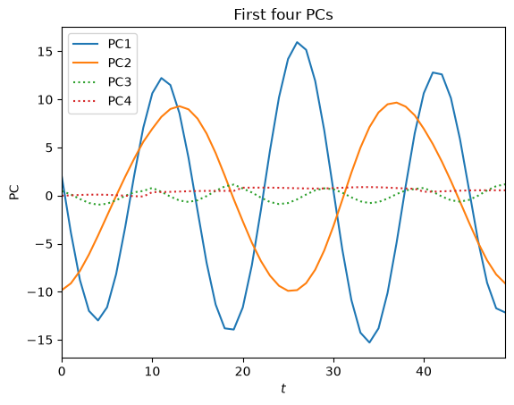
The EOFs are just the eigenvectors, but we need to reshape them back into the two spatial dimensions :
eofs = np.real(eigvec.reshape(10, 20, r))Let’s look at the leading EOF:
plt.pcolormesh(x[:, :, 0], y[:, :, 0], eofs[:, :, 0], cmap='RdBu_r', norm=CenteredNorm())
plt.colorbar()
plt.ylabel('$y$')
plt.xlabel('$x$')
plt.title('EOF1 (%.1f%%)' %pvar[0])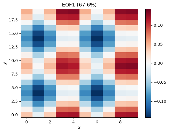
This looks like Mode 2 but with opposite sign and lower magnitude. We can attempt to reconstruct Mode 2 by multiplying this EOF with the corresponding PC:
fig, ax = plt.subplots(1, 2, figsize=(10, 5))

mode_2_reco_plot = ax[0].pcolormesh(x[:, :, 0], y[:, :, 0], eofs[:, :, 0]*pcs[2, 0], cmap='RdBu_r', norm=CenteredNorm())
plt.colorbar(mode_2_reco_plot, ax=ax[0])
ax[0].set_ylabel('$y$')
ax[0].set_xlabel('$x$')
ax[0].set_title('Reconstructed Mode 2 at $t=0$')

mode_2_orig_plot = plt.pcolormesh(x[:, :, 2], y[:, :, 2], mode_2[:, :, 2], cmap='RdBu_r', norm=CenteredNorm())
plt.colorbar(mode_2_orig_plot, ax=ax[1])
ax[1].set_ylabel('$y$')
ax[1].set_xlabel('$x$')
ax[1].set_title('Original Mode 2 at $t=0$')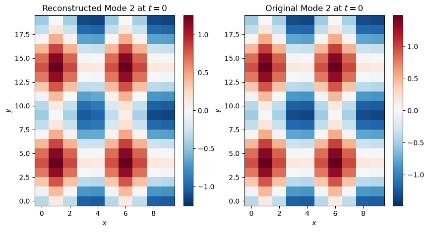
Here is the next EOF:
plt.pcolormesh(x[:, :, 0], y[:, :, 0], eofs[:, :, 1], cmap='RdBu_r', norm=CenteredNorm())
plt.colorbar()
plt.ylabel('$y$')
plt.xlabel('$x$')
plt.title('EOF2 (%.1f%%)' %pvar[1])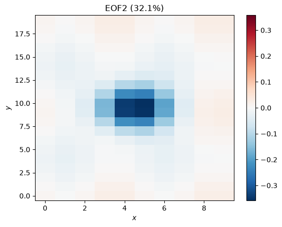
This is Mode 1, plus some noise and some apparent contamination (mode mixing) from Mode 2. We could reconstruct this mode, as well, but instead, let’s take a look at the next two modes:
plt.pcolormesh(x[:, :, 0], y[:, :, 0], eofs[:, :, 2], cmap='RdBu_r', norm=CenteredNorm())
plt.colorbar()
plt.ylabel('$y$')
plt.xlabel('$x$')
plt.title('EOF3 (%.1f%%)' %pvar[2])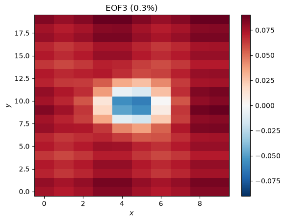
plt.pcolormesh(x[:, :, 0], y[:, :, 0], eofs[:, :, 3], cmap='RdBu_r', norm=CenteredNorm())
plt.colorbar()
plt.ylabel('$y$')
plt.xlabel('$x$')
plt.title('EOF4 (%.1f%%)' %pvar[3])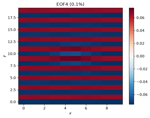
EOF3 looks like some sort of residual from Mode 1, while EOF4 shows some zonal stripes that were not in our original data. Even though there is structure here, we should not interpret these as a meaningful or physical modes of variability in the data; they are artifacts of the method, particularly the orthogonality constraints. The very low explained variance is also an indication that the modes are probably not meaningful.
PC3 shows an oscillation with a period of about 10 time steps and EOF3 shows a pattern that we might expect from the data, so if we didn’t have a priori knowledge about the data, we might have been tempted to interpret this mode as meaningful. We therefore have to be careful when interpreting the modes we find with EOF analyses.
Exercise
Change the period of Mode 2 from 15 time steps to 20 time steps, bringing it closer in frequency to Mode 1. What happens?
Adding noise
Real geophysical data is rarely so clean. Let’s add some noise with a similar amplitude to the modes and see what happens. If the modes we constructed were modes of climate variability, this noise would be weather.
noisy_data = mode_1 + mode_2 + np.random.default_rng().normal(loc=0.0, scale=1.0, size=(nx, ny, nt))Let’s look at the data at for comparison:
plt.pcolormesh(x[:, :, 2], y[:, :, 2], noisy_data[:, :, 2], cmap='RdBu_r', norm=CenteredNorm())
plt.colorbar()
plt.ylabel('$y$')
plt.xlabel('$x$')
plt.title('Noisy data at $t=0$')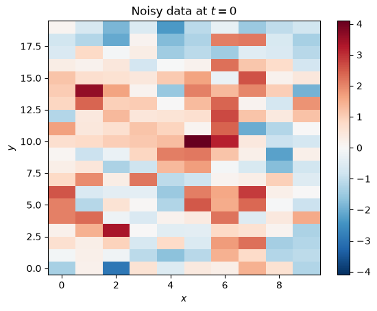
The modes aren’t nearly as apparent with the noise added, just like real climate data.
noisy_data = (noisy_data.reshape(50, 10, 20) - noisy_data.mean(axis=2)).reshape(10, 20, 50)
noisy_data_2d = noisy_data.reshape(200, 50)

n_R = np.cov(noisy_data_2d)
(n_eigval, n_eigvec) = np.linalg.eig(n_R)

n_i = np.argsort(-n_eigval)
n_eigval = -np.sort(-n_eigval)
n_eigvec = n_eigvec[:,i]
r = 4
n_eigval = n_eigval[:r]
n_eigvec = n_eigvec[:, :r]

n_pvar = np.real(n_eigval/np.trace(n_R)*100)
n_pcs = np.real(np.dot(noisy_data_2d.T, n_eigvec))
n_eofs = np.real(n_eigvec.reshape(10, 20, r))
plt.plot(n_pcs[:, 0], label='PC1')
plt.plot(n_pcs[:, 1], label='PC2')
plt.plot(n_pcs[:, 2], label='PC3', linestyle=':')
plt.plot(n_pcs[:, 3], label='PC4', linestyle=':')
plt.legend(loc='upper left')
plt.ylabel('PC')
plt.xlabel('$t$')
plt.xlim(0, nt-1)
plt.title('First four PCs (noisy data)')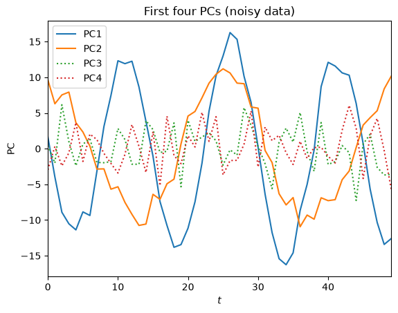
n_fig, n_ax = plt.subplots(2, 2, figsize=(10, 5), layout='constrained')

noisy_eof1_plot = n_ax[0, 0].pcolormesh(x[:, :, 0], y[:, :, 0], n_eofs[:, :, 0], cmap='RdBu_r', norm=CenteredNorm())
plt.colorbar(noisy_eof1_plot, ax=n_ax[0, 0])
n_ax[0, 0].set_ylabel('$y$')
n_ax[0, 0].set_title('Noisy EOF1 (%.1f%%)' %n_pvar[0])

noisy_eof2_plot = n_ax[0, 1].pcolormesh(x[:, :, 0], y[:, :, 0], n_eofs[:, :, 1], cmap='RdBu_r', norm=CenteredNorm())
plt.colorbar(noisy_eof1_plot, ax=n_ax[0, 1])
n_ax[0, 1].set_title('Noisy EOF2 (%.1f%%)' %n_pvar[1])

noisy_eof3_plot = n_ax[1, 0].pcolormesh(x[:, :, 0], y[:, :, 0], n_eofs[:, :, 2], cmap='RdBu_r', norm=CenteredNorm())
plt.colorbar(noisy_eof3_plot, ax=n_ax[1, 0])
n_ax[1, 0].set_ylabel('$y$')
n_ax[1, 0].set_xlabel('$x$')
n_ax[1, 0].set_title('Noisy EOF3 (%.1f%%)' %n_pvar[2])

noisy_eof4_plot = n_ax[1, 1].pcolormesh(x[:, :, 0], y[:, :, 0], n_eofs[:, :, 3], cmap='RdBu_r', norm=CenteredNorm())
plt.colorbar(noisy_eof4_plot, ax=n_ax[1, 1])
n_ax[1, 1].set_xlabel('$x$')
n_ax[1, 1].set_title('Noisy EOF4 (%.1f%%)' %n_pvar[3])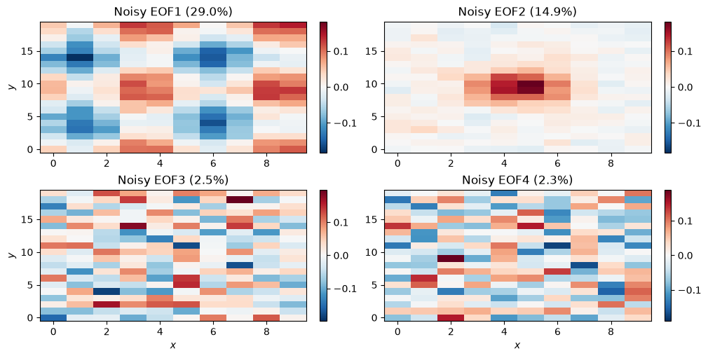
The EOF analysis has again successfully identified our two modes. The third and fourth modes explain more variance than in the clean example, but the spatial patterns strongly suggest that they are just noise.
Summary
In this notebook, we implemented the EOF method on some synthetic data using NumPy. First, we generated two simple modes of variability and combined them. Then, our EOF analysis was able to largely isolate the modes as the first two EOF/PC pairs.
What’s next?
In the next notebook, we will use a package called xeofs to find climate modes in real sea surface temperature data.
- Chen, X., Wallace, J. M., & Tung, K.-K. (2017). Pairwise-Rotated EOFs of Global SST. Journal of Climate, 30(14), 5473–5489. 10.1175/JCLI-D-16-0786.1
- Dommenget, D., & Latif, M. (2002). A Cautionary Note on the Interpretation of EOFs. Journal of Climate, 15(2), 216–225. https://doi.org/10.1175/1520-0442(2002)015<;0216:ACNOTI>2.0.CO;2