Looking at NEXRAD Data from Moore, Oklahoma
Overview
Within this notebook, we will cover:
How to access NEXRAD data from AWS
How to read this data into Py-ART
How to customize your plots and maps
Prerequisites
Concepts |
Importance |
Notes |
|---|---|---|
Required |
Projections and Features |
|
Required |
Basic plotting |
|
Required |
IO/Visualization |
Time to learn: 45 minutes
Imports
import pyart
import fsspec
from metpy.plots import USCOUNTIES
import matplotlib.pyplot as plt
import cartopy.crs as ccrs
import cartopy.feature as cfeature
import warnings
warnings.filterwarnings("ignore")
## You are using the Python ARM Radar Toolkit (Py-ART), an open source
## library for working with weather radar data. Py-ART is partly
## supported by the U.S. Department of Energy as part of the Atmospheric
## Radiation Measurement (ARM) Climate Research Facility, an Office of
## Science user facility.
##
## If you use this software to prepare a publication, please cite:
##
##     JJ Helmus and SM Collis, JORS 2016, doi: 10.5334/jors.119
How to Access NEXRAD Data from Amazon Web Services (AWS)
Let’s start first with NEXRAD Level 2 data, which is ground-based radar data collected by the National Oceanic and Atmospheric Administration (NOAA), as a part of the National Weather Service (NWS) observing network.
Level 2 Data
Level 2 data includes all of the fields in a single file - for example, a file may include:
Reflectivity
Velocity
Search for Data from the Moore, Oklahoma Tornado (May 20, 2013)
Data We will access data from the noaa-nexrad-level2 bucket, with the data organized as:
s3://noaa-nexrad-level2/year/month/date/radarsite/{radarsite}{year}{month}{date}_{hour}{minute}{second}_V06
We can use fsspec, a tool to work with filesystems in Python, to search through the bucket to find our files!
We start first by setting up our AWS S3 filesystem
fs = fsspec.filesystem("s3", anon=True)
Once we setup our filesystem, we can list files from May 20, 2013 from the NWS Oklahoma City, Oklahoma (KTLX) site, around 2000 UTC.
files = sorted(fs.glob("s3://noaa-nexrad-level2/2013/05/20/KTLX/KTLX20130520_20*"))
files
['noaa-nexrad-level2/2013/05/20/KTLX/KTLX20130520_200356_V06.gz',
 'noaa-nexrad-level2/2013/05/20/KTLX/KTLX20130520_200811_V06.gz',
 'noaa-nexrad-level2/2013/05/20/KTLX/KTLX20130520_201229_V06.gz',
 'noaa-nexrad-level2/2013/05/20/KTLX/KTLX20130520_201643_V06.gz',
 'noaa-nexrad-level2/2013/05/20/KTLX/KTLX20130520_202058_V06.gz',
 'noaa-nexrad-level2/2013/05/20/KTLX/KTLX20130520_202511_V06.gz',
 'noaa-nexrad-level2/2013/05/20/KTLX/KTLX20130520_202928_V06.gz',
 'noaa-nexrad-level2/2013/05/20/KTLX/KTLX20130520_203346_V06.gz',
 'noaa-nexrad-level2/2013/05/20/KTLX/KTLX20130520_203800_V06.gz',
 'noaa-nexrad-level2/2013/05/20/KTLX/KTLX20130520_204215_V06.gz',
 'noaa-nexrad-level2/2013/05/20/KTLX/KTLX20130520_204630_V06.gz',
 'noaa-nexrad-level2/2013/05/20/KTLX/KTLX20130520_205045_V06.gz',
 'noaa-nexrad-level2/2013/05/20/KTLX/KTLX20130520_205459_V06.gz',
 'noaa-nexrad-level2/2013/05/20/KTLX/KTLX20130520_205914_V06.gz']
We now have a list of files we can read in!
Read the Data into PyART
When reading into PyART, we can use the pyart.io.read_nexrad_archive or pyart.io.read module to read in our data.
radar = pyart.io.read_nexrad_archive(f's3://{files[3]}')
Notice how for the NEXRAD Level 2 data, we have several fields available
list(radar.fields)
['reflectivity',
 'differential_reflectivity',
 'velocity',
 'differential_phase',
 'cross_correlation_ratio',
 'spectrum_width']
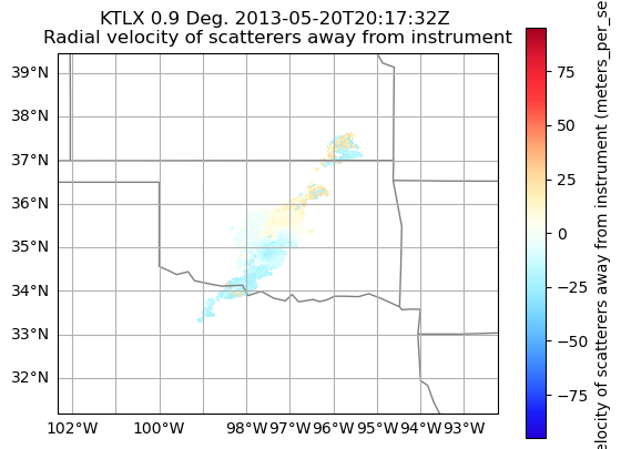
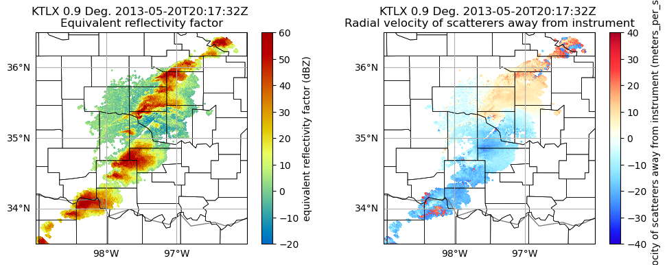
Plot a quick-look of the dataset
Let’s get a quicklook of the reflectivity and velocity fields
display = pyart.graph.RadarMapDisplay(radar)
display.plot_ppi_map('reflectivity',
                     sweep=3,
                     vmin=-20,
                     vmax=60,
                     projection=ccrs.PlateCarree()
                    )
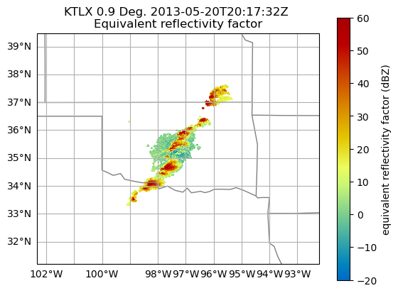
display.plot_ppi_map('velocity',
                     sweep=3,
                     projection=ccrs.PlateCarree(),
                    )
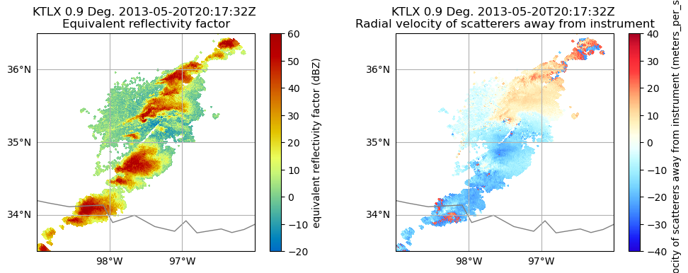
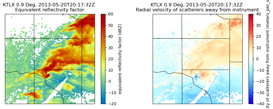
How to customize your plots and maps
Let’s add some more features to our map, and zoom in on our main storm
Combine into a single figure
Let’s start first by combining into a single figure, and zooming in a bit on our main domain.
# Create our figure
fig = plt.figure(figsize=[12, 4])

# Setup our first axis with reflectivity
ax1 = plt.subplot(121, projection=ccrs.PlateCarree())
display = pyart.graph.RadarMapDisplay(radar)
display.plot_ppi_map('reflectivity',
                     sweep=3,
                     vmin=-20,
                     vmax=60,
                     ax=ax1,)

# Zoom in by setting the xlim/ylim
plt.xlim(-99, -96)
plt.ylim(33.5, 36.5)

# Setup our second axis for velocity
ax2 = plt.subplot(122, projection=ccrs.PlateCarree())
display.plot_ppi_map('velocity',
                     sweep=3,
                     vmin=-40,
                     vmax=40,
                     projection=ccrs.PlateCarree(),
                     ax=ax2,)

# Zoom in by setting the xlim/ylim
plt.xlim(-99, -96)
plt.ylim(33.5, 36.5)
plt.show()
Add Counties
We can add counties onto our map by using the USCOUNTIES module from metpy.plots
# Create our figure
fig = plt.figure(figsize=[12, 4])

# Setup our first axis with reflectivity
ax1 = plt.subplot(121, projection=ccrs.PlateCarree())
display = pyart.graph.RadarMapDisplay(radar)
display.plot_ppi_map('reflectivity',
                     sweep=3,
                     vmin=-20,
                     vmax=60,
                     ax=ax1,)

# Zoom in by setting the xlim/ylim
plt.xlim(-99, -96)
plt.ylim(33.5, 36.5)

# Add counties
ax1.add_feature(USCOUNTIES,
                linewidth=0.5)

# Setup our second axis for velocity
ax2 = plt.subplot(122, projection=ccrs.PlateCarree())
display.plot_ppi_map('velocity',
                     sweep=3,
                     vmin=-40,
                     vmax=40,
                     projection=ccrs.PlateCarree(),
                     ax=ax2,)

# Zoom in by setting the xlim/ylim
plt.xlim(-99, -96)
plt.ylim(33.5, 36.5)

# Add counties
ax2.add_feature(USCOUNTIES,
                linewidth=0.5)

plt.show()
Downloading file 'us_counties_20m.dbf' from 'https://github.com/Unidata/MetPy/raw/v1.5.1/staticdata/us_counties_20m.dbf' to '/home/jovyan/.cache/metpy/v1.5.1'.
Downloading file 'us_counties_20m.shx' from 'https://github.com/Unidata/MetPy/raw/v1.5.1/staticdata/us_counties_20m.shx' to '/home/jovyan/.cache/metpy/v1.5.1'.
Downloading file 'us_counties_20m.shp' from 'https://github.com/Unidata/MetPy/raw/v1.5.1/staticdata/us_counties_20m.shp' to '/home/jovyan/.cache/metpy/v1.5.1'.
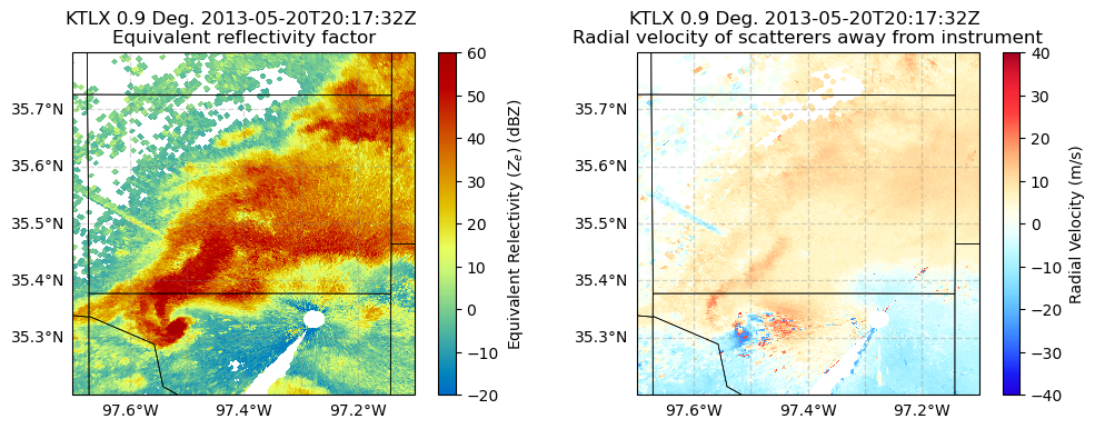
Zoom in even more
Let’s zoom in even more to our main feature - it looks like there is velocity couplet (where high positive and negative values of velcocity are close to one another, indicating rotation), near the center of our map.
# Create our figure
fig = plt.figure(figsize=[12, 4])

# Setup our first axis with reflectivity
ax1 = plt.subplot(121, projection=ccrs.PlateCarree())
display = pyart.graph.RadarMapDisplay(radar)
display.plot_ppi_map('reflectivity',
                     sweep=3,
                     vmin=-20,
                     vmax=60,
                     ax=ax1,)

# Zoom in by setting the xlim/ylim
plt.xlim(-98, -97)
plt.ylim(35, 36)

# Add counties
ax1.add_feature(USCOUNTIES,
                linewidth=0.5)

# Setup our second axis for velocity
ax2 = plt.subplot(122, projection=ccrs.PlateCarree())
display.plot_ppi_map('velocity',
                     sweep=3,
                     vmin=-40,
                     vmax=40,
                     projection=ccrs.PlateCarree(),
                     ax=ax2,)

# Zoom in by setting the xlim/ylim
plt.xlim(-98, -97)
plt.ylim(35, 36)

# Add counties
ax2.add_feature(USCOUNTIES,
                linewidth=0.5)

plt.show()
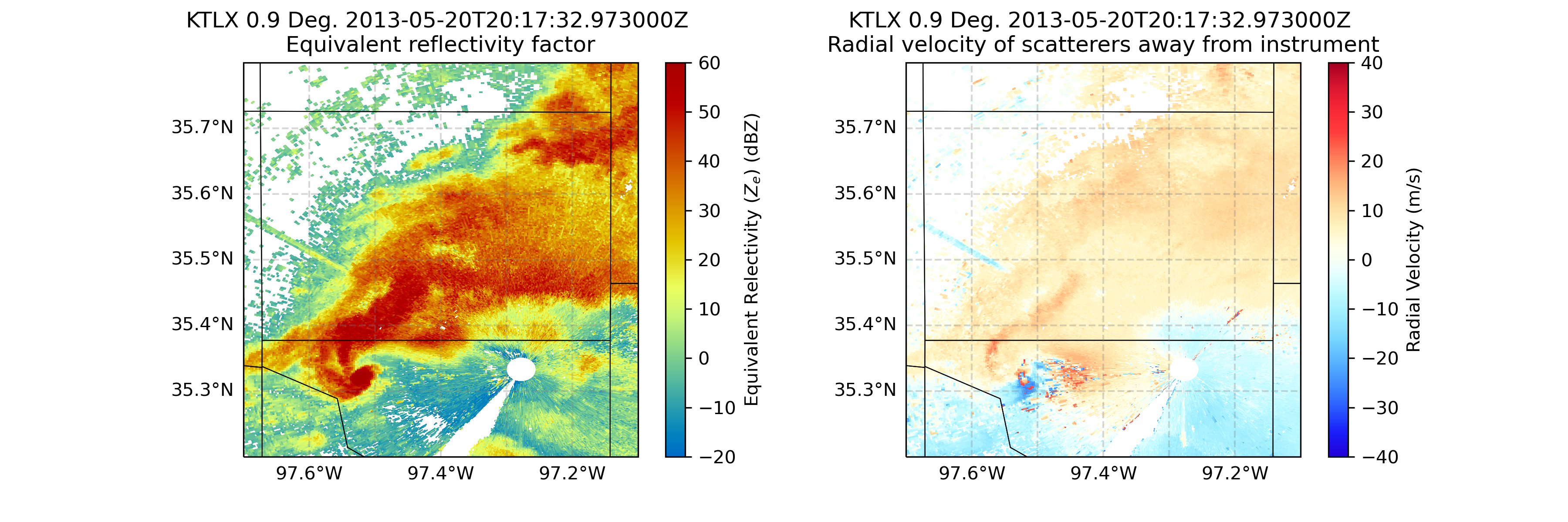
Customize our Labels and Add Finer Grid Labels
You’ll notice, by default, our colorbar label for the velocity field on the right extends across our entire figure, and the latitude/longitude labels on our axes are now gone. Let’s fix that!
# Create our figure
fig = plt.figure(figsize=[12, 4])

# Setup our first axis with reflectivity
ax1 = plt.subplot(121, projection=ccrs.PlateCarree())
display = pyart.graph.RadarMapDisplay(radar)
ref_map = display.plot_ppi_map('reflectivity',
                               sweep=3,
                               vmin=-20,
                               vmax=60,
                               ax=ax1,
                               colorbar_label='Equivalent Relectivity ($Z_{e}$) (dBZ)')


# Zoom in by setting the xlim/ylim
plt.xlim(-97.7, -97.1)
plt.ylim(35.2, 35.8)

# Add gridlines
gl = ax1.gridlines(crs=ccrs.PlateCarree(),
                  draw_labels=True,
                  linewidth=1,
                  color='gray',
                  alpha=0.3,
                  linestyle='--')

# Make sure labels are only plotted on the left and bottom
gl.xlabels_top = False
gl.ylabels_right = False

# Increase the fontsize of our gridline labels
gl.xlabel_style = {'fontsize':10}
gl.ylabel_style = {'fontsize':10}

# Add counties
ax1.add_feature(USCOUNTIES,
                linewidth=0.5)

# Setup our second axis for velocity
ax2 = plt.subplot(122, projection=ccrs.PlateCarree())
vel_plot = display.plot_ppi_map('velocity',
                                sweep=3,
                                vmin=-40,
                                vmax=40,
                                projection=ccrs.PlateCarree(),
                                ax=ax2,
                                colorbar_label='Radial Velocity (m/s)')

# Zoom in by setting the xlim/ylim
plt.xlim(-97.7, -97.1)
plt.ylim(35.2, 35.8)

# Add gridlines
gl = ax2.gridlines(crs=ccrs.PlateCarree(),
                   draw_labels=True,
                   linewidth=1,
                   color='gray',
                   alpha=0.3,
                   linestyle='--')

# Make sure labels are only plotted on the left and bottom
gl.xlabels_top = False
gl.ylabels_right = False

# Increase the fontsize of our gridline labels
gl.xlabel_style = {'fontsize':10}
gl.ylabel_style = {'fontsize':10}

# Add counties
ax2.add_feature(USCOUNTIES,
                linewidth=0.5)
plt.show()
Summary
Within this example, we walked through how to use MetPy and PyART to read in NEXRAD Level 2 data from the Moore Oklahoma tornado in 2013, create some quick looks, and customize the plots to analyze the tornadic supercell closest to the radar.