This notebook demonstrates how to analyze salinity patterns in South Florida using curated buoy data processed by the EnviStor smart data pipeline and made available through PelicanFS, a high-performance file system interface for the Open Science Data Federation (OSDF).
The data used here comes from three monitoring stations managed by FIU, each located in a distinct part of South Florida’s coastal waters. These datasets were curated and made analysis-ready by the EnviStor pipeline.
The central question is:
What are the salinity patterns in South Florida?
We’ll answer this by loading the data, cleaning and merging it, and visualizing salinity trends over time across multiple locations.
Imports
import pandas as pd
import matplotlib.pyplot as plt
import seaborn as sns

from pelicanfs.core import OSDFFileSystem
from io import BytesIO

sns.set(style="whitegrid")
Load the Curated Salinity Datasets
We’ll load data from three buoy stations directly from PelicanFS using the OSDFFileSystem() interface. These Excel files have already been curated and prepared by the EnviStor smart pipeline, and are stored in the /envistor namespace in OSDF.
Each file corresponds to a different buoy location:
Biscayne Bay
Haulover Inlet
Little River
We use BytesIO to read the content as a stream before passing it to pandas.read_excel(). Each resulting DataFrame includes a "Station" column to identify its source location.
pelfs = OSDFFileSystem()
file_buoy1 = pelfs.cat('/envistor/CREST_Buoy_2_NW_Biscayne_Bay_-_S_of_Biscayne_Canal_082720-112221.xlsx')
file_buoy2 = pelfs.cat('/envistor/CREST_Buoy_3_Haulover_Inlet_100518_-_073020_updated.xlsx')
file_buoy3 = pelfs.cat('/envistor/CREST_Buoy_3-2_Little_River_042121-050624.xlsx')

excel_file1 = BytesIO(file_buoy1)
df_file_buoy1 = pd.read_excel(excel_file1)
df_file_buoy1['Station'] = 'Buoy - Biscayne Bay'

excel_file2 = BytesIO(file_buoy2)
df_file_buoy2 = pd.read_excel(excel_file2)
df_file_buoy2['Station'] = 'Buoy - Haulover Inlet'

excel_file3 = BytesIO(file_buoy3)
df_file_buoy3 = pd.read_excel(excel_file3)
df_file_buoy3['Station'] = 'Little River'
Clean and Combine the Data
Now that we’ve loaded the individual DataFrames, we’ll prepare them for analysis.
Here’s what we do:
Create a timestamp: Combine the
"Date"and"Time"columns into a singledatetimecolumn.Standardize salinity: Rename the
"Sal_psu"column to"Salinity"and convert its values to numeric (in case of string or error-prone entries).Merge datasets: Concatenate the three cleaned DataFrames into one (
df_all) so we can analyze salinity trends across all buoy stations together. We also drop any rows with missing salinity values and set thedatetimecolumn as the index to enable time-based operations later.
for df in [df_file_buoy1, df_file_buoy2, df_file_buoy3]:
    df["datetime"] = pd.to_datetime(df["Date"].astype(str) + " " + df["Time"].astype(str))

    df.rename(columns={"Sal_psu": "Salinity"}, inplace=True)
    df["Salinity"] = pd.to_numeric(df["Salinity"], errors="coerce")

df_all = pd.concat([df_file_buoy1, df_file_buoy2, df_file_buoy3], ignore_index=True)
df_all.dropna(subset=["Salinity"], inplace=True)
df_all.set_index("datetime", inplace=True)
Resample and Aggregate
Salinity readings are taken multiple times per day. To reveal broader trends, we resample the data to daily averages.
This step:
Reduces noise
Makes it easier to compare across time
Prepares the data for visualization
We group by station and resample by day ('1D').
df_daily = (
    df_all
    .groupby("Station")
    .resample("1D")
    ["Salinity"]
    .mean()
    .reset_index()
)
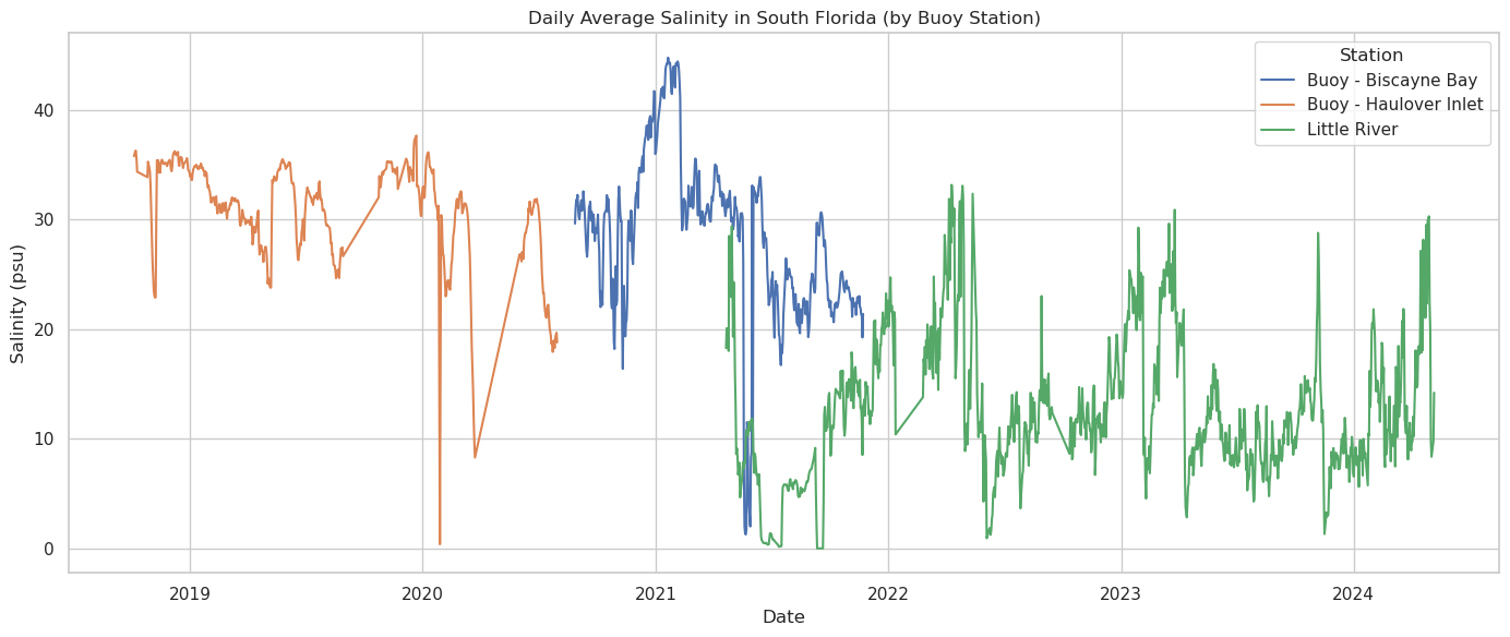
Visualize the Salinity Patterns
Now we can plot daily salinity patterns to compare how they evolve over time across the three locations.
We’ll use Seaborn for a clean, readable line chart.
plt.figure(figsize=(14, 6))
sns.lineplot(data=df_daily, x="datetime", y="Salinity", hue="Station")
plt.title("Daily Average Salinity in South Florida (by Buoy Station)")
plt.xlabel("Date")
plt.ylabel("Salinity (psu)")
plt.legend(title="Station")
plt.tight_layout()
plt.show()

Interpret the Results
With the visualization in hand, we can start identifying key salinity patterns in South Florida:
Biscayne Bay (blue) shows a clear seasonal fluctuation, with higher salinity in dry months and noticeable drops likely linked to storm events or freshwater inflow.
Haulover Inlet (orange) tends to have consistently higher salinity levels, suggesting stronger tidal mixing and less influence from freshwater discharge.
Little River (green) displays the most variability — sharp dips and spikes in salinity hint at frequent freshwater input, possibly from canals, rain events, or upstream runoff.
These differences illustrate how geographic location and local hydrology impact salinity levels. By comparing trends across stations, we gain insight into how dynamic and localized coastal salinity can be.
Next Steps
This notebook provided a foundation for analyzing coastal salinity patterns using curated data from the EnviStor pipeline. If you’re interested in extending this work, here are a few ideas:
Incorporate other environmental variables: Analyze how temperature, turbidity, or dissolved oxygen vary alongside salinity to build a more holistic view of water quality.
Add spatial analysis: Use GIS tools or libraries (e.g., Cartopy or Folium) to visualize station locations and explore spatial gradients in salinity.
Compare across years: Investigate long-term salinity trends and identify anomalies across different seasons or years.
Include other datasets from EnviStor: Expand the workflow by pulling additional datasets from OSDF, such as ocean currents, rainfall, or metadata-enriched observations.
Develop alert thresholds: Identify salinity levels that may signal ecological stress or risk, potentially integrating this with decision-making tools.