
PyWavelets and Jingle Bells
Part 1 for working with audio signals
Overview
This notebook will generate a wavelet scalogram to determine the order of notes in a short .wav file. You’ll learn how to generate a Wavelet Power spectrum graph
- Prerequisites
- Background
- PyWavelets Overview
- Wavelet Power Spectrum
Prerequisites
| Concepts | Importance | Notes |
|---|---|---|
| Intro to Matplotlib | Necessary | Used to plot data |
| Intro to Pandas | Necessary | Used to read in and organize data (in particular dataframes) |
| Intro to Numpy | Necessary | Used to work with large arrays |
| Intro to SciPy | Helpful | Used to work with .wav files and built-in Fast Fourier Transform |
- Time to learn: 20 minutes
Background
Wavelet analysis is accomplished in Python via external package. PyWavelets is an open source Python package for wavelet analysis
Either with pip install:
pip install PyWaveletsOr with conda
conda install pywaveletsImports
import numpy as np                          # working with arrays
import pandas as pd                         # working with dataframes
from scipy.io import wavfile                # loading in wav files
import matplotlib.pyplot as plt             # plot data
from scipy.fftpack import fft, fftfreq      # working with Fourier Transforms

import pywt                                 # PyWavelets
PyWavelets Overview
PyWavelets returns both the coefficients and frequency information for wavelets from the input data
coeffs, frequencies = pywt.cwt(data, scales, wavelet, sampling_period)Input Values
The Continuous Wavelet Transform (CWT) in PyWavelets accepts multiple input values:
Required:
- data: input data (as an array)
- wavelet: name of the Mother wavelet
- scales: collection of the scales to use will determine the range which the wavelet will be stretched or squished
Optional:
- sampling_period: sampling period for frequencies output. Scales are not scaled by the period (and coefficients are independent of the sampling_period)
Return Values
The continuous wavelet transforms in PyWavelets returns two values:
- coefficients: collection of complex number outputs for wavelet coefficients
- frequencies: collection of frequencies (if the sampling period are in seconds then frequencies are in hertz otherwise a sampling period of 1 is assumed)
The final size of coefficients depends on the length of the input data and the length of the given scales.
Choosing a Scale
Scales vs. Frequency
The range of scales are a combination of the smallest scale (s0), spacing between discrete scales (dj), and the maximum scale (jtot).
For the purpose of this exercise, the musical range of frequencies range from 261 - 494 Hz.
| Note | Freq |
|---|---|
| A note | 440 hz |
| B note | 494 hz |
| C note | 261 hz |
| D note | 293 hz |
| E note | 330 hz |
| F note | 350 hz |
| G note | 392 hz |
Note: Musical note frequencies can vary, these frequencies are taken from here
It is good practice to include a range greater than precisely needed. This will make the bands for each frequency in the wavelets clearer.
Scales will change the shape of the wavelet to have it match a specific frequency. For example, scalings from 1 to 40 represent a frequency range from 8125 - 208.33 Hz.
sample_rate, signal_data = wavfile.read('jingle_bells.wav')
scales = np.arange(1, 40)
wavelet_coeffs, freqs = pywt.cwt(signal_data, scales, wavelet = "morl")
Extract audio .wav file
The .wav input file contains information about the amplitude at every time step (in seconds) in the file. The frequency will determine which note each part of the piece represents.
sampleRate, signalData = wavfile.read("../data/jingle_bells.wav")

duration = len(signalData) / sampleRate
time = np.arange(0, duration, 1/sampleRate)

print(f"Sample Rate: {sampleRate}")
print(f"duration = {duration} seconds")
print(f"Total Length in time steps = {len(time)}")
Sample Rate: 10000
duration = 15.6991 seconds
Total Length in time steps = 156991
Let’s Give the Data a Look!
It is always good practice to view the data that we have collected. First, let’s organize the data into a pandas dataframe to organize the amplitude and time stamps.
signal_df = pd.DataFrame({'time (seconds)': time, 'amplitude': signalData})
signal_df.head()Plot a Small Sample of the .wav File
Plot a small subsample of the .wav to visualize the input data.
fig, ax = plt.subplots(figsize=(8, 8))
fig = plt.plot(signal_df["time (seconds)"], signal_df["amplitude"])
plt.title("Subsample of \"Jingle Bells\" Audio File")
ax.set_xlim(signal_df["time (seconds)"][2000], signal_df["time (seconds)"][3000])
plt.xlabel("Time (seconds)")
plt.ylabel("Amplitude")
plt.show()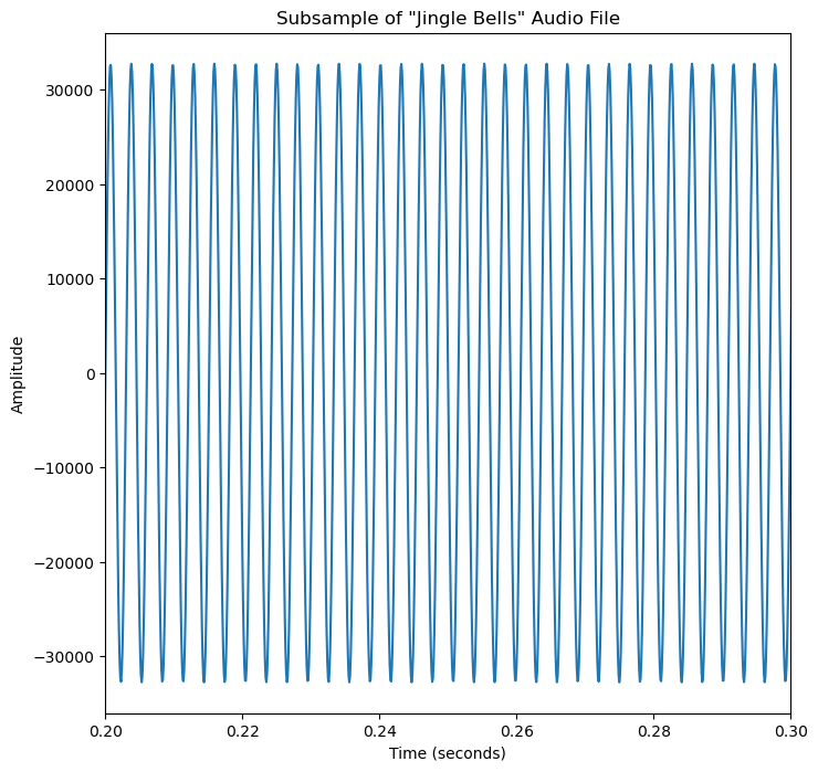
Power Spectrum
wavelet_coeffs is a complex number with a real and an imaginary part (1 + 2i). The power spectrum plots the real component of the complex number. The real component represents the magnitude of the wavelet coefficient displayed as the absolute value of the coefficients squared.
wavelet_mother = "morl" # morlet mother wavelet

# scale determines how squished or stretched a wavelet is
scales = np.arange(1, 40)
wavelet_coeffs, freqs = pywt.cwt(signalData, scales, wavelet = wavelet_mother)

# Shape of wavelet transform
print(f"size {wavelet_coeffs.shape} with {wavelet_coeffs.shape[0]} scales and {wavelet_coeffs.shape[1]} time steps")
print(f"x-axis be default is: {wavelet_coeffs.shape[1]}")
print(f"y-axis be default is: {wavelet_coeffs.shape[0]}")
size (39, 156991) with 39 scales and 156991 time steps
x-axis be default is: 156991
y-axis be default is: 39
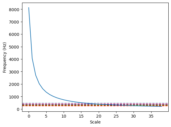
A Note on Choosing the Right Scales
freqs is normalized frequencies, so it needs to be multiplied by this sampling frequency to turn it back into frequencies which means that you need to multiply them by your sampling frequency (500Hz) to turn them into actual frequencies.
wavelet_mother = "morl" # morlet mother wavelet

# scale determines how squished or stretched a wavelet is
scales = np.arange(1, 40)
wavelet_coeffs, freqs = pywt.cwt(signalData, scales, wavelet = wavelet_mother)

plt.axhline(y=440, color='lightpink', linestyle='--', label='A') # A note: 440 hz
plt.axhline(y=494, color="lightblue", linestyle='--', label='B') # B Note: 494 hz
plt.axhline(y=261, color='red', linestyle='--', label='C')       # C Note: 261 hz
plt.axhline(y=293, color='green', linestyle='--', label='D')     # D Note: 293 hz
plt.axhline(y=330, color='orange', linestyle='--', label='E')    # E Note: 330 hz
plt.axhline(y=350, color='grey', linestyle='--', label='F')      # F Note: 350 hz
plt.axhline(y=392, color='purple', linestyle='--', label='G')    # G Note: 392 hz

plt.xlabel("Scale")
plt.ylabel("Frequency (Hz)")
print(f"Frequency in Hz:\n{freqs*sampleRate}")
plt.plot(freqs*sampleRate)
Frequency in Hz:
[8125. 4062.5 2708.33333333 2031.25 1625.
1354.16666667 1160.71428571 1015.625 902.77777778 812.5
738.63636364 677.08333333 625. 580.35714286 541.66666667
507.8125 477.94117647 451.38888889 427.63157895 406.25
386.9047619 369.31818182 353.26086957 338.54166667 325.
312.5 300.92592593 290.17857143 280.17241379 270.83333333
262.09677419 253.90625 246.21212121 238.97058824 232.14285714
225.69444444 219.59459459 213.81578947 208.33333333]
Plot scalogram
The scalogram will visually display the strength of the frequency at a particular time interval. A stronger signal in red represents a wavelet that strongly matches a specific frequency in that range, while blue represents where the wavelet has a weaker match to a specific frequency. The best match for a note will be found where the signal is strongest.
fig, ax = plt.subplots(figsize=(8, 8))
data = np.log2(np.square(abs(wavelet_coeffs))) # compare the magnitude
plt.xlabel("Time Steps")
plt.ylabel("Scale Sensitivity")
plt.imshow(data,
           vmax=(data).max(), vmin=(data).min(),
           cmap="coolwarm", aspect="auto")
plt.colorbar()
plt.show()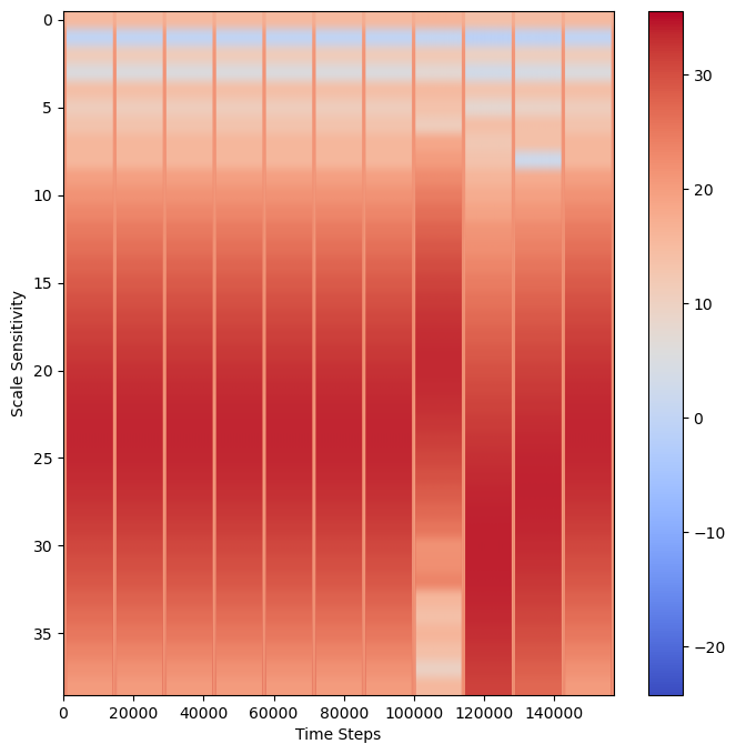
Overlay Possible Frequencies
To overlay these frequencies with the wavelet scalogram:
Important Note
To convert HZ frequency to ascale = hz *.0001 (where 0.01 is 100 Hz sampling) then apply frequency2scale() PyWavelets functionfig, ax = plt.subplots(figsize=(8, 8))
# Overlay frequency of notes as dotted lines
sample_rate = 1/sampleRate
a_freq = pywt.frequency2scale(wavelet_mother, 440*sample_rate)
plt.axhline(y=a_freq, color='lightpink', linestyle='--', label='A') # A note: 440 hz
b_freq = pywt.frequency2scale(wavelet_mother, 494*sample_rate)
plt.axhline(y=b_freq, color="lightblue", linestyle='--', label='B') # B Note: 494 hz
c_freq = pywt.frequency2scale(wavelet_mother, 261*sample_rate)
plt.axhline(y=c_freq, color='red', linestyle='--', label='C') # C Note: 261 hz
d_freq = pywt.frequency2scale(wavelet_mother, 293*sample_rate)
plt.axhline(y=d_freq, color='green', linestyle='--', label='D') # D Note: 293 hz
e_freq = pywt.frequency2scale(wavelet_mother, 330*sample_rate)
plt.axhline(y=e_freq, color='orange', linestyle='--', label='E') # E Note: 330 hz
f_freq = pywt.frequency2scale(wavelet_mother, 350*sample_rate)
plt.axhline(y=f_freq, color='grey', linestyle='--', label='F') # F Note: 350 hz
g_freq = pywt.frequency2scale(wavelet_mother, 392*sample_rate)
plt.axhline(y=g_freq, color='purple', linestyle='--', label='G') # G Note: 392 hz
# Plot Power scalogram
power = np.log2(np.square(abs(wavelet_coeffs))) # compare the magntiude
plt.title("Note Frequency as Scale")
plt.xlabel("Time Steps")
plt.ylabel("Scale Sensitivity")
plt.imshow(power,
vmax=(power).max(), vmin=(power).min(),
cmap="coolwarm", aspect="auto")
plt.legend()
plt.show()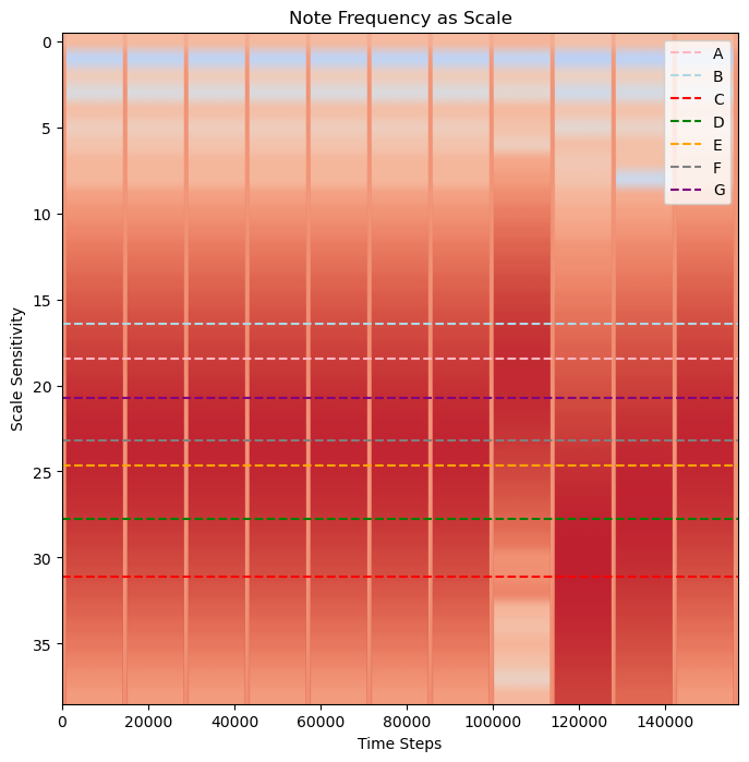
Determining Which Frequencies to Overlay
For this example, we know that the input data is “Jingle Bells” so we know which notes are going to be used.
"Jingle Bells, Jingle Bells, Jingle All the Way" as EEE EEE EGCDEHowever, let’s imagine that we aren’t sure. Wavelets gain information about when a frequency occurs, but at a lower resolution to an exact frequency. To determine which notes are a best fit, you can make use of FFT to determinine which notes to include. Without FFT, the larger possible ranges of frequency can make it possible to confuse nearby notes.
Fast Fourier Transform
fourier_transform = abs(fft(signalData))
freqs = fftfreq(len(fourier_transform), sample_rate)
fig, ax = plt.subplots(figsize=(8, 8))
plt.plot(freqs, fourier_transform)
ax.set_xlim(left=200, right=500)
plt.axvline(x=261, color="red", label="C",alpha=0.5) # C Note: 261 hz
plt.axvline(x=293, color="green", label="D",alpha=0.5) # D Note: 293 hz
plt.axvline(x=330, color="orange", label="E",alpha=0.5) # E Note: 330 hz
plt.axvline(x=391, color="purple", label="G",alpha=0.5) # G Note: 391 hz
plt.title("Signal Frequency Prevalence (FFT)")
plt.xlabel('Frequency (Hz)')
plt.ylabel('Amplitude')
plt.legend()
plt.show()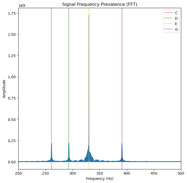
Overlay Frequency of Notes
Using FFT we can now say that there are four clear frequencies that are associated with four notes for CDEG.
Fast Fourier Transform Predicts Four Notes
FFT predicts an output with four notes:
C, D, E, GLet’s plot the notes!
fig, ax = plt.subplots(figsize=(8, 8))

# Overlay frequency of notes as dotted lines
sample_rate = 1/sampleRate
c_freq = pywt.frequency2scale(wavelet_mother, 261*sample_rate)
plt.axhline(y=c_freq, color='red', linestyle='--', label='C')       # C Note: 261 hz
d_freq = pywt.frequency2scale(wavelet_mother, 293*sample_rate)
plt.axhline(y=d_freq, color='green', linestyle='--', label='D')     # D Note: 293 hz
e_freq = pywt.frequency2scale(wavelet_mother, 330*sample_rate)
plt.axhline(y=e_freq, color='orange', linestyle='--', label='E')    # E Note: 330 hz
g_freq = pywt.frequency2scale(wavelet_mother, 392*sample_rate)
plt.axhline(y=g_freq, color='purple', linestyle='--', label='G')    # G Note: 392 hz

# Plot Power scalogram
power = np.log2(np.square(abs(wavelet_coeffs))) # compare the magntiude
plt.title("Note Frequency as Scale")
plt.xlabel("Time Steps")
plt.ylabel("Scale Sensitivity")
plt.imshow(power,
           vmax=(power).max(), vmin=(power).min(),
           cmap="coolwarm", aspect="auto")
plt.legend()
plt.show()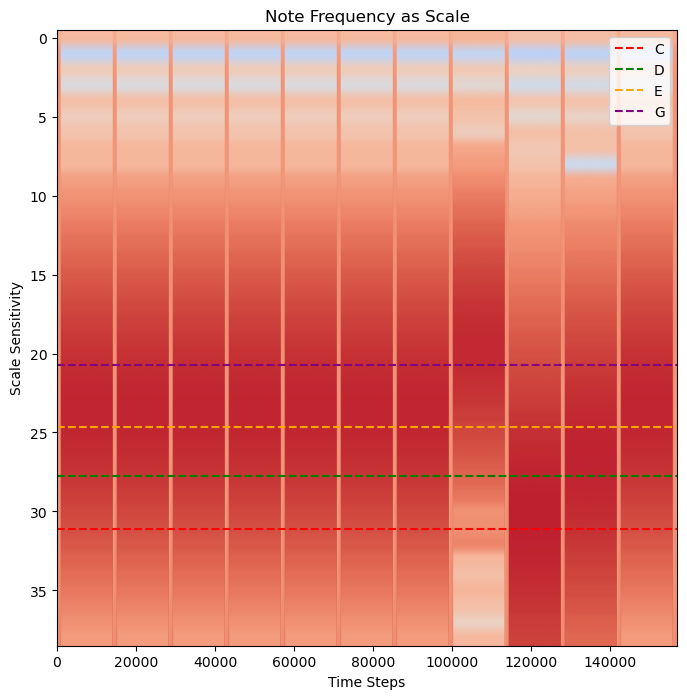
Four Notes!
The darkest color correlates with the frequency at each time stamp. Rather than appearing as distinct peaks like a Fourier Transform, wavelets return a gradient of frequencies. This is the loss in precision due to Heisenberg’s Uncertainty Principle. While the frequencies can still be determined, there is some level of uncertainty in the exact frequencies. This is where combining wavelets with a Fourier Transform can be useful. We now know that this piece has four notes CDEG. The vertical bands represent where the note ends before the next note begins. This piece of music has a deliberate start and stop so this band will not always be as obvious in other pieces of music.
We can read this wavelet analysis by finding what note corresponds with the darkest band.
We should now have the order of the notes, read from left to right:
EEE EEE EGCDE
Summary
Wavelets can report on both the frequency and time a frequency occurs. However, due to Heisenberg’s Uncertainty Principle, by gaining resolution on time, some resolution on frequency is lost. It can be helpful to incorporate both a Fourier Transform and a Wavelet analysis to a signal to help determine the possible ranges of expected frequencies. PyWavelets is a free open-source package for wavelets in Python.
What’s next?
Up next: apply wavelets transform to determine the frequency and order of an unknown input!