Interactive Visualuzation using hvPlot
Overview
ERA-5 Dataset is available from NCAR RDA in netcdf format. A subset of this dataset is processed into Zarr format and available from NCAR RDA endpoints. To learn how you can create Zarr files from NCAR RDA netcdf files, please see this notebook.
By the end of this notebook, you should be able to:
Understand the importance for interactive plots and the challenges associated with them
Use
hvPlotto generate basic interactive plots withXarray
Prerequisites
Concepts |
Importance |
Notes |
|---|---|---|
Necessary |
Time to learn: 30 minutes
Imports
import holoviews as hv
import xarray as xr
from holoviews import opts
hv.extension("bokeh")


Data
As we mentioned above a subset of NCAR RDA data is available in Zarr format.
rda_url = "https://data.rda.ucar.edu/"
annual_means = rda_url + "pythia_era5_24/annual_means/"
xrds = xr.open_dataset(annual_means + "temp_2m_annual_1940_2023.zarr", engine="zarr")
xrds = xrds.isel(time=slice(0, 5))
xrds.load()
<xarray.Dataset> Size: 21MB
Dimensions: (time: 5, latitude: 721, longitude: 1440)
Coordinates:
* latitude (latitude) float64 6kB 90.0 89.75 89.5 ... -89.5 -89.75 -90.0
* longitude (longitude) float64 12kB 0.0 0.25 0.5 0.75 ... 359.2 359.5 359.8
* time (time) datetime64[ns] 40B 1940-12-31 1941-12-31 ... 1944-12-31
Data variables:
VAR_2T (time, latitude, longitude) float32 21MB 258.2 258.2 ... 226.1Considerations for Interactive Plots
Add some markdown text on some of the following ideas:
What are some reasons we want to make data visualuzation interactive?
Baisc Interactivity using hvPlot
The hvPlot package is a familiar and high level API for data exploration and visualuzation.

One of the most powerfull features of hvPlot is that it provides an alternative plotting API that directly attaches to existing Python objects through the .hvplot() attribute. For the case of Xarray, importing hvplot.xarray adds a brand new set of plotting routines accessible either through xr.DataArray.hvplot() or xr.Dataset.hvplot()
import hvplot.xarray
Before using hvPlot, let’s take a look at the default Xarray plotting methods.
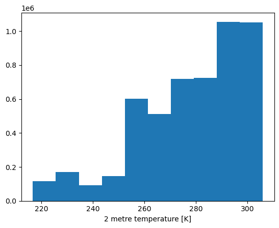
xrds["VAR_2T"].plot()
(array([ 117402., 170562., 92662., 147326., 602810., 510824.,
719488., 723657., 1055503., 1050966.]),
array([216.61584473, 225.55987549, 234.50390625, 243.44793701,
252.39198303, 261.33599854, 270.2800293 , 279.22409058,
288.16812134, 297.1121521 , 306.05618286]),
<BarContainer object of 10 artists>)
We can replace the .plot() function call with .hvplot(). By default, hvPlot uses the Bokeh backend, which has naitive interactive tools, such as :
Panning
Box Select
Scroll Zoom
Saving
Resetting
xrds["VAR_2T"].hvplot()
If we wanted to plot …
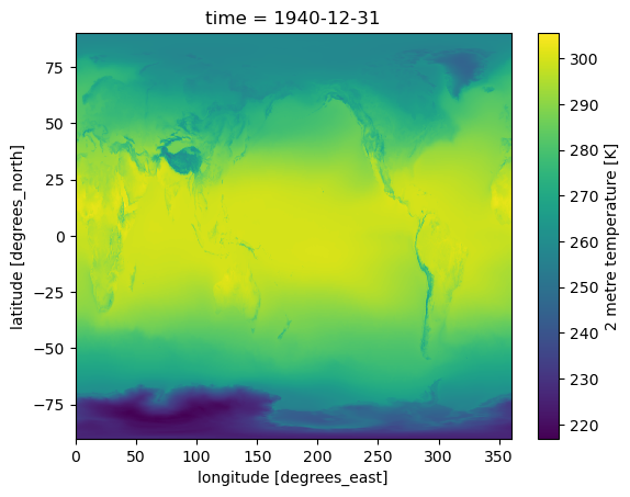
xrds["VAR_2T"].isel(time=0).plot()
<matplotlib.collections.QuadMesh at 0x7f4844483350>
Switching
xrds["VAR_2T"].isel(time=0).hvplot()
Time Widget
Climate data typically comes with multiple timesteps. We can create a basic widget that allows us to seek through time by setting the groupby='time' parameter in our .hvplot() call.
xrds["VAR_2T"].hvplot(groupby="time", widget_location="bottom")
You may notice that our colorbar is dynamically changing as we change our time steps. We can fix the colorbar by setting a clim value, which is a tuple of the minimum and maximum desired colorbar range.
One suggestion is to use the minimum and maximum of the data variable you are visualuzing across time.
clim = (xrds["VAR_2T"].values.min(), xrds["VAR_2T"].values.max())
xrds["VAR_2T"].hvplot(clim=clim, groupby="time", widget_location="bottom")
You may have noticed that there is a slight lag when switching time steps. This is due to hvPlot plotting the full resolution of our dataset. We can instead rasterize the output by setting rasterize=True, which will significantly improve the perfromance of our interactive plot.
xrds["VAR_2T"].hvplot(
rasterize=True, clim=clim, groupby="time", widget_location="bottom"
)
Animation Widget
Another usefull interactive feature is animations. Instead of manually scrolling through time, we can set up a widget that lets us animate our data across time. This can be achieved by adding a Scrubber widget to our plot by setting widget_type="scrubber"
xrds["VAR_2T"].hvplot(
rasterize=True,
groupby="time",
widget_type="scrubber",
widget_location="bottom",
)