In this section, you’ll learn:
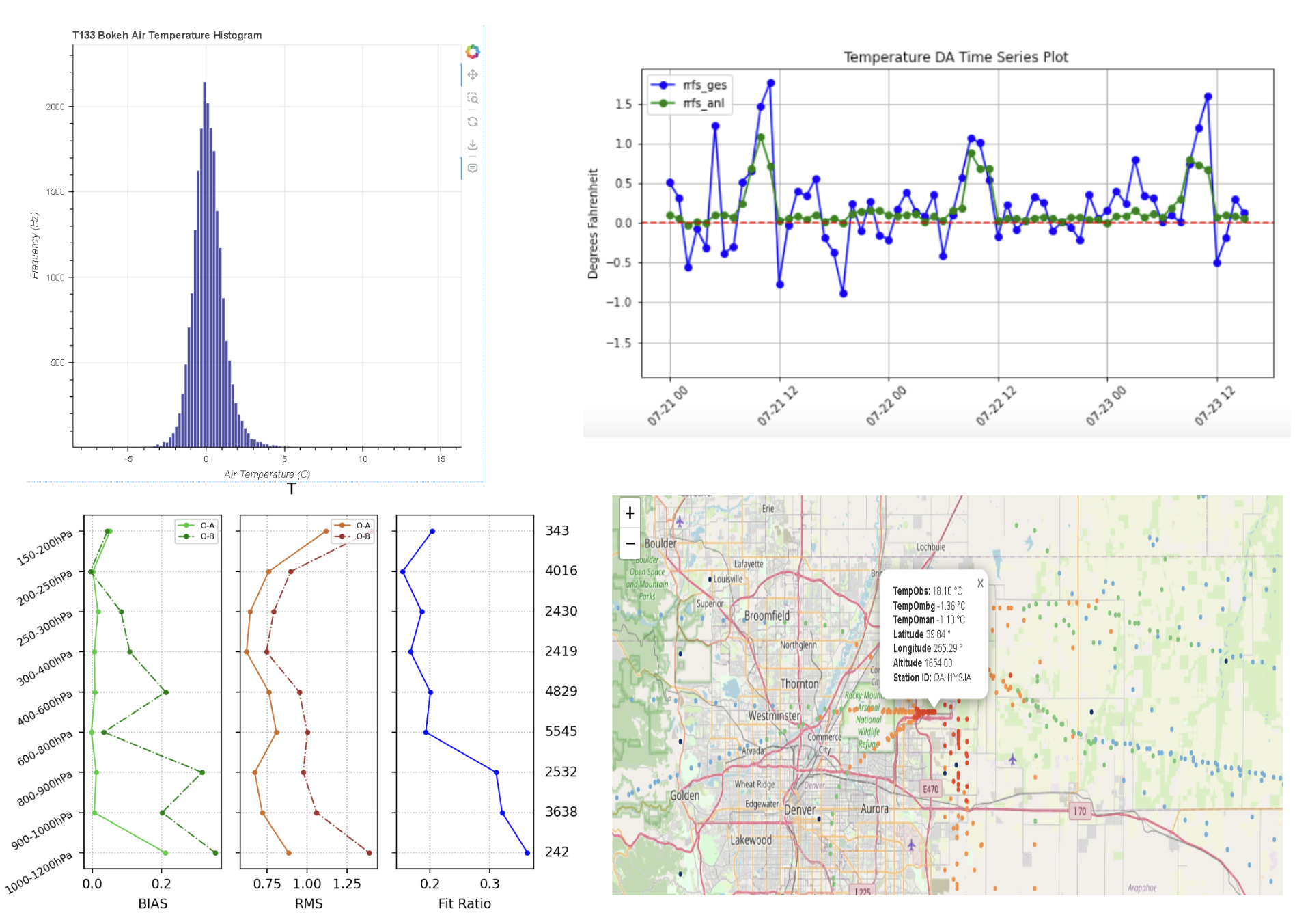
Generate data assimilation statistics and visualize them in the observation space
Prerequisites
| Concepts | Importance | Notes |
|---|---|---|
| Atmospheric Data Assimilation | Helpful |
Time to learn: 10 minutes
Readers may check pyDAmonitor for more information
Work with obsSpace
JEDI or GSI generates observation space diagnostic files, which contains original observation information, hofx (H(x), i.e. model counter-parts at the observation locations), OMB (observation minus background), OMA as well as other information.
This notebook covers how to deal with JEDI diganostic files (which are also called output ioda files). We call them jdiag files here.
Import packages
%%time

# autoload external python modules if they changed
%load_ext autoreload
%autoreload 2

# import modules
import warnings
import math
import sys
import os

import cartopy.crs as ccrs
import geoviews as gv
import geoviews.feature as gf
import holoviews as hv
import hvplot.xarray
from holoviews import opts
import matplotlib.pyplot as plt
import matplotlib.ticker as mticker
import matplotlib.colors as colors
from netCDF4 import Dataset


import s3fs
import seaborn as sns  # seaborn handles NaN values automatically

import geopandas as gp
import numpy as np
import uxarray as ux
import xarray as xr
import pandas as pd

from obsSpace import obsSpace, fit_rate, query_data, to_dataframe, query_dataset, query_obj
CPU times: user 412 ms, sys: 83 ms, total: 495 ms
Wall time: 171 ms
---------------------------------------------------------------------------
ModuleNotFoundError                       Traceback (most recent call last)
Cell In[1], line 1
----> 1 get_ipython().run_cell_magic('time', '', '\n# autoload external python modules if they changed\n%load_ext autoreload\n%autoreload 2\n\n# import modules\nimport warnings\nimport math\nimport sys\nimport os\n\nimport cartopy.crs as ccrs\nimport geoviews as gv\nimport geoviews.feature as gf\nimport holoviews as hv\nimport hvplot.xarray\nfrom holoviews import opts\nimport matplotlib.pyplot as plt\nimport matplotlib.ticker as mticker\nimport matplotlib.colors as colors\nfrom netCDF4 import Dataset\n\n\nimport s3fs\nimport seaborn as sns  # seaborn handles NaN values automatically\n\nimport geopandas as gp\nimport numpy as np\nimport uxarray as ux\nimport xarray as xr\nimport pandas as pd\n\nfrom obsSpace import obsSpace, fit_rate, query_data, to_dataframe, query_dataset, query_obj\n')

File <timed exec>:12

ModuleNotFoundError: No module named 'geoviews'
Retrieve JEDI data
The example JEDI data are stored at jetstream2. We need to retreive those data first.
%%time
local_dir="/tmp/conus12km"
os.makedirs(local_dir, exist_ok=True)

if not os.path.exists(local_dir + "/jdiag_cris-fsr_n20.nc"):
    jetstream_url = 'https://js2.jetstream-cloud.org:8001/'
    fs = s3fs.S3FileSystem(anon=True, asynchronous=False,client_kwargs=dict(endpoint_url=jetstream_url))
    conus12_path = 's3://pythia/mpas/conus12km'
    fs.get(conus12_path + "/jdiag_aircar_t133.nc", local_dir+"/jdiag_aircar_t133.nc")
    fs.get(conus12_path + "/jdiag_aircar_q133.nc", local_dir+"/jdiag_aircar_q133.nc")
    fs.get(conus12_path + "/jdiag_aircar_uv233.nc", local_dir+"/jdiag_aircar_uv233.nc")
    fs.get(conus12_path + "/jdiag_cris-fsr_n20.nc", local_dir+"/jdiag_cris-fsr_n20.nc")
    print("Data downloading completed")
else:
    print("Skip..., data is available in local")

jdiag_file=local_dir+"/jdiag_aircar_t133.nc"
Use NetCDF4 to read jdiag files
dataset=Dataset(jdiag_file, mode='r')
query_dataset(dataset)
Use the obsSpace class to read jdiag files
From the above output, we can see that jdiag (or output ioda file) wraps atmospheric state varaibles under attributes (or groups, such as hofx0, obsError, ObsValue, etc).
We provide a Python class obsSpace to access jdiag data in a traditional, intuitive way, such as aircar.t.hofx0, aircar.t.obsError, etc.
# create an `aircar` object using the `obsSpace` class
aircar = obsSpace(jdiag_file)
check the aircar object
query_obj(aircar)From the above output, we can see the aircar object contains t, q, u, v, etc. Since jdiag_aircar_t133.nc only contains temperature observations, only aircar.t has observation diagnostics.
Query temperature data array
query_data(aircar.t)# print out array values
np.set_printoptions(threshold=500) # don't print out all array values
print(aircar.t.ObsValue)Convert data array to Pandas DataFrame
Converting jdiag data into Pandas DataFrame brings up lots of benefits and we can utilize lots of existing DataFrame capabilities.
df = to_dataframe(aircar.t)
df
Plot histograms
Example 1
# plot histogram of OmA

plt.figure(figsize=(8, 5))
#sns.histplot(df["oman"], bins=50, kde=True, color="steelblue")
sns.histplot(aircar.t.oman, bins=100, kde=True, color="steelblue")
plt.title("Histogram of oman")
plt.xlabel("oman values")
plt.ylabel("Density")
plt.tight_layout()
plt.show()
Example 2
# overlay OMB and OMA histogram together

df_long = df[["oman", "ombg"]].melt(var_name="variable", value_name="value")

plt.figure(figsize=(8, 5))
sns.histplot(data=df_long, x="value", hue="variable", bins=50, kde=True, element="step", stat="count")
plt.title("Overlayed Histogram: oman vs ombg")
plt.tight_layout()
plt.show()
Example 3
# overlay OMB and OMA histogram together

plt.figure(figsize=(8, 5))
sns.histplot(df["oman"], bins=100, kde=True, color="blue", label="oman", multiple="layer")
sns.histplot(df["ombg"], bins=100, kde=True, color="red", label="ombg", multiple="layer")

plt.title("Overlayed Histogram: oman vs ombg")
plt.xlabel("Value")
plt.ylabel("Frequency")
plt.legend()
plt.tight_layout()
plt.show()
plot fitting rate
The rate fitting to observations is an important metric to evaluate data assimilation performance. We don’t want a small fitting rate, which means very little observation impacts on the model forecast. We don’t want a large fitting rate either, which means we fit too close to the observations and the model forecast will crash. Usually, a fitting rate of 20%~30% is expected.
# 1. Filter valid data (both 'oman' and 'ombg' are not NaN)
valid_df = df[df["oman"].notna() & df["ombg"].notna()].copy()
valid_df = valid_df.dropna(subset=["height"])  # removes any rows in valid_df where height is missing (NaN)
print(valid_df[valid_df["height"] < 0]["height"])   # negative height
dz = 1000
grouped = fit_rate(aircar.t, dz=dz)
# 5. Plot vertical profile of fit_rate vs height
plt.figure(figsize=(7, 6))
plt.plot(grouped["fit_rate"], grouped["height_bin"], marker="o", color="blue")
# plt.axvline(x=0, color="gray", linestyle="--") # ax vertical line
plt.xlabel("Fit Rate (%)") # label change
plt.gca().xaxis.set_major_formatter(plt.FuncFormatter(lambda x, _: f'{x*100:.0f}%')) # format as %
plt.ylabel("Height Bin (m)")
plt.title("Vertical Profile of Fit Rate")
# Fine-tune ticks
plt.xticks(np.arange(0, 0.25, 0.05)) #, fontsize=12)
plt.yticks(np.arange(0, 13000, dz)) #, , fontsize=12)
# Add minor ticks
from matplotlib.ticker import AutoMinorLocator
plt.gca().xaxis.set_minor_locator(AutoMinorLocator())
plt.gca().yaxis.set_minor_locator(AutoMinorLocator())
# plt.grid(which='both', linestyle='--', linewidth=0.5)
plt.grid(True)
plt.ylim(0, 13000) # set y-axis from 0 (bottom) to 13,000 (top)
plt.tight_layout()
plt.show()print(grouped["height_bin"])Plot satellite radiance observations
load satellite data using obsSpace
%%time

obsCris = obsSpace(local_dir + "/jdiag_cris-fsr_n20.nc")
# query the `bt` data array, excluding the metadata starting with `sensorCentralWavenumber_`. bt=Brightness Temperature
query_data(obsCris.bt, meta_exclude="sensorCentralWavenumber_")# print H(x) values
print(obsCris.bt.hofx0)assemble target obs array
ncount=0
idx = []
idx2 = []
ch=61
for n in np.arange(len(obsCris.bt.ombg[:,ch])):
    #if obsCris.bt.CloudDetectMinResidualIR[n,ch] == 1:
     if obsCris.bt.ombg[n,ch] > -200 and obsCris.bt.ombg[n,ch] < 200:
       idx.append(n)
       ncount = ncount + 1

lat=obsCris.bt.latitude[idx]
lon=obsCris.bt.longitude[idx]
obarray=obsCris.bt.DerivedObsValue[idx,ch]
print(lon,lat,obarray)
print(ncount)
prepare color map
datmi = np.nanmin(obarray)  # Min of the data
datma = np.nanmax(obarray)  # Max of the data


import matplotlib.pyplot as plt
if np.nanmin(obarray) < 0:
  cmax = datma
  cmin = datmi
  cmax=310
  cmin=200
  #cmax=1.0
  #cmin=-1.0
  cmap = 'RdBu'
else:
  #cmax = omean+stdev
  #cmin = np.maximum(omean-stdev, 0.0)
  cma = datma
  cmin = datmi
  cmax=310
  cmin=200
  #cmax=1.0
  #cmin=-1.0
  cmap = 'RdBu'
  cmap = 'viridis'
  cmap = 'jet'


cmin = 200.
cmax = 310.
conus_12km = [-150, -50, 15, 55]

color_map = plt.cm.get_cmap(cmap)
reversed_color_map = color_map.reversed()
units = 'K'
#units = '%'

fig = plt.figure(figsize=(10, 5))
Make the plot
# Initialize the plot pointing to the projection
# ------------------------------------------------
ax = plt.axes(projection=ccrs.PlateCarree(central_longitude=0))

# Plot grid lines
# ----------------
gl = ax.gridlines(crs=ccrs.PlateCarree(central_longitude=0), draw_labels=True,
                  linewidth=1, color='gray', alpha=0.5, linestyle='-')
gl.top_labels = False
gl.xlabel_style = {'size': 10, 'color': 'black'}
gl.ylabel_style = {'size': 10, 'color': 'black'}
gl.xlocator = mticker.FixedLocator(
   [-180, -135, -90, -45, 0, 45, 90, 135, 179.9])
ax.set_ylabel("Latitude",  fontsize=7)
ax.set_xlabel("Longitude", fontsize=7)

# Get scatter data
# ------------------
#print('obarray = ', obarray)
print('min/max obarray = ', min(obarray),max(obarray))
#sc = ax.scatter(lonData, latData,
sc = ax.scatter(lon, lat,
                c=obarray, s=4, linewidth=0,
                transform=ccrs.PlateCarree(), cmap=cmap, vmin=cmin, vmax = cmax, norm=None, antialiased=True)


# Plot colorbar
# --------------
cbar = plt.colorbar(sc, ax=ax, orientation="horizontal", pad=.1, fraction=0.06,ticks=[200, 210, 220, 230, 240, 250, 260, 270, 280, 290, 300, 310])
#cbar = plt.colorbar(sc, ax=ax, orientation="horizontal", pad=.1, fraction=0.06,ticks=[-3, -2.5, -2, -1.5, -1, -0.5, 0, 0.5, 1.0, 1.5, 2.0, 2.5, 3 ])
#cbar = plt.colorbar(sc, ax=ax, orientation="horizontal", pad=.1, fraction=0.06,ticks=[0, 10, 20, 20, 40, 50, 60, 70, 80, 90, 100])
cbar.ax.set_ylabel(units, fontsize=10)
# Plot globally
# --------------
#ax.set_global()
#ax.set_extent(conus)
ax.set_extent(conus_12km)

# Draw coastlines
# ----------------
ax.coastlines()
ax.text(0.45, -0.1, 'Longitude', transform=ax.transAxes, ha='left')
ax.text(-0.08, 0.4, 'Latitude', transform=ax.transAxes,
        rotation='vertical', va='bottom')

#text = f"Total Count:{datcont:0.0f}, Max/Min/Mean/Std: {datma:0.3f}/{datmi:0.3f}/{omean:0.3f}/{stdev:0.3f} {units}"
#print(text)
#ax.text(0.67, -0.1, text, transform=ax.transAxes, va='bottom', fontsize=6.2)

dpi=150
gl.top_labels = False
plt.tight_layout()

# show plot
# -----------
# pname='test.png'
# plt.savefig(pname, dpi=dpi)