Overview
This notebook is a continuation of the notebook “Exploring High-Impact Rainfall from Hurricane Ida’s Remnants with MPAS-Viewer”. Here, we’re exploring how to create a spatial plot the temperature field, as well as selecting a single point to visualize different variables.
Imports
from mpasviewer import scvtmesh
import cartopy.crs as ccrs
from datetime import datetime

from earthcmap import escmap
import matplotlib.pyplot as plt
import pandas as pd
import numpy as np
import cartopy.feature as cfeature
Data retrieval
url_thredds = "https://thredds.hydroshare.org/thredds/catalog/hydroshare/resources/6be754bf29cb488b815810c35f3f0ac9/data/contents/nyc_out/catalog.html" ### New York
inidt = datetime(2021, 9, 1, 13); enddt = datetime(2021, 9, 2, 12) ## NYC

list_files = scvtmesh.get_thredds_list(url_thredds)#, date_start=inidt, date_end=enddt)
mpasd = scvtmesh(grid_file='http://thredds.hydroshare.org/thredds/dodsC/hydroshare/resources/6be754bf29cb488b815810c35f3f0ac9/data/contents/nyc_static/nyc.static.nc',
diag_list=list_files)Loading variables
mpasd.dataset(load_variables=['rainnc', 'rainc', 'precipw', 't2m', 'uzonal'])/home/runner/micromamba/envs/mpasviewer-cookbook-dev/lib/python3.14/site-packages/mpasviewer/main.py:101: FutureWarning: In a future version of xarray the default value for data_vars will change from data_vars='all' to data_vars=None. This is likely to lead to different results when multiple datasets have matching variables with overlapping values. To opt in to new defaults and get rid of these warnings now use `set_options(use_new_combine_kwarg_defaults=True) or set data_vars explicitly.
outgrid = xr.open_mfdataset(allfls, combine='nested', concat_dim='Time', decode_cf=True, mask_and_scale=False)
Loaded grid_file dataset: http://thredds.hydroshare.org/thredds/dodsC/hydroshare/resources/6be754bf29cb488b815810c35f3f0ac9/data/contents/nyc_static/nyc.static.nc
mpasd.rain_rate()Loading our data
dta = mpasd.load()dtatimes = [str(x) for x in dta['time'].data.astype('datetime64[s]')]Visualizing temperature data and creating a gif
Given that we’re going to plot temperatures, we will first define the colorbar and units we’re going to use.
cmap, norm = escmap("temp_ecmwf", units="K")for idx in range(len(dta.time)):
mpasd.show(
dta,
var_name="t2m",
time_index=idx,
figsize=(5, 5),
cmap=cmap,
norm=norm,
)
# Add timestamp to each frame
timestamp = pd.to_datetime(dta.time.values[idx])
timestr = timestamp.strftime("%d %b %Y, %H:%M UTC")
plt.title(
f"{timestr}",
pad=40,
x=0.61
)
plt.savefig(
f"temperature{idx:02d}.png",
dpi=150,
bbox_inches="tight"
)
plt.close()/home/runner/micromamba/envs/mpasviewer-cookbook-dev/lib/python3.14/site-packages/cartopy/io/__init__.py:263: DownloadWarning: Downloading: https://naturalearth.s3.amazonaws.com/10m_physical/ne_10m_coastline.zip
warnings.warn(f'Downloading: {url}', DownloadWarning)
Now, we make use of the image module under the Python Imaging Library, and retrieve all the figures we created in our previous step:
from PIL import Image

files = [f"temperature{i:02d}.png" for i in range(len(dta.time))]

frames = [Image.open(f).convert("RGB") for f in files]

frames[0].save(
    "Ida_Temperature_Evolution.gif",
    save_all=True,
    append_images=frames[1:],
    duration=500,
    loop=0
)
Lastly, we go ahead and create our animated image!
from IPython.display import Image as IPImage

IPImage(filename="Ida_Temperature_Evolution.gif")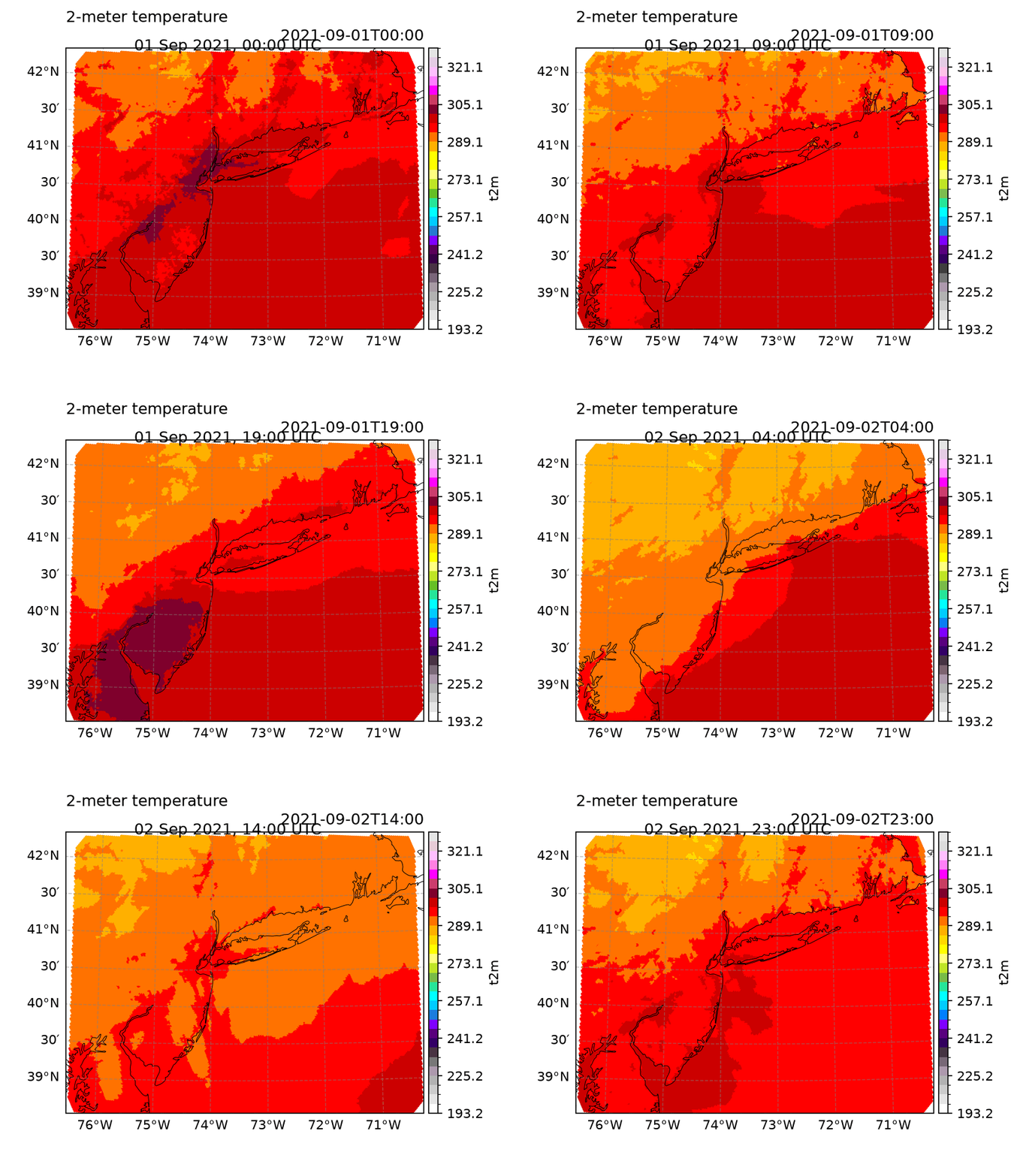
Figure 1. Two-meter temperature variation from 01 September 2021 00:00 UTC to 02 September 2021 23:00 UTC, with 1 hour step progressions.
Exploring other variables at a set location
Oftentimes, researchers need to compare modelled data with observational data (or data from other sources) for their studies. Therefore, it is important to know how to select a point within an MPAS-A output.
Remember: MPAS-A utilizes an unstructured Voronoi mesh. For mapping information of a specific point (given its latitude and longitude), a cellid can be used. Cellid’s are a unique index number for each of the hexagonal cells that compose the MPAS gridded structure.
The point we want to analyze can be seen through this map:
fig = plt.figure(figsize=(8, 8))
ax = plt.axes(projection=ccrs.PlateCarree(central_longitude=180))

#Add coastlines and land
for features in [cfeature.COASTLINE, cfeature.LAND, cfeature.BORDERS, cfeature.STATES, cfeature.OCEAN]:
    ax.add_feature(features)

ax.set_extent([285.5, 286.5, 40.5, 40.9], crs=ccrs.PlateCarree())

station_lon = -73.898
station_lat = 40.672

ax.scatter(station_lon, station_lat, s=80, color='red', edgecolor='black', zorder=5, transform=ccrs.PlateCarree())

ax.gridlines(draw_labels=True, dms=True, x_inline=False, y_inline=False)
ax.gridlines(draw_labels=True, xlocs=np.arange(-180,210,15), ylocs=np.arange(-180,180,5))
ax.tick_params(axis='both', which='major', labelsize=50)

plt.title('Location of the point under analysis', fontsize=13)
plt.show()
/home/runner/micromamba/envs/mpasviewer-cookbook-dev/lib/python3.14/site-packages/cartopy/io/__init__.py:263: DownloadWarning: Downloading: https://naturalearth.s3.amazonaws.com/10m_physical/ne_10m_land.zip
warnings.warn(f'Downloading: {url}', DownloadWarning)
/home/runner/micromamba/envs/mpasviewer-cookbook-dev/lib/python3.14/site-packages/cartopy/io/__init__.py:263: DownloadWarning: Downloading: https://naturalearth.s3.amazonaws.com/10m_physical/ne_10m_ocean.zip
  warnings.warn(f'Downloading: {url}', DownloadWarning)
/home/runner/micromamba/envs/mpasviewer-cookbook-dev/lib/python3.14/site-packages/cartopy/io/__init__.py:263: DownloadWarning: Downloading: https://naturalearth.s3.amazonaws.com/10m_cultural/ne_10m_admin_0_boundary_lines_land.zip
  warnings.warn(f'Downloading: {url}', DownloadWarning)
/home/runner/micromamba/envs/mpasviewer-cookbook-dev/lib/python3.14/site-packages/cartopy/io/__init__.py:263: DownloadWarning: Downloading: https://naturalearth.s3.amazonaws.com/10m_cultural/ne_10m_admin_1_states_provinces_lakes.zip
  warnings.warn(f'Downloading: {url}', DownloadWarning)
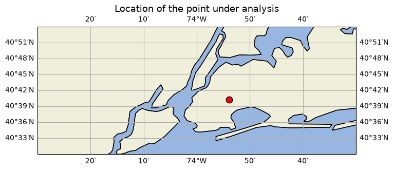
Figure 2. Spatial location of the point under analysis.
We now identify the cellid that’s linked to the longitude and latitude we want to analyze by using the mpasviewer function latlon2cellid:
cellid = mpasd.latlon2cellid(lon = -73.898, lat = 40.672)
print(cellid)
23160
Rain rate time series
Now that our cell has been identified, we go ahead and retrieve rain rate data for that specific cell:
pt0 = dta['rain_rate'].sel(face = cellid)And now, we can now plot the rain rate for our specific cell!
pt0.plot()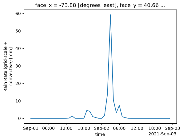
Figure 3. Temporal distribution of rain rate for the selected location. On 01 September, two relatively small increments in rain rates can be observed, while a considerable peak is detected on 02 September, with a value nearing the 60 mm mark.
Temperature time series
The same logic can be applied for any other variable that we want to analyze. Here, we will look at the variation in temperatures through time for our specific location:
pt1 = dta['t2m'].sel(face = cellid)pt1.plot()
plt.title("2m Temperature (t2m)", pad=10)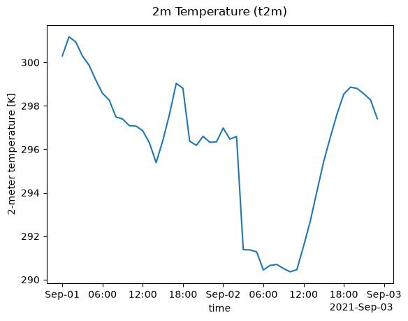
Figure 4. Temporal distribution of the 2-meter temperature for the selected location. A considerably large decrease in temperatures is observed on 02 September 04:00 UTC, time at which the largest rain rate (Fig. 3) was observed.
Vertical wind profile
From our dataset, we can also obtain the vertical distribution of zonal winds for our selected location. Here, we first isolate our variable uzonal for our specific cellid:
profile = dta['uzonal'].sel(face = cellid)#.to_dataframe()We can now set our y axis as the pressue levels to obtain a vertical profile:
profile.plot(y = 'nPresLevels', yincrease = False, vmin = 0, vmax = 40)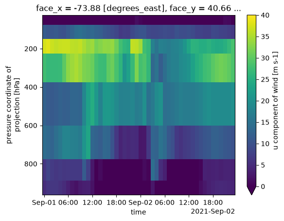
Figure 5. Time series of the zonal component of the wind for different pressure levels.
profile[10,:].plot(y = 'nPresLevels', yincrease = False)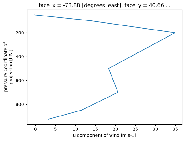
Figure
profile[10,:]