![]()
Data Visualization
In this tutorial, you’ll learn about:
Working with data variables on unstructured grid elements including nodes, edges, and faces
Polygon plotting techniques (vector & raster)
Point plotting techniques (vector & raster)
Handling periodic elements for 2D visualization
Time to learn: 15 minutes
Introduction
Building on Grid Visualization
Our exploration of unstructured grid visualization continues from the previous section, where we examined geometric visualization using the Grid class. We now advance to the next critical aspect: visualizing data variables mapped to unstructured grid elements.
Understanding Data Element Mapping
The visualization approach for unstructured grid data depends fundamentally on how data variables map to specific grid elements. Each variable may correspond to nodes, edges, or faces, and this mapping determines the most effective visualization strategy. This relationship between data and grid elements forms the foundation for selecting appropriate visualization techniques that accurately represent your data’s spatial distribution and relationships.
import uxarray as ux
grid_path = "../../meshfiles/oQU480.grid.nc"
data_path = "../../meshfiles/oQU480.data.nc"
uxds = ux.open_dataset(grid_path, data_path)
uxds["bottomDepth"]
<xarray.UxDataArray 'bottomDepth' (n_face: 1791)> Size: 14kB [1791 values with dtype=float64] Dimensions without coordinates: n_face
Our data variable above, bottomDepth, has a final dimension of n_face, meaning that it is mapped to the faces of our grid.
Plotting Accessor
UXarray provides streamlined access to all visualization methods through the UxDataArray.plot accessor. This interface serves as the central entry point for data visualization, with each data array supporting a default visualization method when calling UxDataArray.plot().
uxds["bottomDepth"].plot()
Polygons
Face-centered data variables are visualized by default using raster polygon plots. In these plots, each face within the unstructured grid is represented as a distinct polygon. The polygons are shaded according to their corresponding data values.
uxds["bottomDepth"].plot.polygons()
Raster vs Vector Polygons
By default, polygon rasterization is enabled (rasterize=True). This setting optimizes performance by converting vector polygons into a raster format when rendering. For high-resolution grids, maintaining rasterization is strongly recommended, as rendering individual vector polygons can significantly impact performance.
Disabling rasterization (rasterize=False) switches to direct vector polygon rendering, which may be suitable for simpler visualizations where maintaining vector properties is essential.
uxds["bottomDepth"].plot.polygons(rasterize=False)
Vector polygon plots maintain complete data fidelity regardless of zoom level, preserving both accuracy and visual quality throughout any magnification. This characteristic distinguishes them from rasterized alternatives, which may show pixelation upon close inspection.
The following visualization demonstrates this advantage. When examining a magnified region of our grid, the vector-rendered polygons maintain their crisp definition and precise data representation.
(
uxds["bottomDepth"].plot.polygons(
rasterize=False, xlim=(-20, 0), ylim=(-5, 5), title="Vector Polygons"
)
+ uxds["bottomDepth"].plot.polygons(
rasterize=True, xlim=(-20, 0), ylim=(-5, 5), title="Raster Polygons"
)
).cols(1)
Handling Periodic Elements
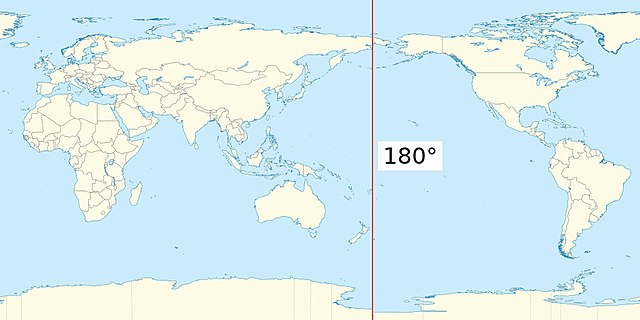
Visualizing unstructured grids on a spherical surface presents unique challenges, particularly when dealing with the antimeridian (180° longitude). This longitudinal line, where the Eastern and Western hemispheres meet, requires special consideration to ensure accurate 2D visualization of data that crosses this boundary.
UXarray addresses this challenge through its periodic_elements parameter in polygon plotting functions. This parameter offers three approaches for managing faces that intersect with the antimeridian:
periodic_elements='exclude' (Default)
Faces that cross the antimeridian are masked, removing them from the visualization. While this approach may omit some data, it offers optimal performance and is recommended for most use cases.
periodic_elements='split'
Faces that cross the antimeridian are divided, ensuring complete data representation. However, this processing step impacts the initial plotting time.
periodic_elements='ignore'
Faces that cross the antimeridian are not processed.
For optimal visualization performance, we recommend maintaining the default periodic_elements='exclude' setting unless complete data representation at the antimeridian is essential for your specific analysis.
(
uxds["bottomDepth"].plot.polygons(
periodic_elements="exclude", title="periodic_elements='exclude'"
)
+ uxds["bottomDepth"].plot.polygons(
periodic_elements="split", title="periodic_elements='split'"
)
).cols(1)
When working with data near or across the antimeridian (180° longitude), selecting an appropriate projection becomes crucial for accurate visualization. For comprehensive guidance on handling such scenarios, including recommended projections and geographic features, please refer to the Geographic Projections & Features notebook.
Polygon Plots for Node/Edge Data
Polygon plots require face-centered data variables, as each polygon must be rendered with a single value. This limitation presents a challenge when working with node-centered or edge-centered data, requiring a conversion process to map the data to faces.
One effective approach is to perform topological averaging. This method calculates the mean value of adjacent nodes or edges and assigns the result to each face, creating a face-centered representation suitable for polygon visualization. While this transformation may introduce some averaging effects, it provides a practical solution for visualizing node and edge data within the constraints of polygon plotting.
grid_path = "../../meshfiles/hex.grid.nc"
data_path = "../../meshfiles/hex.node.data.nc"
uxds_node_centered = ux.open_dataset(grid_path, data_path)
uxds_node_centered["random_data_node"].topological_mean(destination="face").plot()
Points
Points provide an alternative visualization method that offers flexibility across different data mappings. This approach maps data values to specific coordinates, enabling visualization of node-centered, edge-centered, or face-centered data.
The following visualization demonstrates this technique using face-centered data. Each point corresponds to a face center coordinate and displays its associated data value. This method maintains data fidelity while presenting the information in a discrete, coordinate-based format.
uxds["bottomDepth"].plot.points()
Rasterization
As with polygon-based visualizations, point-based plots support rasterization through the rasterize=True parameter. This optimization technique converts vector-based points into a raster format during rendering.
uxds["bottomDepth"].plot.points(rasterize=True)
Point-based rasterization demonstrates different characteristics across varying data resolutions. For coarse-resolution data like our example, point-based visualization produces notably lower visual quality compared to polygon-based approaches.
However, rasterized point plots emerge as a valuable tool for high-resolution grid visualization, offering significant performance advantages. For detailed information about leveraging this technique with high-resolution data, please refer to the Visualizing High-Resolution Grids section.