
PyWavelets and Jingle Bells
Part 1 for working with audio signals
Overview
This notebook will generate a wavelet scalogram to determine the order of notes in a short .wav file. You’ll learn how to generate a Wavelet Power spectrum graph
Prerequisites
Background
PyWavelets Overview
Wavelet Power Spectrum
Prerequisites
Concepts |
Importance |
Notes |
|---|---|---|
Necessary |
Plotting on a data |
|
Necessary |
Familiarity with working with dataframes |
|
Necessary |
Familiarity with working with arrays |
|
Helpful |
Familiarity with working with .wav files |
Time to learn: 20 minutes
Background
Wavelet analysis is accomplished in Python via external package. PyWavelets is an open source Python package for wavelet analysis
pip install PyWavelets
Imports
import numpy as np                          # working with arrays
import pandas as pd                         # working with dataframes
from scipy.io import wavfile                # loading in wav files
import matplotlib.pyplot as plt             # plot data
from scipy.fftpack import fft, fftfreq      # working with Fourier Transforms

import pywt                                 # PyWavelets
PyWavelets Overview
coeffs, freqs = pywt.cwt(data, scales, wavelet, sampling_period)
Input Values
data: input data as a array_like
scales: array_like collection of the scales to use (np.arange(s0, jtot, dj))
wavelet: name of Mother wavelet
sampling_period: optional sampling period for frequencies output
Return Values
coefs: array_like collection of complex number output for wavelet coefficients
freqs: array_like collection of frequencies
Choosing a Scale
Scales vs. Frequency
The range of scales are a combination of s0, dj, and jtot. The musical range of frequencies range from 261 - 494 Hz
Note |
Freq |
|---|---|
A note |
440 hz |
B note |
494 hz |
C note |
261 hz |
D note |
293 hz |
E note |
330 hz |
F note |
350 hz |
G note |
392 hz |
It is good to include a range greater than needed to make clear bands for each frequency
sample_rate, signal_data = wavfile.read('jingle_bells.wav')
scales = np.arange(1, 40)
wavelet_coeffs, freqs = pywt.cwt(signal_data, scales, wavelet = "morl")
For example, scales from 1 to 40 represent a frequency (Hz) range from 8125 - 208.33 Hz
Extract audio .wav file
The .wave input files contains information about the amplitude at every point in the file. The frequency of the note will determine which chord each part of the piece represents
sampleRate, signalData = wavfile.read("../data/jingle_bells.wav")

duration = len(signalData) / sampleRate
time = np.arange(0, duration, 1/sampleRate)

print(f"Sample Rate: {sampleRate}")
print(f"duration = {duration} seconds (sample rate and audioBuffer = {len(signalData)} / {sampleRate}")
print(f"len of audio file = {len(signalData)}")
print(f"Total Length in time = {len(time)}")
Sample Rate: 10000
duration = 15.6991 seconds (sample rate and audioBuffer = 156991 / 10000
len of audio file = 156991
Total Length in time = 156991
Let’s Give the Data a Look!
It is always good practice to view the data that we have collected. First, let’s organize the data into a pandas dataframe to organize the amplitude and time stamps
signal_df = pd.DataFrame({'time (seconds)': time, 'amplitude': signalData})
signal_df.head()
| time (seconds) | amplitude | |
|---|---|---|
| 0 | 0.0000 | -417 |
| 1 | 0.0001 | -2660 |
| 2 | 0.0002 | -2491 |
| 3 | 0.0003 | 6441 |
| 4 | 0.0004 | -8540 |
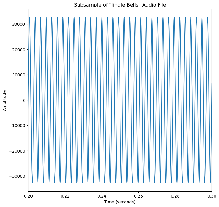
Plot a Small Sample of the .wav File
Plot a small subsample of the .wav to visualize the input data
fig, ax = plt.subplots(figsize=(8, 8))
fig = plt.plot(signal_df["time (seconds)"], signal_df["amplitude"])
plt.title("Subsample of \"Jingle Bells\" Audio File")
ax.set_xlim(signal_df["time (seconds)"][2000], signal_df["time (seconds)"][3000])
plt.xlabel("Time (seconds)")
plt.ylabel("Amplitude")
plt.show()
Power Spectrum
wavelet_coeffs is a complex number with a real and an imaginary number (1 + 2i). The power spectrum plots the real component of the complex number. The real component represents the magntiude of the wavelet coefficient displayed as the absolute value of the coefficients squared
wavelet_coeffs is a complex number with a real and an imaginary number (1 + 2i). The power spectrum plots the real component of the complex number, where the real component represents the magntiude of the wavelet coefficient
import numpy as np
real_component = np.log2(np.square(abs(wavelet_coeffs)))
wavelet_mother = "morl" # morlet

# scale determines how squished or stretched a wavelet is
scales = np.arange(1, 40)
wavelet_coeffs, freqs = pywt.cwt(signalData, scales, wavelet = wavelet_mother)

# Shape of wavelet transform
print(f"size {wavelet_coeffs.shape} with {wavelet_coeffs.shape[0]} scales and {wavelet_coeffs.shape[1]} time steps")
print(f"x-axis be default is: {wavelet_coeffs.shape[1]}")
print(f"y-axis be default is: {wavelet_coeffs.shape[0]}")
size (39, 156991) with 39 scales and 156991 time steps
x-axis be default is: 156991
y-axis be default is: 39
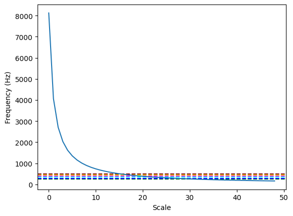
A Note on Choosing the Right Scales
freqs is normalized frequencies, so needs to be multiplied by these sampling frequency to turn back into frequencies which means that you need to multiply them by your sampling frequency (500Hz) to turn them into actual frequencies
wavelet_mother = "morl" # morlet

# scale determines how squished or stretched a wavelet is
scales = np.arange(1, 50)
wavelet_coeffs, freqs = pywt.cwt(signalData, scales, wavelet = wavelet_mother)

plt.axhline(y=440, color='yellow', linestyle='--', label='A')
plt.axhline(y=494, color="maroon", linestyle='--', label='B')
plt.axhline(y=261, color='green', linestyle='--', label='C')
plt.axhline(y=293, color='blue', linestyle='--', label='D')
plt.axhline(y=350, color='cyan', linestyle='--', label='E')
plt.axhline(y=391, color='fuchsia', linestyle='--', label='F')
plt.xlabel("Scale")
plt.ylabel("Frequency (Hz)")
print(f"Frequency in Hz:\n{freqs*sampleRate}")
plt.plot(freqs*sampleRate)
Frequency in Hz:
[8125.         4062.5        2708.33333333 2031.25       1625.
 1354.16666667 1160.71428571 1015.625       902.77777778  812.5
  738.63636364  677.08333333  625.          580.35714286  541.66666667
  507.8125      477.94117647  451.38888889  427.63157895  406.25
  386.9047619   369.31818182  353.26086957  338.54166667  325.
  312.5         300.92592593  290.17857143  280.17241379  270.83333333
  262.09677419  253.90625     246.21212121  238.97058824  232.14285714
  225.69444444  219.59459459  213.81578947  208.33333333  203.125
  198.17073171  193.45238095  188.95348837  184.65909091  180.55555556
  176.63043478  172.87234043  169.27083333  165.81632653]
[<matplotlib.lines.Line2D at 0x7f821ea29b70>]
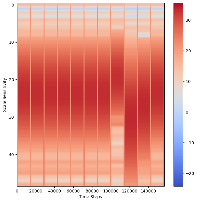
Plot scalogram
fig, ax = plt.subplots(figsize=(8, 8))
data = np.log2(np.square(abs(wavelet_coeffs))) # compare the magntiude
plt.xlabel("Time Steps")
plt.ylabel("Scale Sensitivity")
plt.imshow(data,
           vmax=(data).max(), vmin=(data).min(),
           cmap="coolwarm", aspect="auto")
plt.colorbar()
plt.show()
Overlay Possible Frequencies
To overlay these frequencies with the wavelet scaologram:
Important Note
To convert HZ frequency to a scale = hz *.0001 (where 0.01 is 100 Hz sampling) then apply frequency2scale() PyWavelets function
fig, ax = plt.subplots(figsize=(8, 8))

# Overlay frequency of chords as dotted lines
sample_rate = 1/sampleRate
a_freq = pywt.frequency2scale(wavelet_mother, 440*sample_rate)
plt.axhline(y=a_freq, color='yellow', linestyle='--', label='A')
b_freq = pywt.frequency2scale(wavelet_mother, 494*sample_rate)
plt.axhline(y=b_freq, color="maroon", linestyle='--', label='B')
c_freq = pywt.frequency2scale(wavelet_mother, 261*sample_rate)
plt.axhline(y=c_freq, color='green', linestyle='--', label='C')
d_freq = pywt.frequency2scale(wavelet_mother, 293*sample_rate)
plt.axhline(y=d_freq, color='blue', linestyle='--', label='D')
e_freq = pywt.frequency2scale(wavelet_mother, 330*sample_rate)
plt.axhline(y=e_freq, color='cyan', linestyle='--', label='E')
f_freq = pywt.frequency2scale(wavelet_mother, 350*sample_rate)
plt.axhline(y=f_freq, color='fuchsia', linestyle='--', label='F')
g_freq = pywt.frequency2scale(wavelet_mother, 392*sample_rate)
plt.axhline(y=g_freq, color='pink', linestyle='--', label='G')

# Plot Power scalogram
power = np.log2(np.square(abs(wavelet_coeffs))) # compare the magntiude
plt.title("Note Frequency as Scale")
plt.xlabel("Time Steps")
plt.ylabel("Scale Sensitivity")
plt.imshow(power,
           vmax=(power).max(), vmin=(power).min(),
           cmap="coolwarm", aspect="auto")
plt.legend()
plt.show()
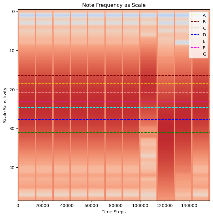
Determining Which Frequencies to Overlay
For this example, we know that the input data is “Jingle Bells” so known which chords are going to be used
"Jingle Bells, Jingle Bells, Jingle All the Way" as EEE EEE EGCDE
However, let’s imagine that we aren’t sure. Wavelets gain information about when a frequency occurs, but at a lower resolution to an exact frequnecy. To determine which chords are a best fit, you can make use of FFT to determinine which chords to include. Without FFT, the larger possible ranges of frequency can make it possible to confuse nearby chords.
Fast Fourier Transform
fourier_transform = abs(fft(signalData))
freqs = fftfreq(len(fourier_transform), sample_rate)
fig, ax = plt.subplots(figsize=(8, 8))
plt.plot(freqs, fourier_transform)
ax.set_xlim(left=200, right=500)
plt.axvline(x=261, color="red", label="C",alpha=0.5)    # C Note: 261 hz
plt.axvline(x=293, color="green", label="D",alpha=0.5)  # D Note: 293 hz
plt.axvline(x=330, color="orange", label="E",alpha=0.5) # E Note: 330 hz
plt.axvline(x=391, color="purple", label="G",alpha=0.5) # G Note: 391 hz
plt.title("Signal Frequency Prevalence (FFT)")
plt.xlabel('Frequency (Hz)')
plt.ylabel('Amplitude')
plt.legend()
plt.show()
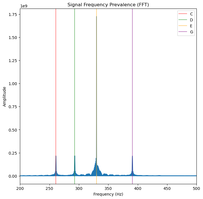
Overlay Frequency of Chords
Using FFT we can now say that there are four clear frequencies that are associated with four chords for CDEG
Fast Fourier Transform Predicts Four Notes
FFT predicts an output with four notes:
C, D, E, G
Let’s plot the notes!
fig, ax = plt.subplots(figsize=(8, 8))

# Overlay frequency of chords as dotted lines
sample_rate = 1/sampleRate
c_freq = pywt.frequency2scale(wavelet_mother, 261*sample_rate)
plt.axhline(y=c_freq, color='green', linestyle='--', label='C')
d_freq = pywt.frequency2scale(wavelet_mother, 293*sample_rate)
plt.axhline(y=d_freq, color='blue', linestyle='--', label='D')
e_freq = pywt.frequency2scale(wavelet_mother, 330*sample_rate)
plt.axhline(y=e_freq, color='cyan', linestyle='--', label='E')
g_freq = pywt.frequency2scale(wavelet_mother, 392*sample_rate)
plt.axhline(y=g_freq, color='pink', linestyle='--', label='G')

# Plot Power scalogram
power = np.log2(np.square(abs(wavelet_coeffs))) # compare the magntiude
plt.title("Note Frequency as Scale")
plt.xlabel("Time Steps")
plt.ylabel("Scale Sensitivity")
plt.imshow(power,
           vmax=(power).max(), vmin=(power).min(),
           cmap="coolwarm", aspect="auto")
plt.legend()
plt.show()
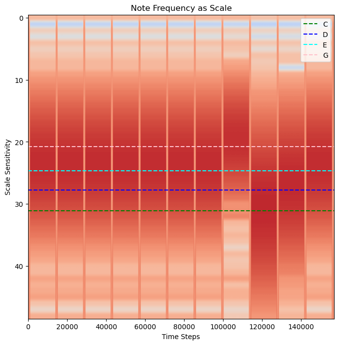
Four Notes!
We have the order of the notes!
A, B, F, A
Summary
Wavelets can report on both the frequency and time a frequency occurs. However, due to Heisenberg’s Uncertainty Principle, by gaining resolution on time, some resolution on frequency is lost. It can be helpful to incorporate both a Fourier Transform and a Wavelet analysis to a signal to help determine the possible ranges of expected frequencies. PyWavelets is a free open-source package for wavelets in Python.
What’s next?
Up next: apply wavelets transform to determine the frequency and order of an unknown input!