Comparison to Xarray
For users coming from an Xarray background, much of UXarray’s design is familiar. This notebook showcases an example of transitioning a Structured Grid Xarray workflow to UXarray.
Imports
import matplotlib.pyplot as plt
import uxarray as ux
import xarray as xr
fig_size = 400
plot_kwargs = {"backend": "matplotlib", "aspect": 2, "fig_size": fig_size}
Data
It is common practice to resample unstructured grids to a structured representation for many analysis workflows to utilize familiar and reliable tools.
The datasets used in this example are meant to mimic this workflow, with a source Unstructured Grid and a Structured representation of that same grid.
Structured
base_path = "../../meshfiles/"
ds_path = base_path + "outCSne30.structured.nc"
xrds = xr.open_dataset(ds_path)
xrds
<xarray.Dataset> Size: 30kB
Dimensions: (lat: 45, lon: 80)
Coordinates:
* lat (lat) int64 360B -90 -86 -82 -78 -74 -70 -66 ... 66 70 74 78 82 86
* lon (lon) float64 640B -180.0 -175.5 -171.0 ... 166.5 171.0 175.5
Data variables:
psi (lat, lon) float64 29kB ...Unstructured
base_path = "../../meshfiles/"
grid_filename = base_path + "outCSne30.grid.ug"
data_filename = base_path + "outCSne30.data.nc"
uxds = ux.open_dataset(grid_filename, data_filename)
uxds
<xarray.UxDataset> Size: 43kB
Dimensions: (n_face: 5400)
Dimensions without coordinates: n_face
Data variables:
psi (n_face) float64 43kB ...Example Workflows
Below are two simple visualization workflows that someone would run into
Creating a single plot
Creating a pair of plots (two different color maps are used to mimic different data)
Xarray
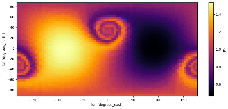
xrds["psi"].plot(figsize=(12, 5), cmap="inferno")
<matplotlib.collections.QuadMesh at 0x7f1c543efaf0>
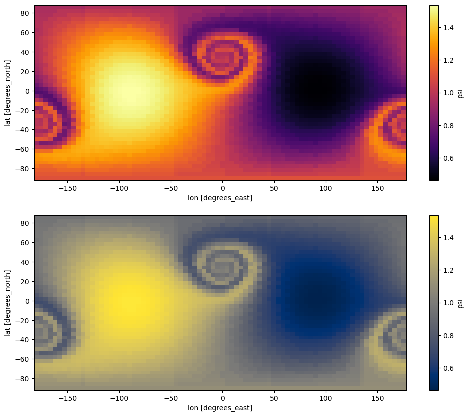
fig, axs = plt.subplots(nrows=2, figsize=(12, 10))
xrds["psi"].plot(cmap="inferno", ax=axs[0])
xrds["psi"].plot(cmap="cividis", ax=axs[1])
<matplotlib.collections.QuadMesh at 0x7f1c54182ef0>
UXarray
uxds["psi"].plot(width=1000, height=500, cmap="inferno")
The default plotting method works great, but we can chose to set exclude_antimeridian=False to include the entire grid and generate a better looking plot.
See also:
To learn more about this type of plotting functionality and supported parameters, please refer to the Polygon Section
uxds["psi"].plot(width=1000, height=500, cmap="inferno", exclude_antimeridian=False)
WARNING:param.main: exclude_antimeridian option not found for polygons plot with bokeh; similar options include: []
(
uxds["psi"].plot(cmap="inferno", exclude_antimeridian=False, **plot_kwargs)
+ uxds["psi"].plot(cmap="cividis", exclude_antimeridian=False, **plot_kwargs)
).opts(fig_size=fig_size).cols(1)


WARNING:param.main: exclude_antimeridian option not found for polygons plot with matplotlib; similar options include: []
WARNING:param.main: fig_size option not found for polygons plot with matplotlib; similar options include: []
WARNING:param.main: exclude_antimeridian option not found for polygons plot with matplotlib; similar options include: []
WARNING:param.main: fig_size option not found for polygons plot with matplotlib; similar options include: []
Using hvPlot to conbine UXarray and Xarray Plots
One of the primary drawbacks to UXarray’s use of HoloViews for visualization is that there is no direct way to integrate plots generated with Xarray and UXarray together. This can be alleviated by using the hvPlot library, specifically hvplot.xarray, on Xarray’s data structures.
See also:
To learn more about hvPlot and xarray, please refer to the hvPlot Documentation
import holoviews as hv
import hvplot.xarray
hv.extension("bokeh")
By using xrds.hvplot() as opposed to xrds.plot(), we can create a simple figure showcasing our Structured Grid figure from Xarray and Unstructured Grid figure from UXarray in a single plot.
hv.extension("bokeh")
(
xrds.hvplot(cmap="inferno", title="Xarray with hvPlot", width=1000, height=500)
+ uxds["psi"].plot(
cmap="inferno",
title="UXarray Plot",
exclude_antimeridian=False,
width=1000,
height=500,
)
).cols(1)

WARNING:param.main: exclude_antimeridian option not found for polygons plot with bokeh; similar options include: []