Points
The primary unstructured grid elements (nodes, edges, faces) each have corresponding latitude-longer coordinates that represent some aspect of the element, such as the center of each face. These coordinates can be transformed into points and shaded with a data variable for visualization.
This notebook showcases how to visualize data variables as points.
Setup
import cartopy.crs as ccrs
import geoviews.feature as gf
import uxarray as ux
from holoviews import opts
file_dir = "../../meshfiles/"
fig_size = 400
plot_kwargs = {"backend": "bokeh", "width": 900, "height": 450}
ortho_plot_kwargs = {"backend": "bokeh", "width": 700, "height": 700}
grid_filename_120 = file_dir + "oQU120.grid.nc"
data_filename_120 = file_dir + "oQU120.data.nc"
uxds_120km = ux.open_dataset(grid_filename_120, data_filename_120)
grid_filename_480 = file_dir + "oQU480.grid.nc"
data_filename_480 = file_dir + "oQU480.data.nc"
uxds_480km = ux.open_dataset(grid_filename_480, data_filename_480)
Representing Coordinates as Points
For 2D visualizations, we can shade pairs of longitude and latitude coordinates as Points. UXarray supports three types of latitude-longitude (i.e spherical) coordinates:
node_lon and node_lat:
Longitudes and Latitudes of the corner nodes of each face
Used for node-centered data variables
edge_lon and edge_lat:
Longitudes and Latitudes of the centers of each edge
Can be derived from
node_lonandnode_latinternally by using Cartesian averagingUsed for edge-centered data variables
face_lon and face_lat:
Longitudes and Latitudes of the centers of each face
Can be derived from
node_lonandnode_latinternally by using Cartesian averagingUsed for face-centered data variables
In the previous notebook, we discussed how Polygon plots can be used for visualizing face-centered data. An alternate visualization of the same data variable can be achieved by shading Points instead of Polygons, which will be showcased in this notebook.
Vector Point Plots
The UxDataArray.plot.points() method produces a Vector Point plot
We can plot each shaded data point using the latitude and longitude of either the nodes, edge centers, or face centers. Since bottomDepth is a face-centered variable, it is plotted using the node coordinates (i.e. node_lon and node_lat)
uxds_480km["bottomDepth"].plot.points(**plot_kwargs)
The size of each point can be increased or decreased by specifying the size parameter
uxds_480km["bottomDepth"].plot.points(size=5, **plot_kwargs)
You may also select what projection to transform the coordinates into using the projection argument.
uxds_480km["bottomDepth"].plot.points(
projection=ccrs.Orthographic(), size=5, **ortho_plot_kwargs
)
failed to validate Scatter(id='p1219', ...).fill_color: expected an element of either String, Nullable(Color), Instance(Value), Instance(Field), Instance(Expr), Struct(value=Nullable(Color), transform=Instance(Transform)), Struct(field=String, transform=Instance(Transform)) or Struct(expr=Instance(Expression), transform=Instance(Transform)), got dim('z')
Rasterized Point Plots
Instead of plotting the geometry of each point directly, we can rasterize our set of points on a fixed-size grid.
(
uxds_480km["bottomDepth"].plot.rasterize(
method="point", width=900, height=400, title="480km Grid"
)
+ uxds_120km["bottomDepth"].plot.rasterize(
method="point", width=900, height=400, title="120km Grid"
)
).cols(1)
/tmp/ipykernel_2738/429910561.py:2: DeprecationWarning: ``UxDataArray.plot.rasterize()`` will be deprecated in a future release. Please use ``UxDataArray.plot.polygons(rasterize=True)`` or ``UxDataArray.plot.points(rasterize=True)``
uxds_480km["bottomDepth"].plot.rasterize(
/tmp/ipykernel_2738/429910561.py:5: DeprecationWarning: ``UxDataArray.plot.rasterize()`` will be deprecated in a future release. Please use ``UxDataArray.plot.polygons(rasterize=True)`` or ``UxDataArray.plot.points(rasterize=True)``
+ uxds_120km["bottomDepth"].plot.rasterize(
Pixel Ratio
As the resolution of our grid increases, observe how there is a much higher density of points, to the point where we can start to observe the trends of the data variable.
As was the case with the Polygon raster, we can specify a pixel_ratio value to control the bin sized used for rasterization. To summarize:
A high pixel ratio increases the number of bins by making each bin smaller, meaning that on average less points fall into each bin, leading to a sparsity
A low pixel ratio decreases the number of bins by making each bin larger, meaning that on average more points fall into each bin, decreasing the sparsity
(
uxds_120km["bottomDepth"].plot.rasterize(
method="point", pixel_ratio=0.40, title="0.4 Pixel Ratio", **plot_kwargs
)
+ (
uxds_120km["bottomDepth"].plot.rasterize(
method="point", pixel_ratio=2.0, title="2.0 Pixel Ratio", **plot_kwargs
)
)
).cols(1)
/tmp/ipykernel_2738/158124999.py:2: DeprecationWarning: ``UxDataArray.plot.rasterize()`` will be deprecated in a future release. Please use ``UxDataArray.plot.polygons(rasterize=True)`` or ``UxDataArray.plot.points(rasterize=True)``
uxds_120km["bottomDepth"].plot.rasterize(
/tmp/ipykernel_2738/158124999.py:6: DeprecationWarning: ``UxDataArray.plot.rasterize()`` will be deprecated in a future release. Please use ``UxDataArray.plot.polygons(rasterize=True)`` or ``UxDataArray.plot.points(rasterize=True)``
uxds_120km["bottomDepth"].plot.rasterize(
We can see that the 0.4 Pixel Ratio looks significantly better than the default example, while the 2.0 Pixel Ratio looks much sparser.
However, there is still a lower density of points near the poles because of the way our data is projected. We can re-project the data to more evenly distribute the points
uxds_120km["bottomDepth"].plot.rasterize(
method="point", projection=ccrs.Sinusoidal(), pixel_ratio=0.4, **plot_kwargs
)
/tmp/ipykernel_2738/1767800343.py:1: DeprecationWarning: ``UxDataArray.plot.rasterize()`` will be deprecated in a future release. Please use ``UxDataArray.plot.polygons(rasterize=True)`` or ``UxDataArray.plot.points(rasterize=True)``
uxds_120km["bottomDepth"].plot.rasterize(
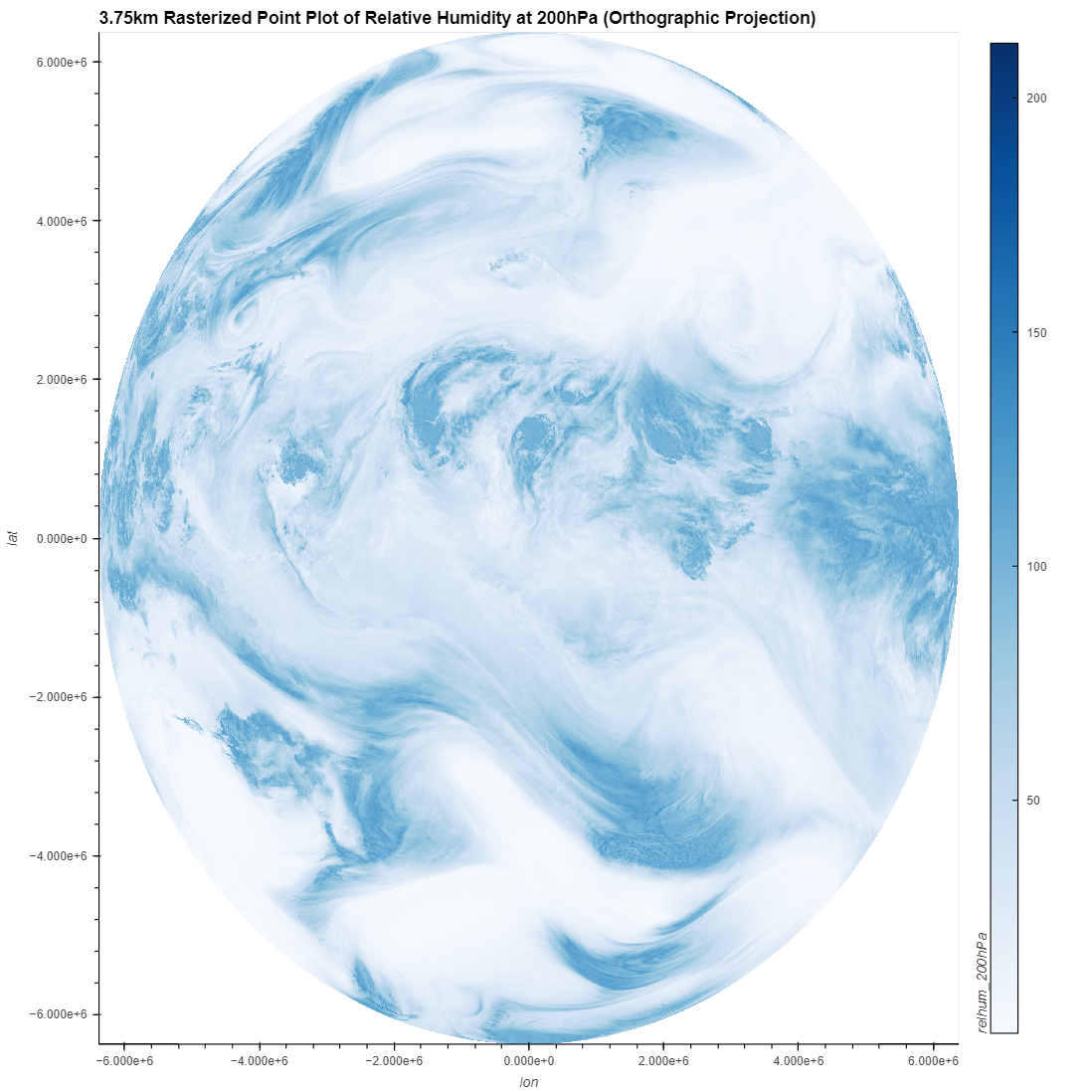
High-Resolution Example
The grids used in this notebook thus far have had resolutions of 480km and 120km. These resolutions are not sufficient for reaching high levels of data fidelity, since there is simply not enough points for the rasterization to look convincing.
The following figures were rendered using UXarray on a 3.75km mesh, which had approximately 42 million faces and 84 million nodes. This means that there are 42 million points available for a face-centered data variable and 84 million points for a node-centered data variable.
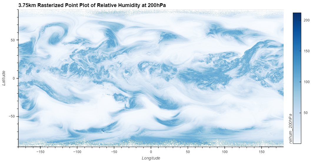
The issue at the poles is still present, even with millions of points. It is still suggested to use a projection to better distribute the points.
See also:
A broader discussion about visualization at higher resolutions, including the pros and cons of Point Rasterization, is discussed in the Visualization at Scale notebook.
Takeaways
Point plotting is a quick way to obtain visualizations of data variables by using the coordinates of the corner nodes, edge centers, or face centers to generate plots.
When should I use vector or raster plots?
Raster plots, when paired with an appropriate pixel ratio and projection, can produce quick and convincing plots comparable to Polygon plots at a fraction of the execution time
Vector plots should be used sparingly, only when plotting the exact point is relevant, such as overlaying points onto another plot