Overview
Within this notebook, we will create an interactive visualization of the latest METAR data across all stations. We will use the following libraries for our visualizations:
Prerequisites
| Concepts | Importance | Notes |
|---|---|---|
| Pandas | Required | Tabular Datasets |
Time to learn: 10 minutes
from IPython.display import Image
import duckdb
import numpy as np
import pandas as pd
import geopandas as gpd
from datetime import datetime, timedelta, timezone
from lonboard import viz, Map, ScatterplotLayer, HeatmapLayer
from lonboard.colormap import apply_continuous_cmap
from palettable.colorbrewer.diverging import BrBG_10, RdBu_10
from pathlib import Path
import geopandas as gpd
import shapely
url = 'https://data.source.coop/dynamical/asos-parquet/year=2026/data.parquet'Get the past three days of data
This query will request just the latest hours worth of data across all stations.
time_1 = datetime.now()
print(f"end time: {time_1}")

time_0 = datetime.now() - timedelta(hours=72)
print(f"start time: {time_0}")
end time: 2026-10-23 04:24:44.268099
start time: 2026-10-20 04:24:44.268314
Query the database for all data between those timestamps
df = duckdb.execute("""
    SELECT *
    FROM read_parquet($1, hive_partitioning=true)
    WHERE
---      country = 'US' AND
    valid BETWEEN $2 AND $3
    ORDER BY country
""", [url, time_0, time_1]).fetchdf()/tmp/ipykernel_4790/432138999.py:8: Pandas4Warning: The inplace keyword in DataFrame.drop is deprecated and will be removed in a future version (PDEP-8).
See https://pandas.pydata.org/docs/dev/whatsnew/v3.1.0.html#deprecation-inplace for more details.
""", [url, time_0, time_1]).fetchdf()
Print the first couple columns of data to get an understanding of the structure
df.head(4)Understanding the data columns
The documentation can be found here for the individual columns:
https://
Print the columns as follows:
df.columnsIndex(['station', 'valid', 'longitude', 'latitude', 'tmpf', 'tmpc', 'dwpf',
'dwpc', 'relh', 'drct', 'sknt', 'gust', 'alti', 'mslp', 'vsby', 'p01i',
'p01m', 'state', 'geometry', 'name', 'elevation', 'country', 'county',
'wfo', 'tzname', 'bbox', 'year'],
dtype='str')Now create a dictionary which assigns descriptions to each column
variables = {
    'tmpf': "Temperature in Fahrenheit",
    'tmpc': "Temperature in Celsius",
    'dwpf': "Dewpoint in Fahrenheit",
    'dwpc': "Dewpoint in Celsius",
    'relh': "Relative humidity in percent",
    'drct': "Wind direction in degrees",
    'sknt': "Wind speed in knots",
    'gust': "Wind gusts in knots",
    'alti': "Altimeter setting in inches of mercury",
    'mslp': "Mean sea level pressure",
    'vsby': "Visibility in statute miles",
    'p01i': "P01I",
    'p01m': "P01M"
}
Plot Timeseries data from a specific station
Select some of the variables from the Boulder, Colorado station, and set the time of each observation as the Dataframe’s index.
df_bdu = df.loc[df['station'] == "BDU"]
df_bdu.head(2)df_select = pd.DataFrame({
'date': df_bdu['valid'],
'tmpc': df_bdu['tmpc'],
'dwpc': df_bdu['dwpc'],
'relh': df_bdu['relh'],
'drct': df_bdu['drct'],
'sknt': df_bdu['sknt'],
'alti': df_bdu['alti'],
}).set_index('date')
# print the head of the dataframe
df_select.head(2)Plotting Across All Stations using Lonboard
Now we will use the library Lonboard to plot the latest temperature data across all stations.
Get the newest observations from each station
df_latest = df.groupby('station').tail(1).sort_values(by='station', ignore_index=True)
df_latest.head(3)df_latest.columnsIndex(['station', 'valid', 'longitude', 'latitude', 'tmpf', 'tmpc', 'dwpf',
'dwpc', 'relh', 'drct', 'sknt', 'gust', 'alti', 'mslp', 'vsby', 'p01i',
'p01m', 'state', 'geometry', 'name', 'elevation', 'country', 'county',
'wfo', 'tzname', 'bbox', 'year'],
dtype='str')Create a geometry from the point data using longitude and latitude
geometry = gpd.points_from_xy(df_latest['longitude'], df_latest['latitude'])And create a GeoPandas DataFrame. We want the data in a form with columns of: [index, feature0, ..., featureN, geometry]. We will use tmpf which is the temperature in degrees Fahrenheit as the singular feature.
gdf2 = gpd.GeoDataFrame(
    df_latest[['tmpf', 'relh']],
    geometry=geometry,
    crs="EPSG:4326",
)
gdf2.head(3)Figure out the minimum and maximum temperature values for the dataset
min_bound = np.min(gdf2['tmpf'])
max_bound = np.max(gdf2['tmpf'])

print(f"min temperature: {np.min(gdf2['tmpf'])} degF, max temperature: {np.max(gdf2['tmpf'])} degF")
min temperature: -2.2 degF, max temperature: 100.4 degF
normalized_value = 1 - (gdf2["tmpf"] - min_bound) / (max_bound - min_bound)
fill_color = apply_continuous_cmap(normalized_value, RdBu_10)
radius = 20_000
layer = ScatterplotLayer.from_geopandas(
gdf2,
get_fill_color=fill_color,
get_radius=radius,
radius_units="meters",
radius_min_pixels=0.1,
)Mapping the Temperature Gradient with Lonboard
Colors are plotted with a red-blue divergent color scheme. Warmer temperatures are denoted with ‘red’ and cooler temperatures are ‘blue’. An example is below:
Image(filename='thumbnails/temperature.png')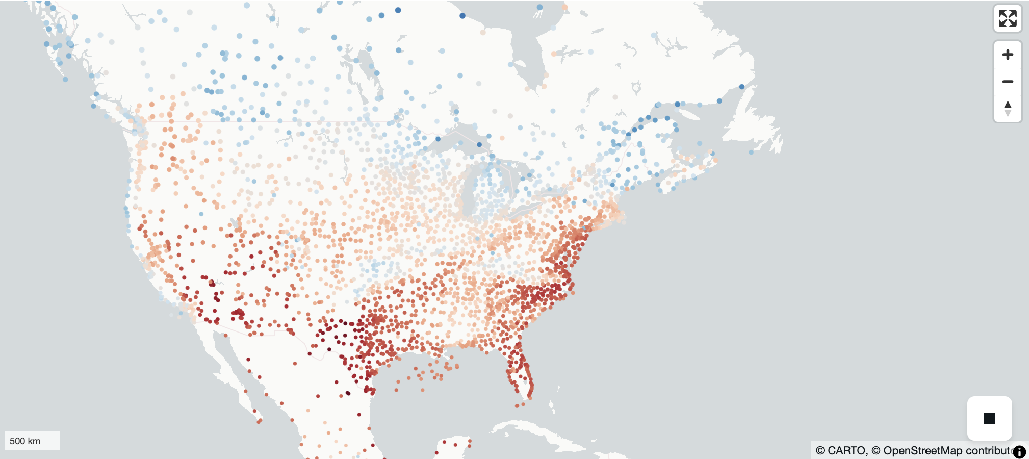
m = Map(layer)
mNext, Relative Humidity (‘relh’)
Dark green means a higher value. Red means a lower value.
Image(filename='thumbnails/relative_humidity.png')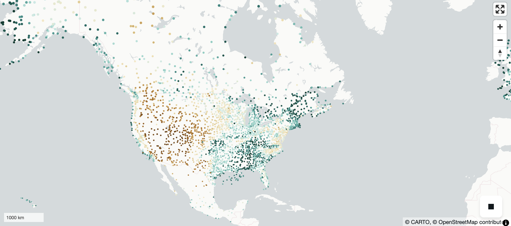
min_bound = np.min(gdf2['relh'])
max_bound = np.max(gdf2['relh'])
normalized_value = (gdf2["relh"] - min_bound) / (max_bound - min_bound)
fill_color2 = apply_continuous_cmap(normalized_value, BrBG_10)
radius2 = 20_000
layer2 = ScatterplotLayer.from_geopandas(
    gdf2,
    # extensions=[filter_extension],
    get_fill_color=fill_color2,
    get_radius=radius2,
    radius_units="meters",
    radius_min_pixels=0.1,
)
m = Map(layer2)
mReferences
Future work:
Add a legend
More interactivity
Visualize other variables, such as the u and v horizontal wind components
What’s next?
We will perform a variety of time-series analyses on METAR data.