Overview
This notebook explores how we might compare METAR products to gridded reanalysis data sets, like ERA-5, WRF, or AORC. We compare single a single site in a time series and look at the comparison in some interactive map-based visualizations.
For this example, we compare METAR with AORC data, a high-resolution reanalysis product produced by NOAA for the continental U.S. and Alaska from 1979-2023. This dataset has only 8 meteorological variables so is relatively simple to understand.
Accessing METAR data
Accessing AORC data
Comparing time series
Interactive map-based visualizations
Prerequisites
| Concepts | Importance | Notes |
|---|---|---|
| Pandas | Necessary | Familiarity with tabular data |
| S3 file access | Helpful | Understanding data access from a cloud-hosted bucket |
Time to learn: 25 minutes
Imports
# basic data wrangling
import pandas as pd
import geopandas as gpd
import numpy as np
import xarray as xr

# data access
import duckdb
import s3fs

# utilities
from datetime import datetime, timedelta
from zoneinfo import ZoneInfo
import scipy.signal as signal
from shapely.geometry import box

# visualization packages
import matplotlib.pyplot as plt
import matplotlib.cm as cm
import matplotlib.colors as colors
from seaborn import set_theme
set_theme()
from lonboard import viz, Map, ScatterplotLayer, HeatmapLayer, PolygonLayer
from lonboard.view_state import MapViewState
from lonboard.basemap import MaplibreBasemap, CartoStyle
from adjustText import adjust_text
Time series comparison
Get METAR data
Data is hosted on Dynamical. We choose a single station, a time range, and select only the variables that we want to compare. Since this example is written by a snow scientist from Boulder, CO, our examples will focus on the winter time in the Colorado Rocky Mountains.
The METAR column names are weird, so we define some more descriptive names here. The full documentation for column names can be found here.
col_refs = {
    'tmpc': ['Temperature', '°C'],
    'relh': ['Relative Humidity', '%'],
    'drct': ['Wind Direction', 'degrees from North'],
    'sknt': ['Wind Speed', 'knots'],
    'p01m': ['Hourly accumulated precipitation', 'mm'],
}
def valid_date(date):
'''
Helper function to check that the date range is valid for METAR and AORC.
'''
assert isinstance(date, datetime)
assert date >= datetime(1979, 1, 1, 0, tzinfo=ZoneInfo('UTC')), 'Date cannot be earlier than 1979'
assert date < datetime(2024, 1, 1, 0, tzinfo=ZoneInfo('UTC')), 'Date cannot be more recent than 2023'
return dateThe Eagle-Vail airport is located just off i70 to the West of Denver. If you want help finding your nearest METAR station, the Local statistics notebook shows how to do this.
# define target!
target = (39.6426, -106.9177)
target_code = 'EGE'

local_tz = 'America/Denver'
time_start = datetime(2021, 1, 1, 0, tzinfo=ZoneInfo(local_tz))
time_end = datetime(2021, 6, 1, 0, tzinfo=ZoneInfo(local_tz))

# both METAR and the AORC are in UTC
time_start_utc = valid_date(time_start.astimezone(ZoneInfo('UTC')))
time_end_utc = valid_date(time_end.astimezone(ZoneInfo('UTC')))

target_vars = ['tmpc', 'relh', 'drct', 'sknt']
Source
gdf = gpd.GeoDataFrame(
    {"station": [target_code]},
    geometry=gpd.points_from_xy([target[1]], [target[0]]),
    crs="EPSG:4326"
)
layer = ScatterplotLayer.from_geopandas(gdf, get_radius=7, radius_units="pixels", get_fill_color=[255, 0, 0, 200])
co_view = MapViewState(longitude=-105.7189, latitude=39.0598, zoom=6.5)
labeled_basemap = MaplibreBasemap(style=CartoStyle.Voyager)

# Render the interactive map
Map(layers=[layer],
    view_state=co_view,
basemap=labeled_basemap)gdf = gpd.GeoDataFrame(
{"station": [target_code]},
geometry=gpd.points_from_xy([target[1]], [target[0]]),
crs="EPSG:4326"
)
m = gdf.explore(
column="station",
cmap=["#FF0000"],
marker_kwds=dict(
radius=7,
fill=True
),
tiles="CartoDB voyager",
location=[39.0598, -105.7189],
zoom_start=7
)
display(m)/home/runner/micromamba/envs/METAR_archive-cookbook/lib/python3.14/site-packages/geopandas/explore.py:383: UserWarning: CartoDB tiles now require an API key. Please provide one to continue using the tiles. You can request the key at https://carto.com/basemaps/apikey/.
tiles = tiles.build_url(scale_factor="{r}")
We’ll need different files if the time range spans multiple years.
metar_base = "https://data.source.coop/dynamical/asos-parquet"
metar_urls = [f"{metar_base}/year={y}/data.parquet" for y in range(time_start.year, time_end.year + 1)]
metar_urls['https://data.source.coop/dynamical/asos-parquet/year=2021/data.parquet']df = duckdb.execute(f"""
SELECT valid, longitude, latitude, station, name, country, {', '.join(target_vars)}
FROM read_parquet($1, hive_partitioning=true)
WHERE station = $2 and
valid between $3 and $4
ORDER BY valid
""", [metar_urls, target_code, time_start_utc, time_end_utc]).fetchdf()/tmp/ipykernel_4986/1124782510.py:7: Pandas4Warning: The inplace keyword in DataFrame.drop is deprecated and will be removed in a future version (PDEP-8).
See https://pandas.pydata.org/docs/dev/whatsnew/v3.1.0.html#deprecation-inplace for more details.
""", [metar_urls, target_code, time_start_utc, time_end_utc]).fetchdf()
df.columnsIndex(['valid', 'longitude', 'latitude', 'station', 'name', 'country', 'tmpc',
'relh', 'drct', 'sknt'],
dtype='str')gdf_metar = gpd.GeoDataFrame(
df,
geometry=gpd.points_from_xy(df.longitude,
df.latitude)
)
gdf_metarGet the AORC data for the target time and location.
AORC data has 8 variables:
APCP_surface: Accumulated precipitation at surface (mm)
TMP_2maboveground: Temperature at 2m above ground (K)
SPFH_2maboveground: Specific humidity at 2m above ground (g/g)
DLWRF_surface: Downward longwave radiation (W/m^2)
DSWRF_surface: Downward shortwave radiation (W/m^2)
PRES_surface: Pressure at surface (Pa)
UGRD_10maboveground: East-West wind speed (m/s)
VGRD_10maboveground: North-South wind speed (m/s)
We’ll use xarray and s3fs to open the cloud-hosted dataset. The advantage of this is that we can quickly access very large amounts of data. df_aorc has a full year of data over the Western U.S.
aorc_base = "noaa-nws-aorc-v1-1-1km"
aorc_urls = [f"s3://{aorc_base}/{y}.zarr" for y in range(time_start.year, time_end.year + 1)]
aorc_urls['s3://noaa-nws-aorc-v1-1-1km/2021.zarr']AORC data is hosted in Zarr format by NOAA on a public S3 bucket.
s3_out = s3fs.S3FileSystem(anon=True)
fileset_aorc = [
    s3fs.S3Map(root=url, s3=s3_out, check=False)
    for url in aorc_urls
]
df_aorc = xr.open_mfdataset(fileset_aorc, engine='zarr')
df_aorcprint(f"Single variable size: {df_aorc.APCP_surface.size / (1024*1024*1024):.2f} GB")Single variable size: 287.93 GB
Before doing anything else, we want to get rid of all the extra data! We select the single grid cell that contains the target point and select out time range.
# select the target point and target time range
df_aorc_pt = df_aorc.sel(
    latitude=target[0],
    longitude=target[1],
    method="nearest"
)
df_aorc_pt = df_aorc_pt.sel(
    time=slice(time_start_utc.replace(tzinfo=None),
               time_end_utc.replace(tzinfo=None))
)
del df_aorc # clean up
print(f"Single variable size: {df_aorc_pt.APCP_surface.size / (1024*1024*1024):.10f} GB")Single variable size: 0.0000033751 GB
In order to compare this to the METAR data, we’ll need to do some conversions. Since the METAR units are generally more understandable, we’ll convert to those.
| Variable | METAR unit | AORC unit |
|---|---|---|
| Temperature | degrees C | degrees K |
| Humidity | Relative humidity | Specific humidity (g/g) |
| Wind | Wind direction (degrees) and wind speed (knots) | E-W/N-S wind speeds (m/s) |
def aorc_to_metar_cols(df_aorc):
    '''
    Helper function for aligning the AORC and METAR variables for conversion.
    '''
    for col in target_vars:
        if col == 'tmpc' :
            print('Converting TMP_2maboveground in K to tmpc in C')
            df_aorc['tmpc'] = df_aorc['TMP_2maboveground'] - 273
        if col == 'relh' :
            print('Converting SPFH_2maboveground to relh (%)')
            q = df_aorc['SPFH_2maboveground']
            tmp = df_aorc['tmpc']
            prs = df_aorc['PRES_surface']
            df_aorc['relh'] = spech_to_relh(q, tmp, prs)
        if col == 'drct' :
            print('Converting UGRD_10maboveground and VGRD_10maboveground to wind direction (deg)')
            dir_rad = np.arctan2(df_aorc['UGRD_10maboveground'], df_aorc['VGRD_10maboveground'])
            dir_deg = np.degrees(dir_rad) + 180.0
            df_aorc['drct'] = np.mod(dir_deg, 360.0)
        if col == 'sknt' :
            print('Converting UGRD_10maboveground and VGRD_10maboveground to wind speed (knots)')
            speed_mps = np.hypot(df_aorc['UGRD_10maboveground'], df_aorc['VGRD_10maboveground'])
            df_aorc['sknt'] = speed_mps * 1.94384
        if col == 'p01m' :
            print('Aligning accumulated precipitation column')
            df_aorc['p01m'] = df_aorc['APCP_surface']
    return df_aorc

def spech_to_relh(q, tmp, prs):
    '''
    Helper function for translating specific humidity to relative humidity
    '''
    p_hpa = prs / 100.0
    w = q / (1.0 - q) # mixing ratio
    # calculate saturation vapor pressure (es) in hPa via Bolton (1980)
    es = 6.112 * np.exp((17.67 * tmp) / (tmp + 243.5))

    epsilon = 0.62198
    ws = epsilon * es / (p_hpa - es) # saturation mixing ratio

    # calculate relatie humidity, bounded from 0 to 100%
    rh_array = (w / ws) * 100.0
    rh_array = np.clip(rh_array, 0.0, 100.0)
    return rh_array
We run the conversions then ditch the extra columns.
df_aorc_pt = aorc_to_metar_cols(df_aorc_pt)
df_aorc_pt = df_aorc_pt[target_vars]
Converting TMP_2maboveground in K to tmpc in C
Converting SPFH_2maboveground to relh (%)
Converting UGRD_10maboveground and VGRD_10maboveground to wind direction (deg)
Converting UGRD_10maboveground and VGRD_10maboveground to wind speed (knots)
Now that the units are harmonized, we need to deal with the timestamps. The METAR data has datetime\[us, UTC\] format (microsecond precision in UTC timezone), while the AORC uses datetime\[ns\] (nanosecond precision in local timezones). We’ll move everything to the local timezone.
# convert to pandas for better manipulation
gdf_aorc = df_aorc_pt.to_dataframe().reset_index()

# convert both dataframes to local timezone
local_tz = 'America/Denver'
gdf_aorc['time'] = pd.to_datetime(gdf_aorc['time']).dt.tz_localize('UTC').dt.tz_convert(local_tz)
gdf_metar['valid'] = pd.to_datetime(gdf_metar['valid']).dt.tz_convert('America/Denver')

# conver to a geodataframe
gdf_aorc = gpd.GeoDataFrame(
    gdf_aorc,
    geometry=gpd.points_from_xy(gdf_aorc.longitude, gdf_aorc.latitude),
    crs="EPSG:4326"
)gdf_metarCompare!
Now that everything is matched up and in the same format, we can make some plots to compare the two datasets.
Here, we just plot each variable against the other.
Source
fig, axes = plt.subplots(len(target_vars), 1, figsize=(12, 2 * len(target_vars)))

for i, v in enumerate(target_vars):
    axes[i].set_title(col_refs[v][0])
    axes[i].set_ylabel(col_refs[v][1])
    axes[i].plot(gdf_metar['valid'], gdf_metar[v], label='METAR', alpha=0.7)
    axes[i].plot(gdf_aorc['time'], gdf_aorc[v], label='AORC', alpha=0.7)

    axes[i].legend(loc='upper left')

plt.tight_layout()
plt.show()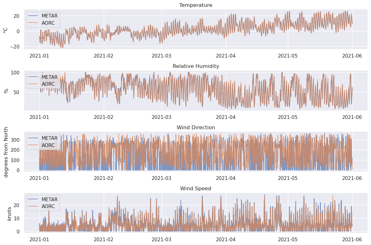
That’s a little messy. Let’s try plotting with a median filter.
A kernel size of 25 for the median filter means that the window size will be about 1 day.
Source
fig, axes = plt.subplots(len(target_vars), 1, figsize=(12, 2 * len(target_vars)))

for i, v in enumerate(target_vars):
    axes[i].set_title(col_refs[v][0])
    axes[i].set_ylabel(col_refs[v][1])
    axes[i].plot(gdf_metar['valid'], signal.medfilt(gdf_metar[v], kernel_size=25), label='METAR', alpha=0.7)
    axes[i].plot(gdf_aorc['time'], signal.medfilt(gdf_aorc[v], kernel_size=25), label='AORC', alpha=0.7)

    axes[i].legend(loc='upper left')

plt.tight_layout()
plt.show()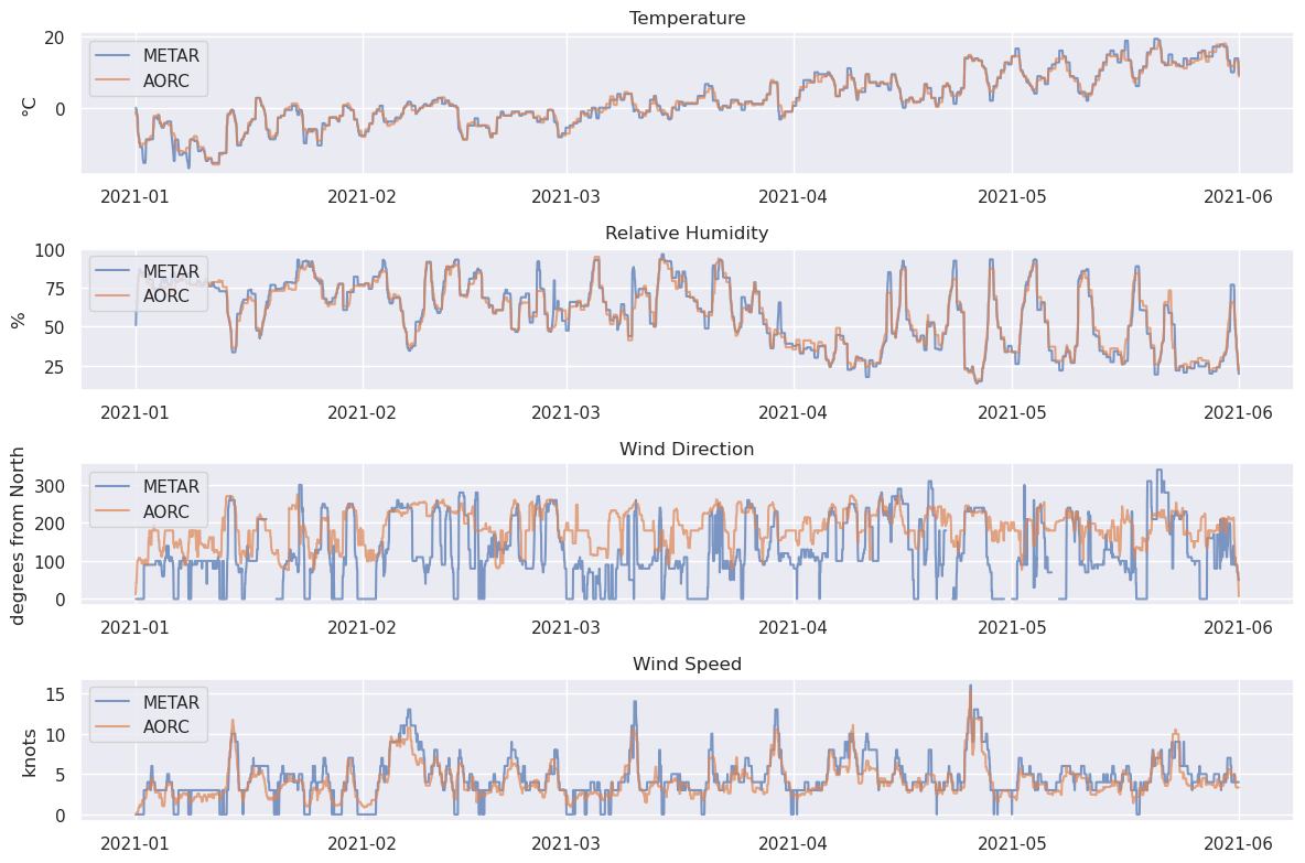
Now, lets plot just the different between each the values. The METAR data is subtracted from the AORC, so this difference is positive (blue) where the AORC is overestimating the METAR data and negative (red) where it is underestimating.
Source
fig, axes = plt.subplots(len(target_vars), 1, figsize=(12, 2 * len(target_vars)))

for i, v in enumerate(target_vars):
    metar_series = pd.Series(
        # gdf_metar[v],
        signal.medfilt(gdf_metar[v], kernel_size=25),
        index=gdf_metar['valid']
    )
    aorc_series = pd.Series(
        # gdf_aorc[v],
        signal.medfilt(gdf_aorc[v], kernel_size=25),
        index=gdf_aorc['time']
    )

    aorc_aligned = aorc_series.reindex(metar_series.index, method='nearest')

    diff = aorc_aligned - metar_series
    x_dates = diff.index.values
    y_values = diff.values

    axes[i].axhline(0, color='darkgray', linewidth=1.2, linestyle='--')

    axes[i].fill_between(x_dates, 0, y_values, where=(y_values > 0),
                         color='blue', alpha=0.4, interpolate=True)
    axes[i].fill_between(x_dates, 0, y_values, where=(y_values < 0),
                         color='red', alpha=0.4, interpolate=True)

    max_val = np.nanmax(np.abs(y_values))
    if max_val > 0:
        axes[i].set_ylim(-max_val * 1.1, max_val * 1.1)

    axes[i].set_title(col_refs[v][0])
    axes[i].set_ylabel(col_refs[v][1])
    axes[i].grid(True, linestyle=':', alpha=0.5)

plt.tight_layout()
plt.show()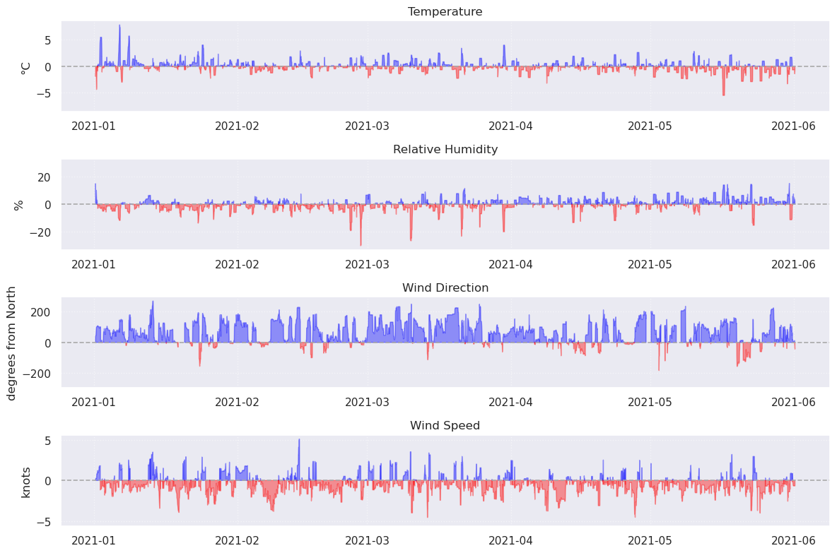
What’s next?
What else might be interesting to compare?
Bias by time of day
Precipitation (not reported by all METAR stations)
Spatial comparison
We might want to look at whether performance changes over a wider range. For this, we’ll expand our area of interest to the full state of Colorado and make some interactive map visualizations.
target = [-109.0603, 36.9924, -102.0415, 41.0034]
target_state = 'CO'

local_tz = 'America/Denver'
time_start = datetime(2021, 1, 1, 0, tzinfo=ZoneInfo(local_tz))
time_end = datetime(2021, 2, 1, 0, tzinfo=ZoneInfo(local_tz))

# convert to UTC again
time_start_utc = valid_date(time_start.astimezone(ZoneInfo('UTC')))
time_end_utc = valid_date(time_end.astimezone(ZoneInfo('UTC')))

target_vars = ['tmpc']
Get AORC data for all of Colorado in the given time range. For space considerations, we are going to limit this down to just the month of January.
aorc_base = "noaa-nws-aorc-v1-1-1km"
aorc_urls = [f"s3://{aorc_base}/{y}.zarr" for y in range(time_start.year, time_end.year + 1)]

# get data
s3_out = s3fs.S3FileSystem(anon=True)
fileset_aorc = [
    s3fs.S3Map(root=url, s3=s3_out, check=False)
    for url in aorc_urls
]
df_aorc = xr.open_mfdataset(fileset_aorc, engine='zarr')

# slice data
df_aorc_co = df_aorc.sel(
    latitude=slice(target[1], target[3]),
    longitude=slice(target[0], target[2]),
    time=slice(time_start_utc.replace(tzinfo=None),
               time_end_utc.replace(tzinfo=None))
)
print(f"Single variable size: {df_aorc_co.APCP_surface.size / (1024*1024*1024):.10f} GB")

df_aorc_co = aorc_to_metar_cols(df_aorc_co)
df_aorc_co = df_aorc_co[target_vars]

del df_aorc
Single variable size: 0.2813384263 GB
Converting TMP_2maboveground in K to tmpc in C
utc_timestamps = pd.DatetimeIndex(df_aorc_co['time'].values)

local_timestamps = utc_timestamps.tz_localize('UTC').tz_convert(local_tz)
local_offsets = [t.utcoffset() for t in local_timestamps]

df_aorc_co = df_aorc_co.assign_coords(time=df_aorc_co['time'] + pd.to_timedelta(local_offsets))

df_aorc_coprint(f"Single variable size: {df_aorc_co.tmpc.size / (1024*1024*1024):.10f} GB")
df_aorc_coSingle variable size: 0.2813384263 GB
Get METAR data for all stations in Colorado
df = duckdb.execute(f"""
    SELECT valid, longitude, latitude, elevation, station, name, country, {', '.join(target_vars)}
    FROM read_parquet($1, hive_partitioning=true)
    WHERE state = $2 and
          valid between $3 and $4
    ORDER BY valid
""", [metar_urls, target_state, time_start_utc, time_end_utc]).fetchdf()/tmp/ipykernel_4986/879255153.py:7: Pandas4Warning: The inplace keyword in DataFrame.drop is deprecated and will be removed in a future version (PDEP-8).
See https://pandas.pydata.org/docs/dev/whatsnew/v3.1.0.html#deprecation-inplace for more details.
""", [metar_urls, target_state, time_start_utc, time_end_utc]).fetchdf()
gdf_metar_co = gpd.GeoDataFrame(
                df,
                geometry=gpd.points_from_xy(df.longitude,
                                            df.latitude)
)
gdf_metar_co.set_crs('EPSG:4326', inplace=True)
gdf_metar_co['valid'] = pd.to_datetime(gdf_metar_co['valid']).dt.tz_convert(local_tz)
gdf_metar_co# prep for visualization
station_stats = gdf_metar_co.groupby('station')['valid'].agg(
obs_count='size',
earliest_date='min',
latest_date='max'
).reset_index()
station_stats['station name'] = station_stats['station']
station_stats['total observations'] = station_stats['obs_count'].astype(str)
gdf_stations_co = gdf_metar_co.drop_duplicates(subset=['station']).copy()
gdf_stations_co = gdf_stations_co.merge(
station_stats[['station', 'station name', 'obs_count', 'total observations']],
on='station',
how='left'
)
# generate sizes for the dots scaled by observation count
max_obs = gdf_stations_co['obs_count'].max()
min_obs = gdf_stations_co['obs_count'].min()
gdf_stations_co['radius_size'] = 4 + 14 * (
(gdf_stations_co['obs_count'] - min_obs) / (max_obs - min_obs)
)
gdf_stations_coLet’s look at where all of the METAR stations that we found are. The size of the bubble corresponds to how many observations each location has.
Source
co_box_geom = box(target[0], target[1], target[2], target[3])
gdf_co_bounds = gpd.GeoDataFrame(geometry=[co_box_geom], crs="EPSG:4326")

bbox_layer = PolygonLayer.from_geopandas(
    gdf_co_bounds,
    get_fill_color=[0, 150, 255, 30],
    get_line_color=[0, 100, 255, 200],
    get_line_width=3,
    line_width_units="pixels"
)

cols = ['latitude', 'longitude',
        'station', 'name', 'elevation',
        'total observations', 'geometry']

stations_layer = ScatterplotLayer.from_geopandas(
    gdf_stations_co[cols],
    get_radius=gdf_stations_co['radius_size'],
    radius_units="pixels",
    get_fill_color=[255, 50, 50, 200],
    get_line_color=[255, 255, 255, 255],
    get_line_width=1,
    line_width_units="pixels",
    pickable=True,
)

co_view = MapViewState(
    longitude=-105.7189,
    latitude=39.0598,
    zoom=6.2
)

Map(
    layers=[bbox_layer, stations_layer],
    view_state=co_view,
    basemap=MaplibreBasemap(style=CartoStyle.Voyager)
)Click on a point for more details about any station.
Source
# plot the outline of CO
m = gdf_co_bounds.explore(
    tooltip=False,
    popup=False,
    style_kwds=dict(
        interactive=False,
        fillColor="#0096FF",    # Soft blue transparent fill
        fillOpacity=0.12,
        color="#0064FF",        # Crisp blue outline
        weight=3
    ),
    tiles="CartoDB voyager",
    location=[39.0598, -105.7189],
    zoom_start=6
)

# add the station dots to the map
gdf_stations_co[cols + ['radius_size']].explore(
    m=m,
    tooltip=[
        'station',
        'name',
        'total observations',
        'latitude',
        'longitude',
        'elevation',
    ],
    marker_type="circle_marker",
    style_kwds=dict(
        style_function=lambda x: {
            "radius": x["properties"]["radius_size"], # Dynamic row-by-row sizing
            "fill": True,
            "fillColor": "#FF3232",                  # Bright red stations
            "fillOpacity": 0.85,
            "color": "#FF3232",                      # Crisp white border outline
            "weight": 1
        }
    )
)
display(m)
/home/runner/micromamba/envs/METAR_archive-cookbook/lib/python3.14/site-packages/geopandas/explore.py:383: UserWarning: CartoDB tiles now require an API key. Please provide one to continue using the tiles. You can request the key at https://carto.com/basemaps/apikey/.
tiles = tiles.build_url(scale_factor="{r}")
Next, we match the stations to their nearest AORC gridcell and create a dataframe that unifies this information.
stations_probe = gdf_metar_co.drop_duplicates(subset=['station'])
station_ids = stations_probe['station'].values
station_lons = stations_probe.geometry.x.values
station_lats = stations_probe.geometry.y.values

# find nearest AORC cells to the stations
df_aorc_co_probe = df_aorc_co.sel(
    longitude=xr.DataArray(station_lons, dims="station", coords={"station": station_ids}),
    latitude=xr.DataArray(station_lats, dims="station", coords={"station": station_ids}),
    method="nearest"
)

# create dataframe for easier manipulation
df_aorc_all = df_aorc_co_probe.to_dataframe().reset_index()
df_aorc_all['time_local'] = pd.to_datetime(df_aorc_all['time']).dt.tz_localize(local_tz, ambiguous='NaT', nonexistent='shift_forward')


station_dfs = []

# interpolate times to match time series at each station
for st_id in station_ids:

    st_aorc = df_aorc_all[df_aorc_all['station'] == st_id].copy()
    st_metar = gdf_metar_co[gdf_metar_co['station'] == st_id].copy()

    if st_metar.empty or st_aorc.empty:
        continue

    aorc_times = pd.to_datetime(st_aorc['time_local'])
    metar_times = pd.to_datetime(st_metar['valid'])

    aorc_index = pd.Index(aorc_times)
    metar_index = pd.Index(metar_times)

    combined_timeline = metar_index.union(aorc_index).unique()
    metar_series = pd.DataFrame({'tmpc_metar': st_metar['tmpc'].values}, index=metar_index)
    metar_interp = metar_series.reindex(combined_timeline).sort_index()

    # linearly interpolate to match to top-of-hour with AORC
    metar_interp['tmpc_metar'] = metar_interp['tmpc_metar'].interpolate(method='time')
    metar_at_hourly_marks = metar_interp.loc[aorc_index].reset_index()
    metar_at_hourly_marks.columns = ['time_local', 'tmpc_metar']

    st_comparison = pd.merge(st_aorc, metar_at_hourly_marks, on='time_local')
    station_dfs.append(st_comparison)

df_comparison = pd.concat(station_dfs, ignore_index=True)
df_comparison = df_comparison.rename(columns={'tmpc': 'tmpc_aorc', 'time_local': 'time'})
df_comparisonThis dataframe can be aggregated by station to calculate the mean bias and mean root mean squared error (RMSE) throughout the month.
df_comparison['temp_bias'] = df_comparison['tmpc_aorc'] - df_comparison['tmpc_metar']

station_metrics = df_comparison.groupby('station').agg(
    mean_bias=('temp_bias', 'mean'),
    mean_rmse=('temp_bias', lambda x: np.sqrt(np.mean(x ** 2)))
).reset_index()

gdf_stations_validated = gdf_metar_co.drop_duplicates(subset=['station']).merge(
    station_metrics,
    on='station',
    how='inner'
)

gdf_stations_validatedNow, we average the AORC across the time axis so that we can plot it spatially.
# getting temporal average for AORC
df_aorc_avg = df_aorc_co['tmpc'].mean(dim='time').to_dataframe().reset_index()

print('Done averaging AORC')

# converting to geodataframe for plotting.
gdf_aorc_grid = gpd.GeoDataFrame(
    df_aorc_avg,
    geometry=gpd.points_from_xy(df_aorc_avg['longitude'], df_aorc_avg['latitude']),
    crs="EPSG:4326"
)
Done averaging AORC
Source
fig, ax = plt.subplots(figsize=(20, 16), facecolor='white')
ax.set_facecolor('white')

ax.grid(True, linestyle='--', alpha=0.4, color='#CCCCCC', zorder=0)
ax.set_xlabel("Longitude (°W)", fontsize=11, labelpad=10)
ax.set_ylabel("Latitude (°N)", fontsize=11, labelpad=10)

# plot AORC
grid_plot = gdf_aorc_grid.plot(
    ax=ax,
    column="tmpc",
    cmap="coolwarm",
    markersize=3,
    alpha=0.35,
    zorder=1
)

norm_bias = colors.Normalize(vmin=-3.0, vmax=3.0)
station_sizes = gdf_stations_validated['mean_rmse'] * 200

# plot stations
station_plot = gdf_stations_validated.plot(
    ax=ax,
    column="mean_bias",
    cmap="bwr",
    norm=norm_bias,
    markersize=station_sizes,
    edgecolor="#222222",
    linewidth=1.2,
    alpha=0.9,
    zorder=3
)

texts = []

for idx, row in gdf_stations_validated.iterrows():
    lon = row.geometry.x
    lat = row.geometry.y

    label_text = f"$\\bf{{{row['station']}}}$\nRMSE:{row['mean_rmse']:.1f}\nBias:{row['mean_bias']:.1f}"

    t = ax.text(
        lon, lat,
        label_text,
        fontsize=10, # Streamlined baseline footprint
        color='#111111',
        zorder=5,
        ha='center', va='center',
        bbox=dict(
            facecolor='white',
            alpha=0.85,
            edgecolor='#DDDDDD',
            boxstyle='round,pad=0.25',
            lw=0.5
        )
    )
    texts.append(t)

# add city labels for some context
cities_data = {
    "Denver": {"lat": 39.7392, "lon": -104.9903, "scale": 5},
    "Colorado Springs": {"lat": 38.8339, "lon": -104.8214, "scale": 4},
    "Fort Collins": {"lat": 40.5853, "lon": -105.0844, "scale": 3.5},
    "Grand Junction": {"lat": 39.071445, "lon": -108.549728, "scale": 2},
    "Glenwood Springs": {"lat": 39.5505, "lon": -107.3248, "scale": 2},
    "Steamboat Springs": {"lat": 40.4850, "lon": -106.8317, "scale": 2},
    "Vail": {"lat": 39.6403, "lon": -106.3742, "scale": 1.5},
    "Winter Park": {"lat": 39.8914, "lon": -105.7631, "scale": 1.5}
}
city_texts = []

for city, info in cities_data.items():
    ax.scatter(
        info["lon"], info["lat"],
        s=info["scale"] * 30,
        color='#666666',
        marker='x',
        linewidth=1.5,
        zorder=2
    )

    ct = ax.text(
        info["lon"] + 0.03, info["lat"] + 0.03,
        city,
        fontsize=10,
        color='#555555',
        fontweight='bold',
        zorder=2,
        bbox=dict(facecolor='white', alpha=0.5, edgecolor='none', pad=1)
    )
    city_texts.append(ct)

# float the labels
adjust_text(
    texts,
    ax=ax,
    add_objects=city_texts,
    arrowprops=dict(
        arrowstyle="-",
        color='#444444',
        lw=0.8,
        alpha=0.7,
        shrinkA=5,
        shrinkB=5,
        connectionstyle="arc3,rad=0"
    ),
    force_points=(0.3, 0.5),
    force_text=(0.5, 0.7),
    expand_points=(1.3, 1.3),
    expand_text=(1.3, 1.3)
)

sm_bias = cm.ScalarMappable(cmap="bwr", norm=norm_bias)
cbar = fig.colorbar(sm_bias, ax=ax, orientation='horizontal', pad=0.06, shrink=0.4)
cbar.set_label("Station Mean Bias (°C) [Blue = Model Cold, Red = Model Warm]", fontsize=11, color='#222222', labelpad=10)

ax.set_xlim(gdf_aorc_grid.geometry.x.min() - 0.1, gdf_aorc_grid.geometry.x.max() + 0.1)
ax.set_ylim(gdf_aorc_grid.geometry.y.min() - 0.1, gdf_aorc_grid.geometry.y.max() + 0.1)

ax.set_title(
    "AORC spatial temperature bias and error\nColorado, January 2021",
    fontsize=26, color='#111111', pad=10, fontweight='bold'
)

plt.tight_layout()
plt.show()
Looks like you are using a tranform that doesn't support FancyArrowPatch, using ax.annotate instead. The arrows might strike through texts. Increasing shrinkA in arrowprops might help.
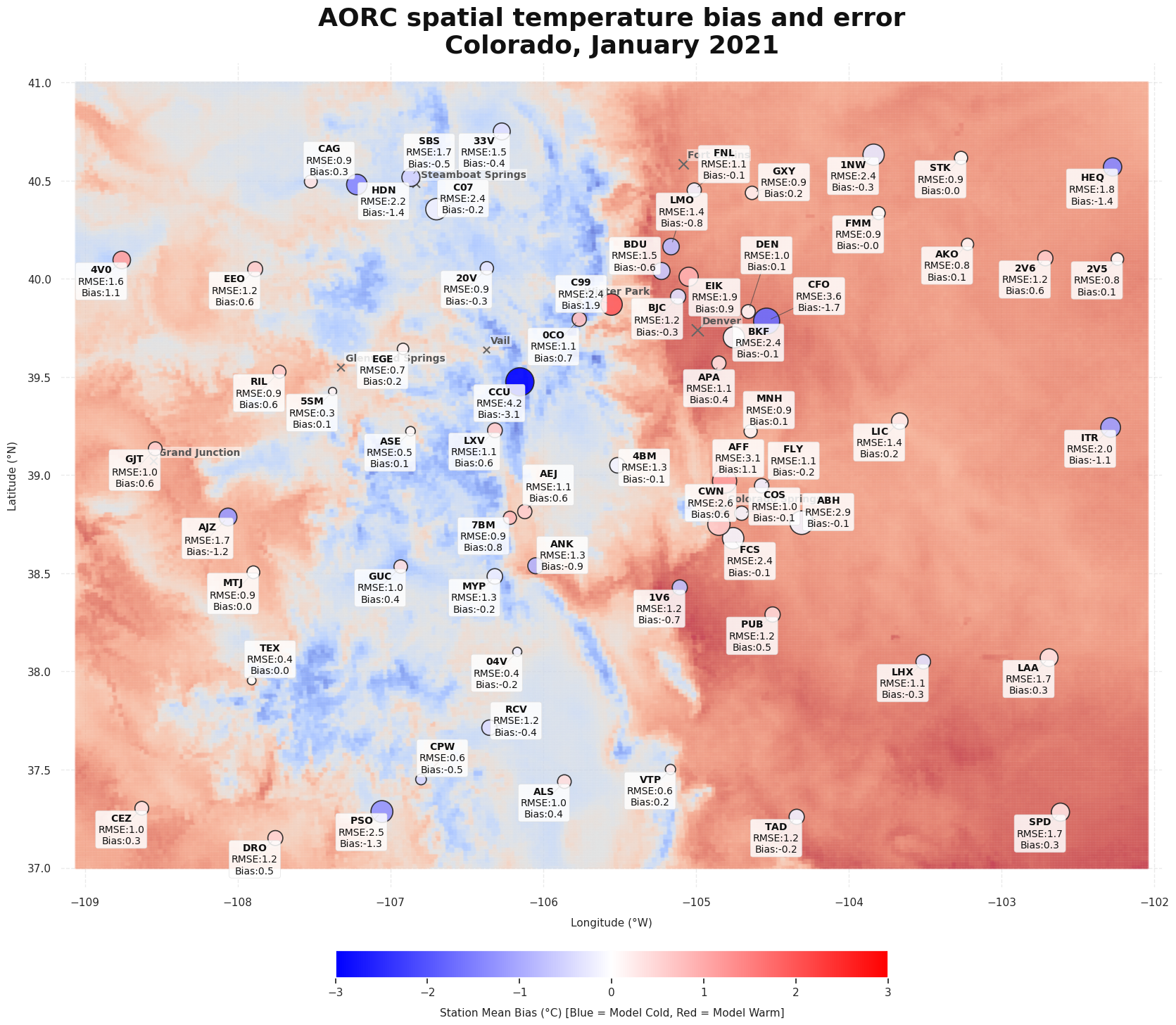
This map shows the average modeled temperature for CO for Jan-Mar 2021, and the station biases and error for each station. The stations are colored based on the AORC bias and sized based on the mean RMSE over the whole time period.
Does bias change with elevation? Lets define some bins and see whether RMSE and bias are very different.
elevation_bins = [0, 1500, 1750, 2250, 3000, 4000]
elevation_labels = [
    f"{elevation_bins[i]}-{elevation_bins[i+1]}m"
    for i in range(len(elevation_bins)-1)
]

df_bands = gdf_stations_validated.copy()

# separate by elevation bands and get mean bias and rmse
df_bands['elevation_band'] = pd.cut(
    df_bands['elevation'],
    bins=elevation_bins,
    labels=elevation_labels,
    include_lowest=True
)
band_metrics = df_bands.groupby('elevation_band', observed=False).agg(
    mean_bias=('mean_bias', 'mean'),
    mean_rmse=('mean_rmse', 'mean'),
    station_count=('station', 'count')
).reset_index()
Source
fig, (ax1, ax2) = plt.subplots(1, 2, figsize=(16, 6), facecolor='white')

# plot
bias_colors = ['#FF4D4D' if b >= 0 else '#4D94FF' for b in band_metrics['mean_bias']]
bars1 = ax1.bar(
    band_metrics['elevation_band'],
    band_metrics['mean_bias'],
    color=bias_colors,
    edgecolor='#333333',
    alpha=0.85
)
ax1.axhline(0, color='black', linestyle='-', linewidth=0.8, alpha=0.7)
ax1.set_title("", fontsize=12, fontweight='bold', pad=12)
ax1.set_ylabel("Mean Bias (°C)", fontsize=11)
# ax1.grid(True, linestyle='--', alpha=0.4, axis='y')


bars2 = ax2.bar(
    band_metrics['elevation_band'],
    band_metrics['mean_rmse'],
    color='#A855F7',
    edgecolor='#333333',
    alpha=0.85
)
ax2.set_title("", fontsize=12, fontweight='bold', pad=12)
ax2.set_ylabel("Mean RMSE (°C)", fontsize=11)

# add data labels
for i, bar in enumerate(bars1):
    val = band_metrics['mean_bias'].iloc[i]
    count = band_metrics['station_count'].iloc[i]
    if not np.isnan(val):
        va_dir = 'bottom' if val >= 0 else 'top'
        offset = 0.005 if val >= 0 else -0.005
        ax1.text(
            bar.get_x() + bar.get_width()/2, val + offset,
            f"{val:+.2f}°C\n(n={count})",
            ha='center', va=va_dir, fontsize=9, fontweight='bold'
        )

for i, bar in enumerate(bars2):
    val = band_metrics['mean_rmse'].iloc[i]
    if not np.isnan(val):
        ax2.text(
            bar.get_x() + bar.get_width()/2, val + 0.005,
            f"{val:.2f}°C",
            ha='center', va='bottom', fontsize=9, fontweight='bold'
        )

for ax in [ax1, ax2]:
    ax.set_facecolor('#FAFAFA')
    ax.set_xlabel("Elevation Terrain Bands (meters)", fontsize=11, labelpad=10)
    ax.tick_params(axis='x', rotation=15)

plt.suptitle(
    "AORC temperature bias and error by elevation",
    fontsize=26, fontweight='bold', y=1.02
)
plt.tight_layout()
plt.show()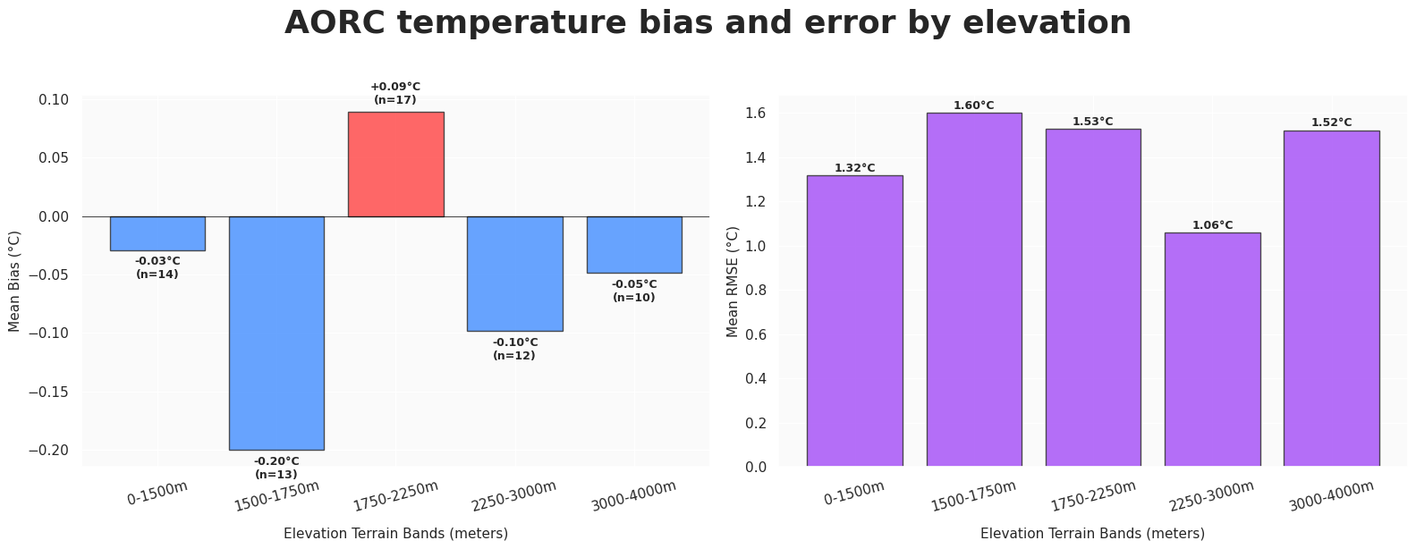
Does model performance change with time of day?
df_diurnal = df_comparison.copy()
time_series = df_diurnal['time'].iloc[:, 0] if df_diurnal['time'].ndim > 1 else df_diurnal['time']
df_diurnal['hour_of_day'] = pd.to_datetime(time_series).dt.hour

diurnal_metrics = df_diurnal.groupby('hour_of_day').agg(
    avg_bias=('temp_bias', 'mean'),
    avg_rmse=('temp_bias', lambda x: np.sqrt(np.mean(x ** 2)))
).reset_index()
Source
fig, (ax1, ax2) = plt.subplots(1, 2, figsize=(16, 6), facecolor='white')

hours = np.arange(24)
hour_labels = [f"{h:02d}:00" for h in hours]

# bias plot
ax1.plot(
    diurnal_metrics['hour_of_day'], diurnal_metrics['avg_bias'],
    color='#EF4444', linewidth=2.5, marker='o', label='Mean Bias'
)
ax1.axhline(0, color='black', linestyle='--', linewidth=1, alpha=0.7)

# shade nighttime
ax1.axvspan(0, 6, color='#E5E7EB', alpha=0.4, zorder=0)#, label='Nighttime')
ax1.axvspan(18, 23, color='#E5E7EB', alpha=0.4, zorder=0)
ax1.set_title("Bias", fontsize=12, fontweight='bold', pad=12)
ax1.set_ylabel("Mean Bias (°C)", fontsize=11)

# RMSE plot
ax2.plot(
    diurnal_metrics['hour_of_day'], diurnal_metrics['avg_rmse'],
    color='#8B5CF6', linewidth=2.5, marker='s', label='Mean RMSE'
)
ax2.axvspan(0, 6, color='#E5E7EB', alpha=0.4, zorder=0)
ax2.axvspan(18, 23, color='#E5E7EB', alpha=0.4, zorder=0)

ax2.set_title("RMSE", fontsize=12, fontweight='bold', pad=12)
ax2.set_ylabel("Mean RMSE (°C)", fontsize=11)

for ax in [ax1, ax2]:
    ax.set_facecolor('#FAFAFA')
    ax.grid(True, linestyle=':', alpha=0.6, color='#CCCCCC')
    ax.set_xlabel("Local Time of Day (24-Hour Clock)", fontsize=11, labelpad=10)
    ax.set_xticks(hours[::2])
    ax.set_xticklabels(hour_labels[::2])
    ax.legend(loc='upper right', frameon=True, facecolor='white', edgecolor='none')

plt.suptitle(
    "AORC temperature bias and error by time-of-day",
    fontsize=26, fontweight='bold', y=1.02
)
plt.tight_layout()
plt.show()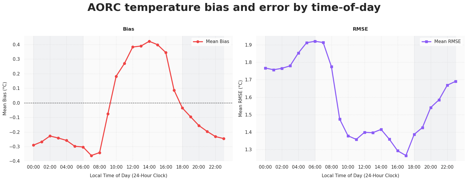
Summary and things to try
There are many other things we might want to look at to evaluate how well the AORC reanalysis data performs against these METAR observations. Hopefully this notebook starts to show you how to harmonize different datasets to compare them (timezones, datatypes, units, etc!).
What’s next?
In the next notebook, we will explore restructuring the METAR dataset into a more optimal analysis-ready, cloud optimized (ARCO) format.