Comparison of Visualization Packages
Overview
There are nearly endless possibilities when it comes to data visualization in Python. Some of these choices can be overwhelming. This chapter aims to lay out and distinguish between different Python visualization libraries so that you are better equipped to make the right choice for your data visualization needs. This cookbook is not a comprehensive tutorial on these packages, but we can offer enough information and resources to help get you started.
Matplotlib
Cartopy
GeoCAT-viz
MetPy
VAPOR
Info
The plotting libraries mentioned here are either ones used extensively by the authors of this Cookbook OR ones that we get asked about a lot when giving data visualization tutorials. This does not cover every library that can be used for plotting in Python, but should cover the more popular packages you might come across.
Missing a plotting library that you use and want others to know more about? Let us know by opening a GitHub Issue.
Prerequisites
Concepts |
Importance |
Notes |
|---|---|---|
Necessary |
||
Necessary |
Time to learn: 10 minutes
Matplotlib

Matplotlib is the workhorse of the Python visualization landscape. It is a comprehensive plotting library that has the capacity to make static, animated, or interactive visualizations. It is hard to imagine plotting in Python without first getting comfortable with Matplotlib. Be sure to check out the Matplotlib documentation as well as the Pythia foundations chapter on Matplotlib for guidance.
Matplotlib’s syntax should feel familiar to anyone who has plotted data in Matlab.
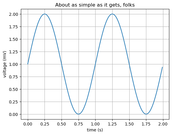
Here is a simple plotting example from Matplotlib:
import matplotlib.pyplot as plt
import numpy as np

# Data for plotting
t = np.arange(0.0, 2.0, 0.01)
s = 1 + np.sin(2 * np.pi * t)

fig, ax = plt.subplots()
ax.plot(t, s)

ax.set(xlabel='time (s)', ylabel='voltage (mV)',
       title='About as simple as it gets, folks')
ax.grid()

plt.show()
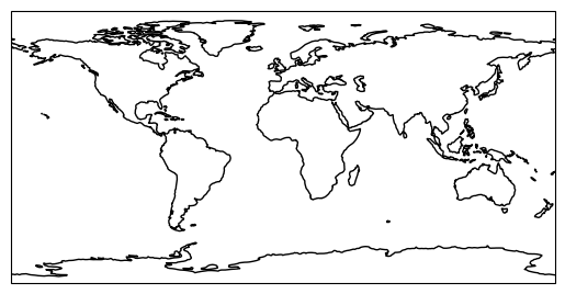
Cartopy
Cartopy is a Python package for plotting data on the globe. It is the go-to package for plotting maps, dealing with different projections, and adding surface features to your plot. Cartopy is buit on top of PROJ, NumPy, Shapely, and Matplotlib. To learn more about what Cartopy can do, check out the Cartopy documentation and the Pythia Foundations Cartopy Chapter.
You may have heard about Basemap, another geoscience plotting library, which was deprecated in favor of Cartopy.
Here is a simple plotting example from Cartopy:
import cartopy.crs as ccrs

ax = plt.axes(projection=ccrs.PlateCarree())
ax.coastlines()

plt.show()
/home/runner/miniconda3/envs/advanced-viz-cookbook/lib/python3.10/site-packages/cartopy/io/__init__.py:241: DownloadWarning: Downloading: https://naturalearth.s3.amazonaws.com/110m_physical/ne_110m_coastline.zip
  warnings.warn(f'Downloading: {url}', DownloadWarning)
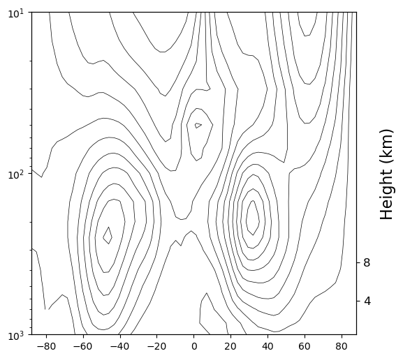
GeoCAT-Viz

The GeoCAT team at the NSF National Center for Atmospheric Research (NSF NCAR) aims to help scientists transitioning from NCL to Python. Out of this team come three different visualization aids: the GeoCAT-examples visualization gallery which contains tons of different plotting examples that you can use as a starting place for your figures, GeoCAT-applications which is designed to be a quick reference guide demonstrating capabilities within the scientific Python ecosystem, and the GeoCAT-viz package (documentation) which contains many convenience functions that formerly existed in NCL and/or for making Python plots look publication-ready.
Here is a simple example of a GeoCAT-viz convenience function:
import xarray as xr
import matplotlib.pyplot as plt
import numpy as np
import geocat.datafiles as gdf
import geocat.viz as gv

# Open a netCDF data file using xarray default engine and load the data into xarrays
ds = xr.open_dataset(gdf.get("netcdf_files/mxclim.nc"))
U = ds.U[0, :, :]

# Generate figure (set its size (width, height) in inches) and axes
plt.figure(figsize=(6, 6))
ax = plt.axes()

# Set y-axis to have log-scale
plt.yscale('log')

# Specify which contours should be drawn
levels = np.linspace(-55, 55, 23)

# Plot contour lines
lines = U.plot.contour(ax=ax,
                       levels=levels,
                       colors='black',
                       linewidths=0.5,
                       linestyles='solid',
                       add_labels=False)

# Invert y-axis
ax.invert_yaxis()

# Create second y-axis to show geo-potential height.
axRHS = gv.add_height_from_pressure_axis(ax, heights=[4, 8])

plt.show();
Downloading file 'registry.txt' from 'https://github.com/NCAR/GeoCAT-datafiles/raw/main/registry.txt' to '/home/runner/.cache/geocat'.
Downloading file 'netcdf_files/mxclim.nc' from 'https://github.com/NCAR/GeoCAT-datafiles/raw/main/netcdf_files/mxclim.nc' to '/home/runner/.cache/geocat'.
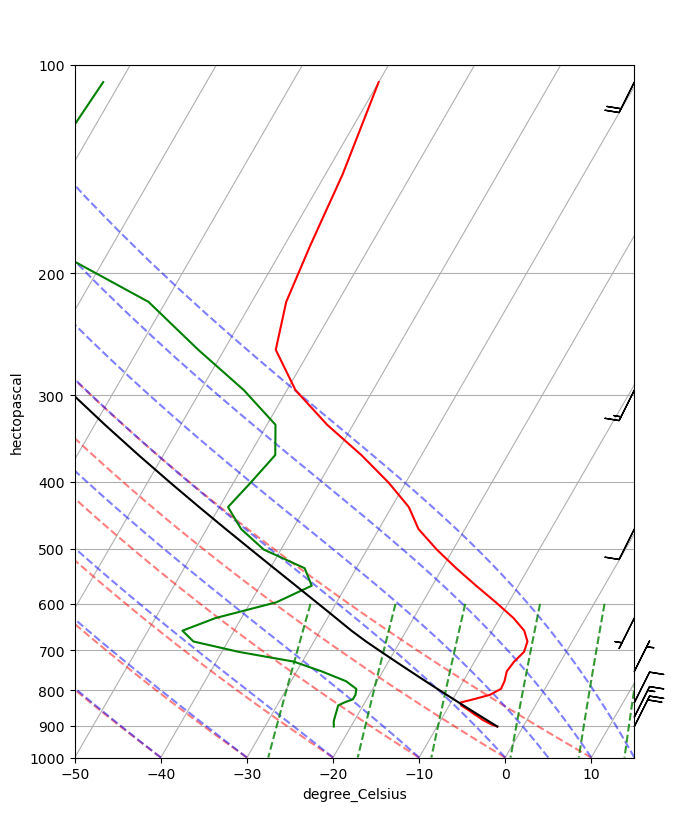
MetPy
MetPy is a collection of tools for data I/O, analysis, and visualization with weather data. MetPy offers some useful functionality for unique plots such as Skew-T diagrams, as well as declaritive plotting functionality. Check out the MetPy documentation.
Here is a simple Skew-T plot from their Getting Started documentation:
import metpy.calc as mpcalc
from metpy.plots import SkewT
from metpy.units import units

fig = plt.figure(figsize=(9, 9))
skew = SkewT(fig)

# Create arrays of pressure, temperature, dewpoint, and wind components
p = [902, 897, 893, 889, 883, 874, 866, 857, 849, 841, 833, 824, 812, 796, 776, 751,
     727, 704, 680, 656, 629, 597, 565, 533, 501, 468, 435, 401, 366, 331, 295, 258,
     220, 182, 144, 106] * units.hPa
t = [-3, -3.7, -4.1, -4.5, -5.1, -5.8, -6.5, -7.2, -7.9, -8.6, -8.9, -7.6, -6, -5.1,
     -5.2, -5.6, -5.4, -4.9, -5.2, -6.3, -8.4, -11.5, -14.9, -18.4, -21.9, -25.4,
     -28, -32, -37, -43, -49, -54, -56, -57, -58, -60] * units.degC
td = [-22, -22.1, -22.2, -22.3, -22.4, -22.5, -22.6, -22.7, -22.8, -22.9, -22.4,
      -21.6, -21.6, -21.9, -23.6, -27.1, -31, -38, -44, -46, -43, -37, -34, -36,
      -42, -46, -49, -48, -47, -49, -55, -63, -72, -88, -93, -92] * units.degC

# Calculate parcel profile
prof = mpcalc.parcel_profile(p, t[0], td[0]).to('degC')
u = np.linspace(-10, 10, len(p)) * units.knots
v = np.linspace(-20, 20, len(p)) * units.knots

skew.plot(p, t, 'r')
skew.plot(p, td, 'g')
skew.plot(p, prof, 'k')  # Plot parcel profile
skew.plot_barbs(p[::5], u[::5], v[::5])

skew.ax.set_xlim(-50, 15)
skew.ax.set_ylim(1000, 100)

# Add the relevant special lines
skew.plot_dry_adiabats()
skew.plot_moist_adiabats()
skew.plot_mixing_lines()

plt.show();
VAPOR
VAPOR stands for the Visualization and Analysis Platform for Ocean, Atmosphere, and Solar Researchers and is another project from NCAR. VAPOR provides an interactive 3D visualization environment. Traditionally users interacted through a graphical user interface (GUI), but it now has a Python API as well. Learn more at the VAPOR documentation. Note that VAPOR requires a GPU-enabled environment to run.
Info
For more VAPOR content, be sure to check out the VAPOR Pythia Cookbook.
Interactive visualization libraries such as Plotly, Seaborn, Bokeh, and hvPlot will be explored in a separate interactive plotting cookbook.
Summary
Each Python plotting library offers a slightly different niche in the data visualization world. Some are better for creating publication figures (matplotlib, cartopy, metpy, geocat-viz, uxarray) while others offer interactive functionality that is great for websites, demonstrations, and other forms of engagement (holoviews, seaborn, plotly, bokeh, and vapor). Hopefully the mini examples on this page allow you to play around and see which user interfaces you like best for your visualization needs.
What’s next?
Next up let’s discuss elements of good data visualization.