Taylor Diagrams
Overview
Taylor diagrams are a visual way of representing a statistical summary of how at least two datasets compare, where all plotted datasets are statistically compared to the same reference dataset (typically climate observations). Taylor diagrams are radial plots, with distance from the origin determined by a normalized standard deviation of your dataset (normalized by dividing it by the standard deviation of the reference or observational dataset) and the angle determined by the correlation coefficient between your dataset and the reference.
Taylor diagrams are popular for displaying climatological data because the normalization of variances helps account for the widely varying numerical values of geoscientific variables such as temperature or precipitation.
This notebook explores how to create and customize Taylor diagrams using geocat-viz. See the more information on geocat-viz.TaylorDiagram.
Creating a Simple Taylor Diagram
Necessary Statistical Analysis
Plotting Different Ensemble Members
Plotting Multiple Models
Plotting Multiple Variables
Plotting Bias
Variants
Prerequisites
Concepts |
Importance |
Notes |
|---|---|---|
Necessary |
Time to learn: 10 minutes
import matplotlib.pyplot as plt
import numpy as np
import pandas as pd
import xarray as xr

import cftime

import geocat.viz as gv
import geocat.datafiles as gdf
Creating a Simple Taylor Diagram
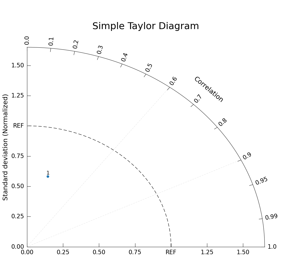
Before getting into the data computation necessary to create a Taylor diagram, let’s demonstrate how to make the simplest Taylor diagram plot. Here we are using sample data with a normalized standard deviation of 0.6 and a correlation coefficient of 0.24.
# Create figure and Taylor Diagram instance
fig = plt.figure(figsize=(12, 12))
taylor = gv.TaylorDiagram(fig=fig, label='REF')

# Draw diagonal dashed lines from origin to correlation values
# Also enforces proper X-Y ratio
taylor.add_xgrid(np.array([0.6, 0.9]))

# Add a model dataset of one point
taylor.add_model_set(stddev=[.6], corrcoef=[.24]);

plt.title("Simple Taylor Diagram", size=26, pad=45); # Need to move title up
Necessary Statistical Analysis
To make understanding a Taylor Diagram more meaningful or intuitive, let’s use some real data. Here we are going to use ERA5 reanalysis data as our observational dataset. CMIP5 temperature data from various representative concentration pathways (RCPs) and ensemble members as our model data.
Because these dataset can be so large, some data pre-processing has been done already to the datasets used in this example.
ERA5 and CMIP5 data have been spatially averaged (removing latitudinal and longitudinal dimensions)
ERA5 and CMIP5 data have been indexed to only include the year 2022
All ensembles from a given CMIP5 RCP model have been combined into one dataset.
Temperature and pressure variables from ERA5 have been combined into one dataset.
Preparing the Reference (Observed) Dataset
Let’s use geocat.datafiles to open up our ERA5 reanalysis data.
This dataset has two variables:
2T_GDSO_SFCwhich refers to the air temperature 2 meters above the surface, andSP_GDSO_SFCwhich is surface pressure.
For this dataset, we still need to resample our data to monthly to match the monthly CMIP5 data.
Notice that our time coordinate is in datetime64, we will have to manipulate either ERA5 or CMIP5 data to use the same time formatting system.
era5 = xr.open_dataset(gdf.get('netcdf_files/era5_2022_2mtemp_spres_xyav.nc'))
era5
Downloading file 'netcdf_files/era5_2022_2mtemp_spres_xyav.nc' from 'https://github.com/NCAR/GeoCAT-datafiles/raw/main/netcdf_files/era5_2022_2mtemp_spres_xyav.nc' to '/home/runner/.cache/geocat'.
<xarray.Dataset> Size: 129kB
Dimensions:              (initial_time0_hours: 8040)
Coordinates:
  * initial_time0_hours  (initial_time0_hours) datetime64[ns] 64kB 2022-01-01...
Data variables:
    2T_GDS0_SFC          (initial_time0_hours) float32 32kB ...
SP_GDS0_SFC (initial_time0_hours) float32 32kB ...# Change hourly data to monthly
era5 = era5.rename({'initial_time0_hours': 'time'}) # Changing dimension name for convenience
era5_resampled = era5.resample(time='MS').mean()
offset = pd.tseries.frequencies.to_offset('15D') # use offsest to adjust to the center of each month as in CMIP5 data
era5_resampled['time'] = era5_resampled.get_index('time') + offset
era5_resampled
<xarray.Dataset> Size: 192B
Dimensions:      (time: 12)
Coordinates:
  * time         (time) datetime64[ns] 96B 2022-01-16 2022-02-16 ... 2022-12-16
Data variables:
    2T_GDS0_SFC  (time) float32 48B 277.2 277.0 277.1 nan ... 279.2 277.7 277.7
SP_GDS0_SFC (time) float32 48B 9.666e+04 9.664e+04 ... 9.655e+04 9.67e+04era5_temp = era5_resampled['2T_GDS0_SFC'] # Because this variable name starts with a number `era5_resampled.2T_GDS0_SFC` would give an error s
# Take a look at our final temperature data
era5_temp
<xarray.DataArray '2T_GDS0_SFC' (time: 12)> Size: 48B
array([277.24756, 277.00116, 277.1267 ,       nan, 279.67548, 281.2928 ,
       281.5387 , 281.20755, 280.13947, 279.15546, 277.7269 , 277.6502 ],
      dtype=float32)
Coordinates:
* time (time) datetime64[ns] 96B 2022-01-16 2022-02-16 ... 2022-12-16
Attributes:
long_name: 2 meter Temperature
units: KPreparing the model datasets
Here our CMIP5 data is originally sourced from the Earth System Grid Federation. Let’s first look at our RCP8.5 model, typically referred to as “business as usual” because it is expected to be the mostly likely outcome without improving greenhouse gas mitigation efforts.
To compare this data with the ERA5 data we need to convert our data to datetime64.
tas_rcp85 = xr.open_dataset(gdf.get('netcdf_files/tas_Amon_CanESM2_rcp85_2022_xyav.nc'))

tas_rcp85
Downloading file 'netcdf_files/tas_Amon_CanESM2_rcp85_2022_xyav.nc' from 'https://github.com/NCAR/GeoCAT-datafiles/raw/main/netcdf_files/tas_Amon_CanESM2_rcp85_2022_xyav.nc' to '/home/runner/.cache/geocat'.
<xarray.Dataset> Size: 344B
Dimensions:  (time: 12)
Coordinates:
  * time     (time) object 96B 2022-01-16 12:00:00 ... 2022-12-16 12:00:00
    height   float64 8B ...
Data variables:
    r1i1p1   (time) float32 48B ...
    r2i1p1   (time) float32 48B ...
    r3i1p1   (time) float32 48B ...
    r4i1p1   (time) float32 48B ...
    r5i1p1   (time) float32 48B ...
Attributes:
    standard_name:     air_temperature
    long_name:         Near-Surface Air Temperature
    units:             K
    original_name:     ST
    cell_methods:      time: mean (interval: 15 minutes)
    cell_measures:     area: areacella
    history:           2011-03-10T05:13:26Z altered by CMOR: Treated scalar d...
    associated_files:  baseURL: http://cmip-pcmdi.llnl.gov/CMIP5/dataLocation...
rcp: rcp85tas_rcp85['time'] = tas_rcp85.indexes['time'].to_datetimeindex()
tas_rcp85
/tmp/ipykernel_2478/3930724370.py:1: RuntimeWarning: Converting a CFTimeIndex with dates from a non-standard calendar, 'noleap', to a pandas.DatetimeIndex, which uses dates from the standard calendar.  This may lead to subtle errors in operations that depend on the length of time between dates.
  tas_rcp85['time'] = tas_rcp85.indexes['time'].to_datetimeindex()
<xarray.Dataset> Size: 344B
Dimensions:  (time: 12)
Coordinates:
  * time     (time) datetime64[ns] 96B 2022-01-16T12:00:00 ... 2022-12-16T12:...
    height   float64 8B ...
Data variables:
    r1i1p1   (time) float32 48B ...
    r2i1p1   (time) float32 48B ...
    r3i1p1   (time) float32 48B ...
    r4i1p1   (time) float32 48B ...
    r5i1p1   (time) float32 48B ...
Attributes:
    standard_name:     air_temperature
    long_name:         Near-Surface Air Temperature
    units:             K
    original_name:     ST
    cell_methods:      time: mean (interval: 15 minutes)
    cell_measures:     area: areacella
    history:           2011-03-10T05:13:26Z altered by CMOR: Treated scalar d...
    associated_files:  baseURL: http://cmip-pcmdi.llnl.gov/CMIP5/dataLocation...
rcp: rcp85Perform the statistical calculations
We need to compute the standard deviation for both our ERA5 observed temperature data and our CMIP5 RCP8.5 modeled temperature.
Find the correlation coefficient between them.
Then, divide the model standard deviation by the observed standard deviation to normalize it around the value 1.
In the next cell we will perform this calculation for all ensemble members.
temp_rcp85_std = []
temp_rcp85_corr = []

std_temp_obsv = float(era5_temp.std().values)

for em in list(tas_rcp85.data_vars): # for each ensemble member
    std = float(tas_rcp85[em].std().values)
    std_norm = std / std_temp_obsv

    corr= float(xr.corr(era5_temp, tas_rcp85[em]).values)

    temp_rcp85_std.append(std_norm)
    temp_rcp85_corr.append(corr)
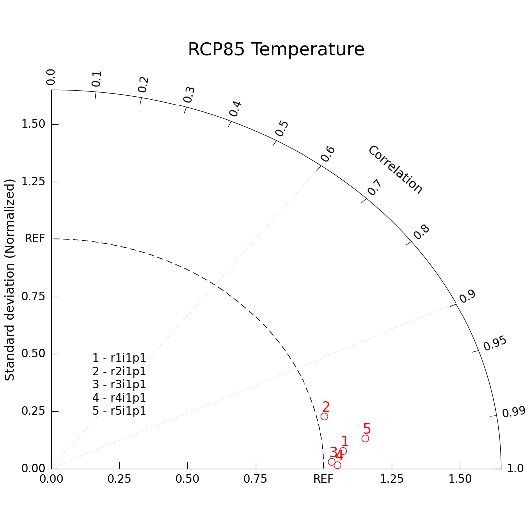
Plotting Different Ensemble Members
One application of a Taylor Diagram application is to plot the same variable from different ensembles of the same climate model.
This Taylor diagram differs from our simple example in that we’ve specified more keyword arguments in our taylor.add_model_set() call, specifying how we want our dots to be drawn. We’ve also added a legend of ensemble members with taylor.add_model_name().
# Create figure and Taylor Diagram instance
fig = plt.figure(figsize=(12, 12))
taylor = gv.TaylorDiagram(fig=fig, label='REF')
ax = plt.gca()

# Draw diagonal dashed lines from origin to correlation values
# Also enforces proper X-Y ratio
taylor.add_xgrid(np.array([0.6, 0.9]))

# Add model sets for p and t datasets
taylor.add_model_set(
    temp_rcp85_std,
    temp_rcp85_corr,
    fontsize=20,  # specify font size
    xytext=(-5, 10),  # marker label location, in pixels
    color='red', # specify marker color
    marker='o', # specify marker shape
    facecolors='none', # specify marker fill
    s=100)  # marker size

# Add legend of ensemble names
namearr = list(tas_rcp85.data_vars)
taylor.add_model_name(namearr, fontsize=16)

# Add figure title
plt.title("RCP85 Temperature", size=26, pad=45);
Plotting Multiple Models
Another potential use case for a Taylor diagram is to plot multiple models. Here we compare RCP2.6, RCP4.5, and RCP8.5 together.
Because it isn’t meaningful to compare ensemble members across model runs (the nature of the perturbations isn’t reliably similar across RCPs or labs), we will look at the first ensemble r1i1p1 for all models. For your analysis, you might find it more meaningful to average across ensemble members, but we’ll keep it simple for this plotting example.
Of course, you could still chose to display more information on one graph, but there is no real conection between the first ensemble of one model versus another.
In this final example, we’ll add another layer of complexity to our Taylor Diagram plot with contour lines of constant root mean squared error (RMSE).
# Open RCP26 and RCP45 files
tas_rcp26 = xr.open_dataset(gdf.get('netcdf_files/tas_Amon_CanESM2_rcp26_2022_xyav.nc'))
tas_rcp26['time'] = tas_rcp26.indexes['time'].to_datetimeindex()

tas_rcp45 = xr.open_dataset(gdf.get('netcdf_files/tas_Amon_CanESM2_rcp45_2022_xyav.nc'))
tas_rcp45['time'] = tas_rcp45.indexes['time'].to_datetimeindex()
Downloading file 'netcdf_files/tas_Amon_CanESM2_rcp26_2022_xyav.nc' from 'https://github.com/NCAR/GeoCAT-datafiles/raw/main/netcdf_files/tas_Amon_CanESM2_rcp26_2022_xyav.nc' to '/home/runner/.cache/geocat'.
/tmp/ipykernel_2478/3755510889.py:3: RuntimeWarning: Converting a CFTimeIndex with dates from a non-standard calendar, 'noleap', to a pandas.DatetimeIndex, which uses dates from the standard calendar.  This may lead to subtle errors in operations that depend on the length of time between dates.
  tas_rcp26['time'] = tas_rcp26.indexes['time'].to_datetimeindex()
Downloading file 'netcdf_files/tas_Amon_CanESM2_rcp45_2022_xyav.nc' from 'https://github.com/NCAR/GeoCAT-datafiles/raw/main/netcdf_files/tas_Amon_CanESM2_rcp45_2022_xyav.nc' to '/home/runner/.cache/geocat'.
/tmp/ipykernel_2478/3755510889.py:6: RuntimeWarning: Converting a CFTimeIndex with dates from a non-standard calendar, 'noleap', to a pandas.DatetimeIndex, which uses dates from the standard calendar.  This may lead to subtle errors in operations that depend on the length of time between dates.
  tas_rcp45['time'] = tas_rcp45.indexes['time'].to_datetimeindex()
# Perform statistical analysis to create our standard deviation and correlation coefficient lists
temp_rcp26_std = float(tas_rcp26['r1i1p1'].std().values)
temp_rcp26_std_norm = temp_rcp26_std / std_temp_obsv
temp_rcp26_corr = float(xr.corr(era5_temp, tas_rcp26['r1i1p1']).values)

temp_rcp45_std = float(tas_rcp45['r1i1p1'].std().values)
temp_rcp45_std_norm = temp_rcp45_std / std_temp_obsv
temp_rcp45_corr = float(xr.corr(era5_temp, tas_rcp45['r1i1p1']).values)

temp_std = [temp_rcp26_std_norm, temp_rcp45_std_norm, temp_rcp85_std[0]]
temp_corr = [temp_rcp26_corr, temp_rcp45_corr, temp_rcp85_corr[0]]
# Create figure and Taylor Diagram instance
fig = plt.figure(figsize=(12, 12))
taylor = gv.TaylorDiagram(fig=fig, label='REF')
ax = plt.gca()

# Draw diagonal dashed lines from origin to correlation values
# Also enforces proper X-Y ratio
taylor.add_xgrid(np.array([0.6, 0.9]))

# Add model set for temp dataset
taylor.add_model_set(
    temp_std,
    temp_corr,
    fontsize=20,
    xytext=(-5, 10),  # marker label location, in pixels
    color='red',
    marker='o',
    facecolors='none',
    s=100)  # marker size

#gv.util.set_axes_limits_and_ticks(ax, xlim=[0,2])

namearr = ['rcp26', 'rcp45', 'rcp85']
taylor.add_model_name(namearr, fontsize=16)

# Add figure title
plt.title("CMIP5 Temperature - First Ensemble Member", size=26, pad=45)

# Add constant centered RMS difference contours.
taylor.add_contours(levels=np.arange(0, 1.1, 0.25),
                 colors='lightgrey',
                 linewidths=0.5);
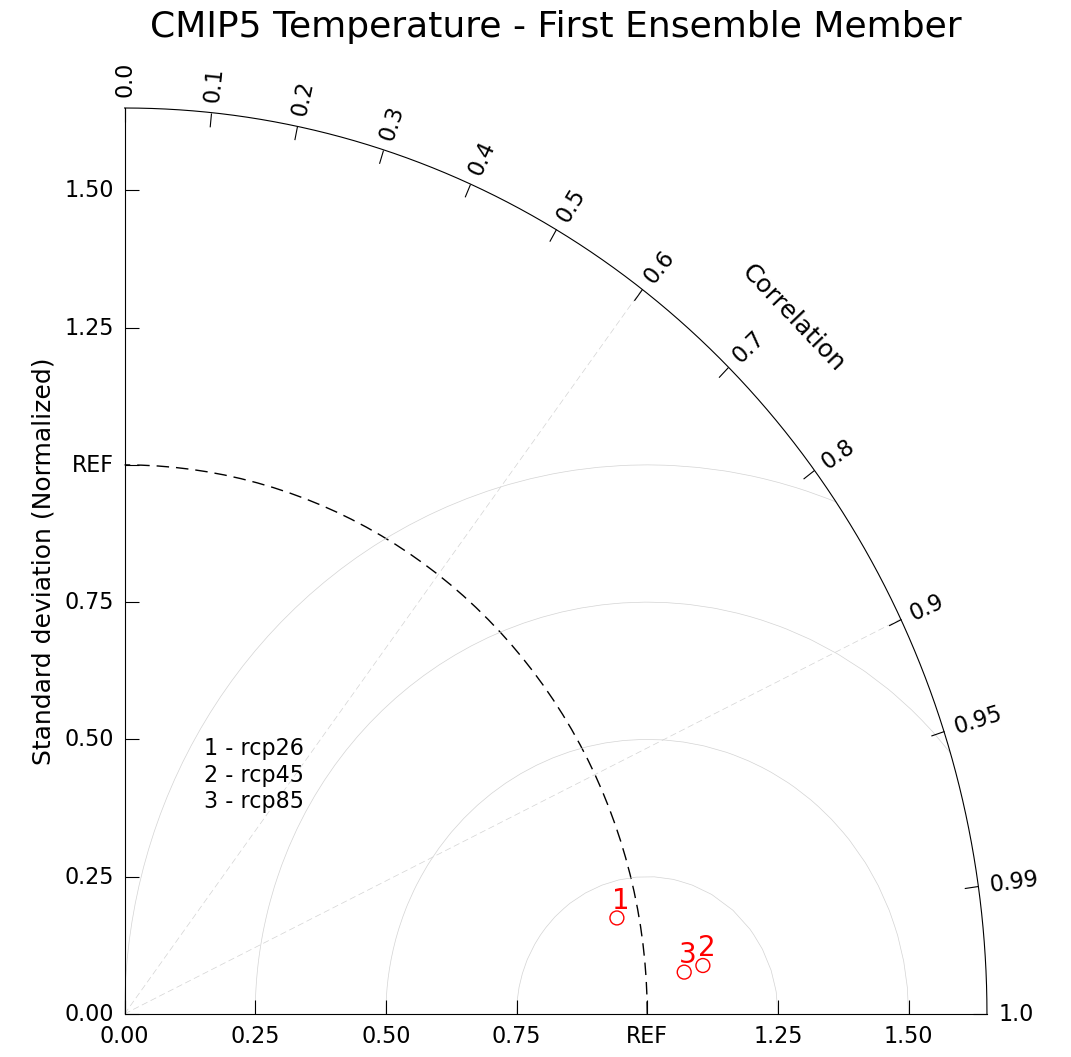
Based on these three RCPs it looks like RCP8.5 has the closest correlation to our observed climate behavior, but RCP2.6 has a closer standard deviation to what we experience. Based on your selected data, scientific interpretations may vary.
Plotting Multiple Variables
A Taylor Diagram can support multiple model sets, you simply need to call taylor.add_model_set() multiple times. By adding the label kwarg and calling taylor.add_legend() you can add a label distinguishing between the two sets.
Since we’ve already demonstrated the statistical analysis necessary to perform Taylor Diagrams, the following example will be using sample data.
Here we make sample data for 7 common climate model variables, for two different models.
# Create sample data

# Model A
a_sdev = [1.230, 0.988, 1.092, 1.172, 1.064, 0.966, 1.079]  # normalized standard deviation
a_ccorr = [0.958, 0.973, 0.740, 0.743, 0.922, 0.982, 0.952]  # correlation coefficient

# Model B
b_sdev = [1.129, 0.996, 1.016, 1.134, 1.023, 0.962, 1.048]  # normalized standard deviation
b_ccorr = [0.963, 0.975, 0.801, 0.814, 0.946, 0.984, 0.968]  # correlation coefficient

# Sample Variable List
var_list = ['Surface Pressure', '2m Temp', 'Dew Point Temp', 'U Wind', 'V Wind', 'Precip', 'Cloud Cov']
# Create figure and TaylorDiagram instance
fig = plt.figure(figsize=(10, 10))
taylor = gv.TaylorDiagram(fig=fig, label='REF')

# Draw diagonal dashed lines from origin to correlation values
# Also enforces proper X-Y ratio
taylor.add_xgrid(np.array([0.6, 0.9]))

# Add models to Taylor diagram
taylor.add_model_set(a_sdev,
                  a_ccorr,
                  color='red',
                  marker='o',
                  label='Model A', # add model set legend label
                  fontsize=16)

taylor.add_model_set(b_sdev,
                  b_ccorr,
                  color='blue',
                  marker='o',
                  label='Model B',
                  fontsize=16)

# Add model name
taylor.add_model_name(var_list, fontsize=16)

# Add figure legend
taylor.add_legend(fontsize=16)

# Add constant centered RMS difference contours.
taylor.add_contours(levels=np.arange(0, 1.1, 0.25),
                 colors='lightgrey',
                 linewidths=0.5);
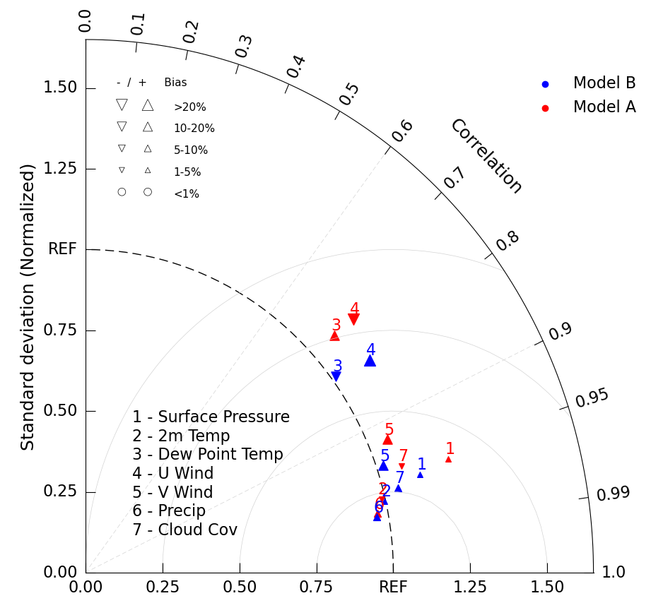
Plotting Bias
We can add another layer of information to the Taylor Diagram by changing the marker size and shape depending on a third variable. Most commonly this is done to demonstrate bias, a statistical definition of the difference between the observed and estimated values.
We do this by adding a bias_array kwarg to the add_model_set() method. Doing so necessitates removing the marker specification, since they are overriden with up or down arrows of varrying sizes. Bias values are in percentages.
Indicate the meaning of these new bias symbols with a third legend with the call add_bias_legend().
# Sample corresponding bias data.

# Case A
a_bias = [2.7, -1.5, 17.31, -20.11, 12.5, 8.341, -4.7]  # bias (%)

# Case B
b_bias = [1.7, 2.5, -17.31, 20.11, 19.5, 7.341, 9.2]
# Create figure and TaylorDiagram instance
fig = plt.figure(figsize=(10, 10))
taylor = gv.TaylorDiagram(fig=fig, label='REF')

# Draw diagonal dashed lines from origin to correlation values
# Also enforces proper X-Y ratio
taylor.add_xgrid(np.array([0.6, 0.9]))

# Add models to Taylor diagram
taylor.add_model_set(a_sdev,
                  a_ccorr,
                  percent_bias_on=True, # indicate marker and size to be plotted based on bias_array
                  bias_array=a_bias, # specify bias array
                  color='red',
                  label='Model A',
                  fontsize=16)

taylor.add_model_set(b_sdev,
                  b_ccorr,
                  percent_bias_on=True,
                  bias_array=b_bias,
                  color='blue',
                  label='Model B',
                  fontsize=16)

# Add model name
taylor.add_model_name(var_list, fontsize=16)

# Add figure legend
taylor.add_legend(fontsize=16)

# Add bias legend
taylor.add_bias_legend()

# Add constant centered RMS difference contours.
taylor.add_contours(levels=np.arange(0, 1.1, 0.25),
                 colors='lightgrey',
                 linewidths=0.5);
Variants
Taylor Diagram’s can be altered in the following variations (not all of which are supported yet by GeoCAT-viz, please consider this feature request form). Coming soon:
Supporting display of negative correlations by extending the diagram into a second quandrant to the left.
Supporting automatic notations connecting related points, say the same variable in two different models to see how it moves towards truth.
Summary
Taylor Diagrams allow you to display and compare statistical information about several models, variables, ensembles, or other dataset categorizations on a single plot. They are commonly used in climate analysis. With these tools under your belt, you’re ready to include stronger data visualizations in your research.
What’s next?
Let’s look at the meteorology specialty plots Skew T Diagrams.
Resources and references
Karl E. Taylor - “Summarizing multiple aspects of model performance in a single diagram”, AGU 2001