Animation
Overview
Animations can be a useful and effective tool to visualize data, especially when that data changes over time. In this notebook, we will explore how to create animations using the matplotlib library.
We will cover the two methods for creating animations in matplotlib, how to set up the elements of both types of animation, how to show the animation in jupyter notebooks, and how to save the animation to a file.
Animation fundamentals with
matplotlibArtist Animation
Function Animation
Prerequisites
Concepts |
Importance |
Notes |
|---|---|---|
Necessary |
||
Useful |
Not necessary for animations in general, but useful for the examples in this notebook |
Time to learn: 10 minutes
import cartopy.crs as ccrs
import matplotlib.animation as animation
import xarray as xr
from matplotlib import pyplot as plt
import os
from PIL import Image
import geocat.datafiles as gdf
Animation fundamentals with matplotlib
There are two different methods of creating animations with matplotlib:
Artist animations pulls from a list of pre-made artists to draw in each frame to produce an animation
Function animation iteratively modifies data on a pre-existing figure to produce an animation
Generally, function animation is easier to use, but artist animation can be more flexible for certain applications. We’ll cover both methods in this notebook.
Animating within jupyter notebooks
Before we get into either type of animation, we’re going to alter matplotlib’s runtime configuration settings (or rcParams) to allow us to use matplotlib’s animation functions within jupyter notebooks. This next cell is not necessary if you want to create animations in a script or just want to save the animation to a file.
Here, we’re changing default animation html output setting to "jshtml", which creates a JavaScript animation that can be displayed in a jupyter notebook. The default setting is "none".
plt.rcParams["animation.html"] = "jshtml"
Artist Animation
Artist animation uses pre-made artists to cycle through to produce an animation.
In this example, we’re going to plot images using matplotlib’s imshow function and save the resulting artist object to a list. Then, we’ll use the ArtistAnimation function to create an animation from that list of artists.
Data
Before we get into those steps, let’s get some images to animate. First, we’ll be looking at some GeoColor satellite imagery from GOES-16.
In this repository, there is a script, notebooks/scripts/goes_getter.py, that will download hourly images from the last 24 hours from the GOES-16 archive if you’d like to play around with this yourself. We have already downloaded some images for this example in the notebooks/data/goes16_hr/ directory and will be using those for this part of the notebook.
Get the images into a list
First, we need to ge the images from the directory into a list. We know the only files in this directory are the images we want to plot, so let’s get get a list of all the files ending in .jpg from that path using os.listdir().
We’ll also sort them using the built in sorted function to make sure that our list of images ends up in chronological order.
im_dir = "./data/goes16_hr/"
im_paths = sorted([p for p in os.listdir(im_dir) if p.endswith(".jpg")])
Creating the figure
Now, we need to set up the figure we’ll be plotting our animation on.
Note
Running the next cell will produce a blank figure in the jupyter notebook. This is expected since we’ve only created a blank figure to plot on, but haven’t actually plotted anything yet.
dpi = 100
figsize = tuple(t / dpi for t in Image.open(im_dir + im_paths[0]).size)
fig = plt.figure(figsize=figsize, dpi=dpi)
ax = fig.add_axes([0, 0, 1, 1]) # span the whole figure
ax.set_axis_off()

First, we set out dpi to be 100. This is technically not necessary at this point in creating the animation, but we’re going to use it to set the size of the figure. Since we’re plotting images, we want to make sure that the figure size is the same size as the images we’re plotting.
Next, we’re going to figure out what our figsize should be based on the dpi and the size of the images we’re about to plot. tuple(t / dpi for t in Image.open(im_dir + im_paths[0]).size) divides each dimension of the size of the image by the intended dpi and then returns the result as a tuple. We then use that tuple to create our figsize.
Next, we create the figure using plt.figure() and the figsize and dpi we just calculated.
Then, we create the axes object using fig.add_axes([0, 0, 1, 1]). This adds axes to our figure that span the entire range of the figure, allowing the images plot on these axes to take up the entire figure space.
Finally, we turn off the axes using ax.axis("off"). This is because we don’t want to see axes on our final image plot.
Tip
Customizing the figure size, dpi, and axes is not necessary for creating an artist animation, but it will make our end result look nicer.
Creating a list of artists
Now that we have a list of the filepaths for all the images we want to plot and axes to plot them on, we can use imshow to plot each image and save the resulting artist object to a list.
ims = [[ax.imshow(Image.open(im_dir + im_path), animated=True)] for im_path in im_paths]
A couple of things to note here:
You may notice that we’re using list generation to create our final list,
ims. But what might not be obvious is that we’re actually making a list of lists. Each createdimplotobject is put into its own one-item list, and then all of those lists are used to createims. This is becauseArtistAnimationexpects a list of lists, where each inner list is a list of artists to be plotted in a single frame.We’re using a kwarg you may not have seen before using
imshow:animated=True. This allows the artist to only be drawn when called as part of an animation. This is a kwarg that is common to all artist objects.
Creating the artist animation
Now that we’ve set up our figure and list (of lists) of artists, we can create the animation using ArtistAnimation.
ani = animation.ArtistAnimation(fig, ims, interval=150, repeat_delay=1000)
ArtistAnimation takes two required arguments:
the figure to plot on (
figin our case) andthe list of pre-created artist objects (
ims) to plot.
We’ve also provided a few optional arguments:
interval: The time between frames in milliseconds. We’ve set this to 150 milliseconds, or 0.15 seconds.repeat_delay: The time in milliseconds to wait before repeating the animation. We’ve set this to 1000 milliseconds, or 1 second.
And that’s it! We’ve created an animation in matplotlib using artist animation. Let’s take a look at it.
ani
Saving the animation
If displaying your animation in a jupyter notebook was your end goal, then you’re done! But if you want to save your animation to a file for later use, you can use the save method of the ArtistAnimation object.
ani.save("goes16_hr.gif")
MovieWriter ffmpeg unavailable; using Pillow instead.
Function animation
The steps for function animation in matplotlib are:
Set up all the artists that will be used in the animation and the initial frame of the animation
Create a function that updates the data in the plot to create each frame of the animation
Create a
FuncAnimationobject with the the previously created elementsDisplay and save the animation
Data
For this example, we’re going to be looking at sample surface temperature data from our sample data repository, geocat-datafiles.
ds = xr.open_dataset(gdf.get("netcdf_files/meccatemp.cdf"))
t = ds.t
Downloading file 'netcdf_files/meccatemp.cdf' from 'https://github.com/NCAR/GeoCAT-datafiles/raw/main/netcdf_files/meccatemp.cdf' to '/home/runner/.cache/geocat'.
Creating the figure
The first step in creating a function animation is to create the figure that will be used to plot the animation.
Since we’re working with data represented by latitude and longitude coordinates, we’re going to set up our figure and axes using cartopy.
# Set up Axes with Cartopy Projection
fig = plt.figure()
ax = plt.axes(projection=ccrs.PlateCarree())
ax.coastlines()
<cartopy.mpl.feature_artist.FeatureArtist at 0x7f7674b86ef0>
Just like before, we used plt.figure() to create the figure. Then, we used plt.axes with the projection kwarg set to ccrs.PlateCarree() to create the axes object. This sets up the axes to use the Plate Carree projection.
Finally, we used ax.coastlines() to add coastlines to the plot.
Creating the initial frame
Now that we have our figure and axes set up, we can plot the initial frame of our animation.
vmin = t.min().values
vmax = t.max().values
levels = 30
# create initial plot that we will update
t[0, :, :].plot.contourf(
ax=ax,
transform=ccrs.PlateCarree(),
vmin=vmin,
vmax=vmax,
levels=levels,
cmap="inferno",
cbar_kwargs={
"location": "bottom",
},
)
<cartopy.mpl.contour.GeoContourSet at 0x7f7673ea3490>
In addition to plotting the initial frame, we also set up the colorbar. In order for every frame of the animation to use the same colorbar, we need to create the colorbar before we create the animation.
The vmin and vmax arguments of plt.contourf are set to the minimum and maximum values of the data, instead of each individual time slice. This ensures that the colorbar remains consistent across all frames of the animation. We also set a levels kwarg to similarly ensure that the contour levels are consistent, as well.
Creating the update function
Now that we have our initial frame, we need to create an update function that will update the data in the plot to create each frame of the animation. This function will be passed in as an argument to FuncAnimation, which expects a function that takes in a single argument, i, which is the frame number of the animation. The argument i is used to index into the data to get the data for the current frame to plot.
# create function to update plot
def animate(i):
# Plot the new frame
t[i, :, :].plot.contourf(
ax=ax,
transform=ccrs.PlateCarree(),
vmin=vmin,
vmax=vmax,
levels=levels,
cmap="inferno",
add_colorbar=False,
)
Note here that that the only differences from our initial frame set up are the indexing on the data to plot and the add_colorbar = False kwarg in plt.contourf. This is because we’ve already created a colorbar in the initial frame that we want to use for all frames of the animation.
Warning
You can accidentally create some funny looking animations if you forget the add_colorbar = False kwarg in the update function.
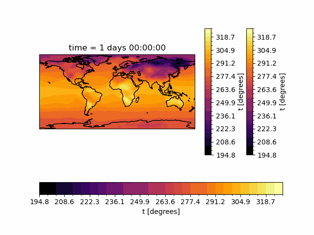
Creating the animation
Now it’s time to create the animation using FuncAnimation.
ani = animation.FuncAnimation(fig, animate, frames=len(t), interval=150, repeat_delay=1000)
This function looks similar to ArtistAnimation, but with one main difference: instead of a list of artists to plot, FuncAnimation takes the update function we created as the second argument. Also, we’ve provided the frames kwarg, which is the number of times the update function will be called. We’ve set it to the number of time slices in the data to make sure the FuncAnimation object does not try to go outside the bounds of the data.
And that’s it! We’ve created a function animation in matplotlib. Let’s take a look at it.
ani
Saving the animation
Just like with ArtistAnimation, we can save the animation using the save method of the FuncAnimation object.
ani.save("temp.gif")
MovieWriter ffmpeg unavailable; using Pillow instead.
Summary
Creating animations in matplotlib might seem intimidating, but is easier when you know the options and purpose of each method. These visualizations can be a powerful tool to display and understand time-dependent data.
What’s next?
In the final section of this cookbook, let’s look at interactive plotting with Holoviz tools.