Overview
Principal component analysis (PCA), often called empirical orthogonal function (EOF) analysis in the atmospheric and ocean sciences, is a method that extracts the patterns in a dataset that explain the most variance. In practice it is most often applied to 3-dimensional geophysical data (latitude, longitude, time), but the underlying linear algebra is the same in any dimension. Here we build the intuition with the simplest possible example: a synthetic 2D point cloud.
Generate a correlated 2D Gaussian cloud
Center the data and form its covariance matrix
Diagonalize the covariance matrix to obtain the EOFs (eigenvectors) and the variance explained by each mode (eigenvalues)
Visualize the eigenvectors as the principal axes of variability of the cloud
The code in this notebook is adapted from Brunton & Kutz (2022).
Prerequisites
| Concepts | Importance | Notes |
|---|---|---|
| Linear algebra | Necessary | Eigenvalues, eigenvectors, covariance matrices |
Time to learn: 15 minutes
Imports
import matplotlib.pyplot as plt
import numpy as np
import seaborn as sns
Generate data
We first create the data: a 2D cloud sampled from a Gaussian distribution.
sns.set_theme(style="whitegrid", context="notebook", font_scale=1.2)
rng = np.random.default_rng(7)

center = np.array([2.0, 1.0])
scales = np.array([2.0, 0.6])
angle = np.pi / 4

rotation = np.array(
    [[np.cos(angle), -np.sin(angle)],
     [np.sin(angle), np.cos(angle)]]
)

n_samples = 10_000
cloud = rotation @ np.diag(scales) @ rng.standard_normal((2, n_samples)) + center[:, None]


plt.figure(figsize=(5, 5))
plt.plot(cloud[0], cloud[1], "o", markersize=2, alpha=0.5, color='k')
plt.plot(center[0], center[1], "o", color="red", markersize=3, label="Center")
plt.legend()
plt.axis("equal")
plt.title("2D Gaussian Cloud");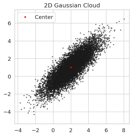
For some geophysical context, we could think of this as some variable measured at two locations (e.g., air temperature measured at two weather stations or salinity measured at two buoys). If those locations are nearby, we expect some correlation between the values measured at each. The goal of an EOF analysis is to find the direction in the above 2-dimensional plane that maximizes the variance explained in the data. As explained in the 3D EOFs notebook and the separate EOFs Cookbook, this is done by computing the covariance matrix of the data and finding its eigenvectors/values.
Analysis
Center data by removing the mean:
mean = cloud.mean(axis=1, keepdims=True)
centered_cloud = cloud - mean
Now, construct the covariance matrix. There are two options here, as described in more detail in the 3D EOFs notebook, depending on the order of multiplication.
cov_matrix_1 = (centered_cloud @ centered_cloud.T) / n_samples
cov_matrix_2 = (centered_cloud.T @ centered_cloud) / n_samples

print("Covariance matrix 1 shape:", cov_matrix_1.shape)
print("Covariance matrix 2 shape:", cov_matrix_2.shape)
Covariance matrix 1 shape: (2, 2)
Covariance matrix 2 shape: (10000, 10000)
Since matrix 1 is much smaller, it is much more computationally efficient to find its eigenvalues.
eigen_val, eigen_vect = np.linalg.eig(cov_matrix_1)eigen_val, eigen_vect(array([3.95439111, 0.35316582]),
array([[ 0.70990989, -0.70429252],
[ 0.70429252, 0.70990989]]))The eigenvectors tells us the directions, and the eigenvalues the magnitudes.
Visualize results
fig, (ax_left, ax_right) = plt.subplots(1, 2, figsize=(10, 4),
                                        sharex=True, sharey=True)

ax_left.scatter(cloud[0], cloud[1], s=2, c="black", alpha=0.35)
ax_left.set_title("Generated cloud")

ax_right.scatter(cloud[0], cloud[1], s=2, c="black", alpha=0.35)
ax_right.set_title("PCA axes")

for direction, length in zip(eigen_vect.T, eigen_val):
    endpoint = mean[:, 0] + direction * np.sqrt(length)
    ax_right.arrow(
        mean[0, 0],
        mean[1, 0],
        endpoint[0] - mean[0, 0],
        endpoint[1] - mean[1, 0],
        color="magenta",
        linewidth=1.5,
        length_includes_head=True,
        head_width=0.15,
        head_length=0.2,
        zorder=5
    )

for ax in (ax_left, ax_right):
    ax.plot(center[0], center[1], "o", color="red", markersize=3, label="Center")
    ax.set_aspect("equal")
    ax.set_xlim(-6, 8)
    ax.set_ylim(-6, 8)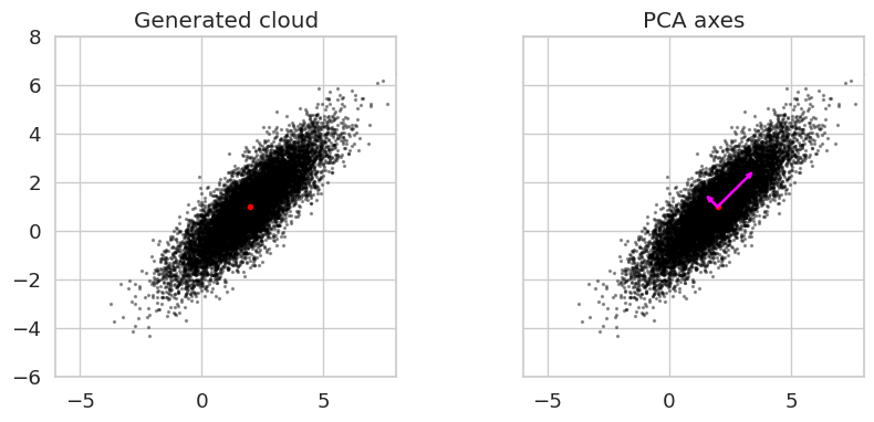
The leading “mode of variability” (i.e., the larger of the two arrows) points in the direction that the data varies the most. In other words, if the data were projected onto the line parallel to the larger arrow, becoming 1-dimensional, it would have the largest 1-dimensional variance possbile for this data. For atmospheric/ocean data in 3 dimensions (latitude, longitude, time), instead of having 2-dimensional eigenvectors, you have (lat lon)-dimensional eigenvectors, so the arrows become maps.
Summary
We performed an EOF / PCA analysis on a synthetic 2D Gaussian cloud. After centering the data, we built its covariance matrix and computed its eigen-decomposition: the eigenvectors point along the orthogonal directions of largest variability in the cloud, and the eigenvalues measure how much variance each direction explains. Projecting the data onto the leading eigenvector gives a 1D representation that retains the maximum possible variance, which is the defining property of PCA. The exact same procedure generalizes to geophysical fields, where the eigenvectors become spatial maps (EOFs) and the projections become time series (principal components).
What’s next?
We now scale this workflow up to space-time data. The next notebook, 3D EOFs, applies the same covariance-and-eigen-decomposition recipe to a synthetic field , where each EOF becomes a 2D map and each principal component is a time series describing how strongly that map is expressed over time.
- Brunton, S. L., & Kutz, J. N. (2022). Data-Driven Science and Engineering : Machine Learning, Dynamical Systems, and Control.