Overview
Daily tropical observations contain variability on many time scales: weather noise, the seasonal cycle, subseasonal variability, ENSO, and longer-term changes. The Madden–Julian Oscillation (MJO) is the dominant mode of tropical intraseasonal variability and lives in the 20–90 day band Zhang, 2013.
In this notebook we apply spectral analysis tools to outgoing longwave radiation (OLR), 850 hPa zonal wind (U850), and 200 hPa zonal wind (U200) over the tropical Indo-Pacific (10°S–10°N, 60°E–160°E) for 1979–2024. We will:
Compute smoothed power spectra with Welch’s method.
Test spectral peaks against an AR(1) red-noise null hypothesis using Monte Carlo simulations.
Apply a 20–90 day Butterworth bandpass filter to isolate MJO time scales.
Diagnose convection–circulation coupling with lead-lag correlations.
Visualize eastward propagation with Hovmöller diagrams.
Prerequisites
| Concepts | Importance | Notes |
|---|---|---|
| Fourier power spectrum and spectral filtering | Necessary | Single-series FFT and basic filters |
| Anomaly time series | Helpful | Seasonal cycle removal |
| Frequency decomposition of zonal winds | Helpful | FFT applied to gridded data |
Time to learn: 45 min
Imports
import numpy as np
import xarray as xr
import s3fs
import matplotlib.pyplot as plt
import seaborn as sns
import cartopy.crs as ccrs
from scipy import signal, stats

sns.set_theme(style="whitegrid", context="notebook", font_scale=1.1)
Settings and data
We focus on the tropical Indo-Pacific box where MJO-related convection is most active. Daily data are sampled once per day, so the sampling interval is day.
start_date = "1979-01-01"
end_date = "2024-12-31"

lat_bounds = (-10, 10)
lon_bounds = (60, 120)

dt = 1.0  # sampling interval in days
We use three preprocessed Zarr stores from the Pythia cloud bucket: NOAA OLR Lee & others, 2014 and NCEP–NCAR U850/U200 Kanamitsu et al., 2002.
URL = "https://js2.jetstream-cloud.org:8001/"
fs = s3fs.S3FileSystem(anon=True, client_kwargs=dict(endpoint_url=URL))

olr_ds = xr.open_zarr(s3fs.S3Map(root="pythia/olr_noaa.zarr", s3=fs, check=False))
olr = olr_ds.rename_vars({"__xarray_dataarray_variable__": "olr"})["olr"]

uwind_ds = xr.open_zarr(s3fs.S3Map(root="pythia/uwind-ncep-ncar.zarr", s3=fs, check=False))
u850 = uwind_ds["uwnd"].isel(level=0).rename("u850")
u200 = uwind_ds["uwnd"].isel(level=1).rename("u200")
proj = ccrs.PlateCarree()
fig, ax = plt.subplots(figsize=(10, 5), subplot_kw={"projection": proj})
pcm = olr.isel(time=0).plot(
ax=ax,
transform=ccrs.PlateCarree(),
add_colorbar=False
)
plt.colorbar(
pcm,
ax=ax,
shrink=0.3,
label=r"OLR [W m$^{-2}$]"
)
lon1, lon2 = lon_bounds
lat1, lat2 = lat_bounds
study_box = plt.Rectangle(
(lon1, lat1),
lon2 - lon1,
lat2 - lat1,
linewidth=2,
edgecolor="red",
facecolor="none",
label="Study area",
)
ax.add_patch(study_box)
ax.set_xlabel("Longitude")
ax.set_ylabel("Latitude")
ax.legend(loc="upper left")
ax.coastlines()
ax.gridlines(alpha=0.5)
plt.show()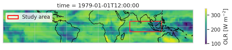
We will reuse a single helper that computes a cosine-latitude-weighted area mean. Cosine weighting accounts for the smaller grid-cell area at higher latitudes.
def area_mean(da, lat_bounds, lon_bounds):
    """Cosine-latitude-weighted area mean over a lat-lon box.

    Handles both increasing and decreasing latitude coordinates.
    """
    lat1, lat2 = lat_bounds
    lon1, lon2 = lon_bounds
    lat_increasing = da["lat"].values[0] < da["lat"].values[-1]
    lat_slice = slice(lat1, lat2) if lat_increasing else slice(lat2, lat1)
    region = da.sel(lat=lat_slice, lon=slice(lon1, lon2))
    weights = np.cos(np.deg2rad(region["lat"]))
    return region.weighted(weights).mean(dim=("lat", "lon"))
A primer: Welch’s method and red-noise testing
A raw Fourier periodogram is statistically noisy: even white noise yields many sharp peaks. Welch’s method stabilizes the estimate by averaging periodograms of overlapping, windowed segments.
A peak is only physically meaningful if it stands above a sensible background. Many climate variables behave like a first-order autoregressive (AR(1) red-noise) process,
whose spectrum is red (more power at low frequencies). We will use a Monte Carlo simulation of AR(1) noise, matched to the lag-1 autocorrelation and variance of the data, to define a 95% confidence level Wilks, 2019.
To verify the method, we first apply it to a synthetic signal whose true periods are known.
A synthetic test case
We build a 10-year daily series containing 20-day, 60-day, and 365-day cosine waves plus Gaussian noise. A correct spectral estimator should peak at these three periods.
nt = 10 * 365  # 10 years of daily data
t = np.arange(nt)
rng = np.random.default_rng(42)

x_synth = (
    2.0 * np.cos(2 * np.pi * t / 20)
    + 1.5 * np.cos(2 * np.pi * t / 60)
    + 4.0 * np.cos(2 * np.pi * t / 365)
    + rng.normal(scale=2.0, size=nt)
)
Welch power spectrum
Welch’s estimator divides the series into segments of length nperseg, applies a Hann window, takes a periodogram of each, and averages them. Longer segments give finer frequency resolution but fewer segments to average, a classic spectral tradeoff.
def welch_spectrum(x, dt=1.0, nperseg=1024):
    """One-sided Welch power spectral density as a function of period (days)."""
    x = np.asarray(x)
    if np.any(np.isnan(x)):
        raise ValueError("Input contains NaN values.")
    nperseg = min(nperseg, len(x))
    freq, psd = signal.welch(
        x - x.mean(),
        fs=1.0 / dt,
        window="hann",
        nperseg=nperseg,
        noverlap=nperseg // 2,
        detrend="constant",
        scaling="density",
    )
    return 1.0 / freq[1:], psd[1:]
AR(1) red noise and Monte Carlo confidence levels
We estimate the lag-1 autocorrelation of the data, simulate many AR(1) series matched to that statistic and to the variance of the data, and take the 95th percentile of their spectra at each period.
def lag1_autocorrelation(x):
    x = np.asarray(x)
    x = x[np.isfinite(x)]
    x = x - x.mean()
    return np.corrcoef(x[:-1], x[1:])[0, 1]


def generate_ar1(alpha, variance, n, rng):
    """Generate one AR(1) realization with target variance."""
    sigma_x = np.sqrt(variance)
    sigma_eps = sigma_x * np.sqrt(1 - alpha**2)
    x = np.empty(n)
    x[0] = rng.normal(scale=sigma_x)
    for i in range(1, n):
        x[i] = alpha * x[i - 1] + rng.normal(scale=sigma_eps)
    return x


def red_noise_confidence(x, dt=1.0, nperseg=1024, n_sim=300,
                         confidence=95, seed=42):
    """Compare a series' Welch spectrum against an AR(1) red-noise reference."""
    x = np.asarray(x)
    x = x[np.isfinite(x)] - np.mean(x)
    alpha = lag1_autocorrelation(x)
    period, obs_psd = welch_spectrum(x, dt=dt, nperseg=nperseg)
    rng = np.random.default_rng(seed)
    red_psds = np.stack([
        welch_spectrum(
            generate_ar1(alpha, np.var(x), len(x), rng),
            dt=dt, nperseg=nperseg,
        )[1]
        for _ in range(n_sim)
    ])
    return {
        "period": period,
        "obs_psd": obs_psd,
        "red_mean": red_psds.mean(axis=0),
        "red_conf": np.percentile(red_psds, confidence, axis=0),
        "alpha": alpha,
    }
Now we compute the Welch spectrum of the synthetic signal and overlay the mean red-noise spectrum and the 95% confidence level.
synth = red_noise_confidence(x_synth, dt=dt, nperseg=1024, n_sim=300)

fig, ax = plt.subplots(figsize=(10, 5))
ax.plot(synth["period"], synth["obs_psd"], lw=2, label="Welch spectrum")
ax.plot(synth["period"], synth["red_mean"], lw=2, ls="--", label="Mean AR(1) red noise")
ax.plot(synth["period"], synth["red_conf"], lw=2, ls=":", label="95% red-noise level")
for p in (30, 60, 365):
    ax.axvline(p, color="grey", lw=1, ls=":")
ax.set(xscale="log", yscale="log", xlim=(2, 1000),
       xlabel="Period [days]", ylabel="Power spectral density",
       title="Welch spectrum of synthetic signal")
ax.invert_xaxis()
ax.legend()
plt.show()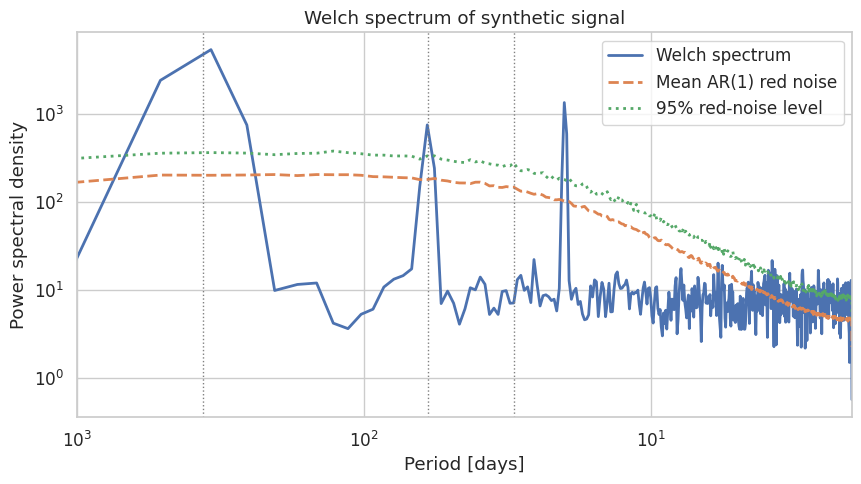
The three inserted oscillations appear as sharp peaks well above the red-noise level, confirming that Welch’s method together with an AR(1) reference can identify oscillatory signals. A few caveats apply to real data:
AR(1) is a simple null hypothesis; many climate processes are more complex.
A significant peak does not prove a physical mechanism, only that the variance is unusual.
A non-significant peak does not rule out a physical signal that is weak, intermittent, or spread across a broad band.
Spectrum of tropical OLR
We compute the anomalies of OLR over the tropical Indo-Pacific [refer to Remove the seasonal cycle using harmonic regression] and look for variability on MJO time scales. A few isolated missing days are filled by linear interpolation, which is required for Fourier-based methods that assume an even time axis.
def remove_seasonal_cycle_harmonic(data, n_harmonics=4, year_period=365.25):
    """Subtract the first ``n_harmonics`` of the annual cycle along the leading (time) axis."""
    n_time = data.shape[0]
    t = np.arange(n_time)

    X = np.ones((n_time, 2 * n_harmonics + 1))
    for k in range(1, n_harmonics + 1):
        X[:, 2 * k - 1] = np.sin(k * 2 * np.pi * t / year_period)
        X[:, 2 * k] = np.cos(k * 2 * np.pi * t / year_period)

    data_2d = data.reshape(n_time, -1)
    coeffs = np.linalg.lstsq(X, data_2d, rcond=None)[0]
    anomalies = data_2d - X @ coeffs
    return anomalies.reshape(data.shape)

olr = (
    olr
    .chunk({"time": -1})
    .interpolate_na(dim="time", method="linear")
)


olr_anom_da = xr.DataArray(
        remove_seasonal_cycle_harmonic(olr.values),
        coords=olr.coords,
        dims=olr.dims,
        name=olr.name,
    )

olr_anom_da[0].plot()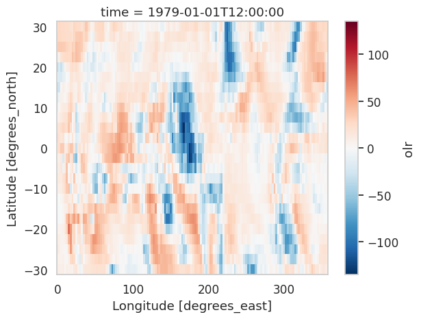
olr_anom = (
    area_mean(olr_anom_da, lat_bounds, lon_bounds)
    .sel(time=slice(start_date, end_date))
    .interpolate_na(dim="time", method="linear")
    .load()
)

fig, ax = plt.subplots(figsize=(10, 5))
olr_anom.sel(time=slice("1997-01-01", "1999-12-31")).plot(
    ax=ax, lw=0.8)
ax.axhline(0, color="k", lw=0.6)
ax.set(title="OLR anomaly")
ax.set_ylabel("OLR anomaly [W/m$^2$]")
plt.show()
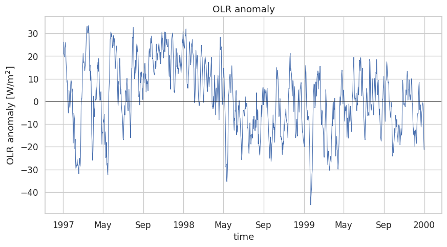
We now compute the Welch spectrum of the OLR anomaly and compare it with an AR(1) reference. Using nperseg=2048 (about 5.6 years) gives several independent segments while still resolving subseasonal periods.
olr_red = red_noise_confidence(olr_anom.values, dt=dt, nperseg=2048, n_sim=200)

fig, ax = plt.subplots(figsize=(10, 5))
ax.plot(olr_red["period"], olr_red["obs_psd"], lw=2, label="OLR anomaly")
ax.plot(olr_red["period"], olr_red["red_mean"], lw=2, ls="--",
        label="Mean AR(1) red noise")
ax.plot(olr_red["period"], olr_red["red_conf"], lw=2, ls=":",
        label="95% red-noise level")
ax.axvspan(20, 90, alpha=0.15, color="C2", label="20-90 day band")
ax.set(xscale="log", yscale="log", xlim=(2, 2000),
       xlabel="Period [days]", ylabel="Power spectral density",
       title="OLR anomaly spectrum vs. red-noise reference")
ax.invert_xaxis()
ax.legend()
plt.show()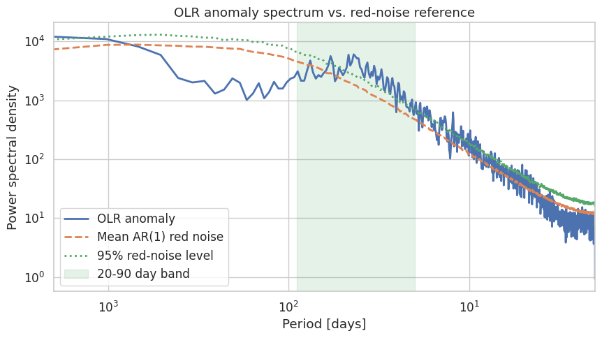
The OLR anomaly carries real 20–90 day power Zhang, 2013, but the spectrum does not show a sharp isolated peak above the red-noise level. This is expected for an area-mean diagnostic: the MJO is a propagating phenomenon, so averaging over a broad longitude range can cancel anomalies in different MJO phases. To diagnose the MJO we need both circulation and propagation information, which we add next.
Convection–circulation coupling
The MJO couples deep convection to tropical zonal-wind anomalies. We add U850 (lower troposphere) and U200 (upper troposphere) to the analysis.
u850_anom_da = xr.DataArray(
        remove_seasonal_cycle_harmonic(u850.values),
        coords=u850.coords,
        dims=u850.dims,
        name=u850.name,
    )

u200_anom_da = xr.DataArray(
        remove_seasonal_cycle_harmonic(u200.values),
        coords=u200.coords,
        dims=u200.dims,
        name=u200.name,
    )
u850_anom = (
area_mean(u850_anom_da, lat_bounds, lon_bounds)
.sel(time=slice(start_date, end_date))
.load()
)
u200_anom = (
area_mean(u200_anom_da, lat_bounds, lon_bounds)
.sel(time=slice(start_date, end_date))
.load()
)OLR and the winds are sometimes recorded with different timestamps (12:00 vs. 00:00 UTC) and the wind anomalies carry an extra level coordinate. We flatten the time stamps to dates and align the three anomalies on a common axis.
def align_anomalies(*arrays):
    cleaned = []
    for da in arrays:
        if "level" in da.coords:
            da = da.drop_vars("level")
        cleaned.append(da.assign_coords(time=da["time"].dt.floor("D")))
    return xr.align(*cleaned, join="inner")


olr_a, u850_a, u200_a = align_anomalies(olr_anom, u850_anom, u200_anom)
print(f"Aligned record length: {olr_a.sizes['time']} days")
Aligned record length: 16802 days
We compute Welch spectra of the three aligned anomalies and normalize each by its total power so the spectral shapes can be compared on one axis.
period, olr_psd = welch_spectrum(olr_a.values, dt=dt, nperseg=2048)
_, u850_psd = welch_spectrum(u850_a.values, dt=dt, nperseg=2048)
_, u200_psd = welch_spectrum(u200_a.values, dt=dt, nperseg=2048)

fig, ax = plt.subplots(figsize=(10, 5))
for label, psd in [("OLR", olr_psd), ("U850", u850_psd), ("U200", u200_psd)]:
    ax.plot(period, psd / psd.sum(), lw=2, label=label)
ax.axvspan(20, 90, alpha=0.15, color="C2", label="20-90 day band")
ax.set(xscale="log", yscale="log", xlim=(2, 2000),
       xlabel="Period [days]", ylabel="Normalized spectral power",
       title="Anomaly spectra: OLR, U850, U200")
ax.invert_xaxis()
ax.legend()
plt.show()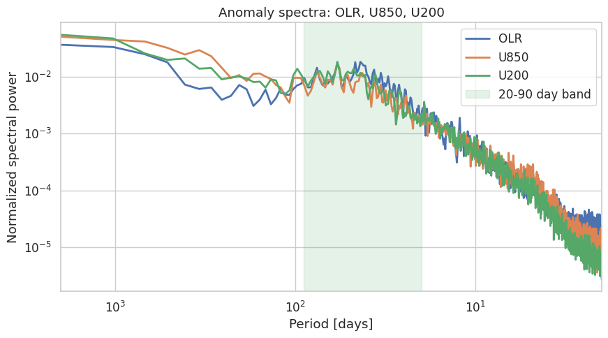
All three variables show enhanced power across the subseasonal band, although none has a textbook MJO peak — again, consistent with the propagation argument above.
Isolating the 20–90 day band
To examine timing relationships we apply a 20–90 day Butterworth bandpass filter with zero-phase forward–backward filtering (scipy.signal.filtfilt). This keeps subseasonal variability and removes both weather noise and seasonal-to-interannual variability.
def bandpass(x, dt=1.0, low_period=90, high_period=20, order=4, axis=-1):
    """Zero-phase Butterworth bandpass filter, parameterized by period."""
    nyq = 0.5 / dt
    b, a = signal.butter(
        order,
        [(1 / low_period) / nyq, (1 / high_period) / nyq],
        btype="bandpass",
    )
    return signal.filtfilt(b, a, np.asarray(x), axis=axis)


olr_20_90 = bandpass(olr_a.values, dt=dt)
u850_20_90 = bandpass(u850_a.values, dt=dt)
u200_20_90 = bandpass(u200_a.values, dt=dt)
Because lower OLR indicates more convection, we work with a convection-positive index . We standardize each series so the different units share an axis.
time_aligned = olr_a["time"]
olr_band = xr.DataArray(olr_20_90, coords={"time": time_aligned}, dims="time")
u850_band = xr.DataArray(u850_20_90, coords={"time": time_aligned}, dims="time")
u200_band = xr.DataArray(u200_20_90, coords={"time": time_aligned}, dims="time")


def zscore(da):
    return (da - da.mean()) / da.std()


t0, t1 = "1997-01-01", "1999-12-31"

fig, ax = plt.subplots(figsize=(13, 4))
for label, da in [("OLR", olr_band),
                  ("U850", u850_band),
                  ("U200", u200_band)]:
    zscore(da).sel(time=slice(t0, t1)).plot(ax=ax, lw=1, label=label)
ax.axhline(0, color="k", lw=0.6)
ax.set(title="20-90 day filtered anomalies (standardized)",
       xlabel="Time", ylabel="Standardized anomaly")
ax.legend()
plt.show()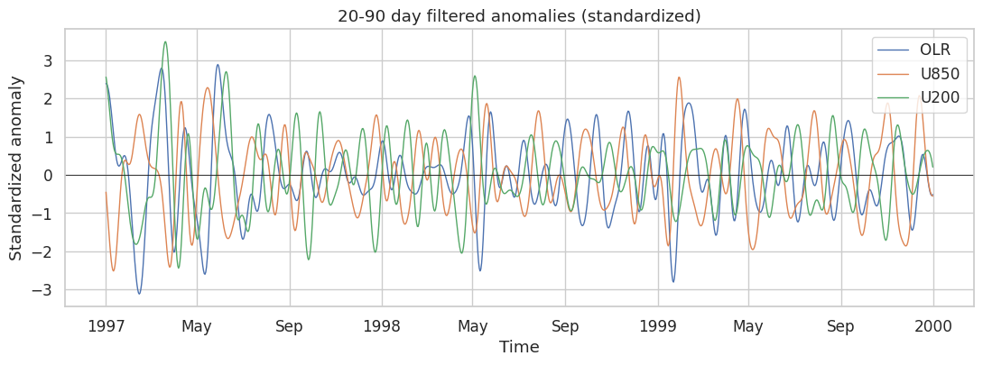
Lead-lag correlation
To quantify timing, we compute the correlation between the convection index and each wind series as one is shifted relative to the other. Our convention is:
Positive lag → wind lags convection
Negative lag → wind leads convection
def lead_lag_correlation(x, y, max_lag):
    x = np.asarray(x) - np.mean(x)
    y = np.asarray(y) - np.mean(y)
    lags = np.arange(-max_lag, max_lag + 1)
    r = np.empty_like(lags, dtype=float)
    for i, lag in enumerate(lags):
        if lag < 0:
            r[i] = np.corrcoef(x[-lag:], y[:lag])[0, 1]
        elif lag > 0:
            r[i] = np.corrcoef(x[:-lag], y[lag:])[0, 1]
        else:
            r[i] = np.corrcoef(x, y)[0, 1]
    return lags, r


max_lag = 60
lags, r_u850 = lead_lag_correlation(olr_band.values, u850_band.values, max_lag)
_, r_u200 = lead_lag_correlation(olr_band.values, u200_band.values, max_lag)
Filtered series are strongly autocorrelated, so adjacent days are not independent. We adjust the sample size with the standard effective-degrees-of-freedom formula Wilks, 2019
and translate into an approximate 95% correlation threshold via a Student- test.
def effective_n(x, y):
    rx, ry = lag1_autocorrelation(x), lag1_autocorrelation(y)
    return len(x) * (1 - rx * ry) / (1 + rx * ry)


def r_threshold(neff, alpha=0.05):
    dof = neff - 2
    tcrit = stats.t.ppf(1 - alpha / 2, dof)
    return np.sqrt(tcrit**2 / (tcrit**2 + dof))


neff_u850 = effective_n(olr_band.values, u850_band.values)
neff_u200 = effective_n(olr_band.values, u200_band.values)
rcrit = max(r_threshold(neff_u850), r_threshold(neff_u200))

print(f"N_eff (convection vs U850) = {neff_u850:.0f}")
print(f"N_eff (convection vs U200) = {neff_u200:.0f}")
print(f"Approximate |r| threshold  = {rcrit:.3f}")
N_eff (convection vs U850) = 243
N_eff (convection vs U200) = 238
Approximate |r| threshold = 0.127
fig, ax = plt.subplots(figsize=(10, 5))
ax.plot(lags, r_u850, lw=2, label="OLR vs U850")
ax.plot(lags, r_u200, lw=2, label="OLR vs U200")
ax.axhline(0, color="k", lw=0.6)
ax.axvline(0, color="k", lw=0.6, ls="--")
ax.axhline(rcrit, color="k", lw=0.8, ls=":", label="Approx. 95% level")
ax.axhline(-rcrit, color="k", lw=0.8, ls=":")
ax.set(xlabel="Lag [days]", ylabel="Correlation",
       title="Lead-lag correlation of 20-90 day filtered anomalies")
ax.legend()
plt.show()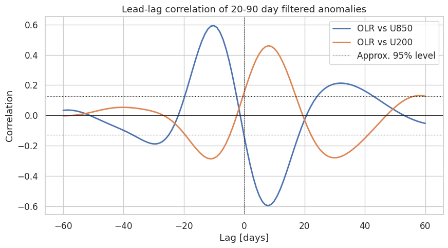
Both lower- and upper-tropospheric winds covary with convection on subseasonal time scales, with phase relationships shifting through the MJO cycle — a hallmark of the coupled convection–circulation structure described by Wheeler & Hendon (2004).
Eastward propagation: Hovmöller diagrams
Spectra and area-mean correlations describe time scales but not propagation. We now keep longitude information by averaging only over the 10°S–10°N latitude band, then bandpass and visualize a longitude–time Hovmöller diagram. A coherent MJO event appears as an eastward-tilted band sweeping across the Indian Ocean and western Pacific.
def lat_mean(da, lat_bounds):
    lat1, lat2 = lat_bounds
    lat_increasing = da["lat"].values[0] < da["lat"].values[-1]
    lat_slice = slice(lat1, lat2) if lat_increasing else slice(lat2, lat1)
    region = da.sel(lat=lat_slice)
    weights = np.cos(np.deg2rad(region["lat"]))
    return region.weighted(weights).mean(dim="lat")


olr_eq_anom = (
    lat_mean(olr_anom_da, lat_bounds)
    .sel(time=slice(start_date, end_date))
    .interpolate_na(dim="time", method="linear")
    .load()
)

olr_eq_anomBecause scipy.signal.filtfilt accepts an axis argument, we can bandpass every longitude in one call. We then flip the sign to obtain a convection-positive field.
olr_eq_20_90 = bandpass(olr_eq_anom.values, dt=dt, axis=0)
conv_eq_20_90 = xr.DataArray(
    -olr_eq_20_90,
    coords=olr_eq_anom.coords,
    dims=olr_eq_anom.dims,
    name="convection_20_90",
)
We plot Hovmöller diagrams for two boreal-winter periods known to contain active MJO events. With time running downward, eastward propagation appears as features tilted from upper left to lower right.
def plot_hovmoller(ax, da, start, end, lon_bounds=(40, 200)):
    da_plot = da.sel(time=slice(start, end),
                     lon=slice(lon_bounds[0], lon_bounds[1]))
    da_plot.plot.contourf(
        ax=ax, x="lon", y="time",
        levels=np.linspace(-30, 30, 21),
        cmap="RdBu_r", extend="both", add_colorbar=True,
        cbar_kwargs={"label": "Convection-positive OLR [W/m$^2$]"},
    )
    ax.invert_yaxis()
    ax.set(title=f"{start} to {end}",
           xlabel="Longitude [°E]", ylabel="Time")


fig, axes = plt.subplots(1, 2, figsize=(14, 6))
plot_hovmoller(axes[0], conv_eq_20_90, "2004-11-01", "2005-04-30")
plot_hovmoller(axes[1], conv_eq_20_90, "2015-11-01", "2016-04-30")
fig.suptitle("20–90 day filtered OLR along the equator")
plt.tight_layout()
plt.show()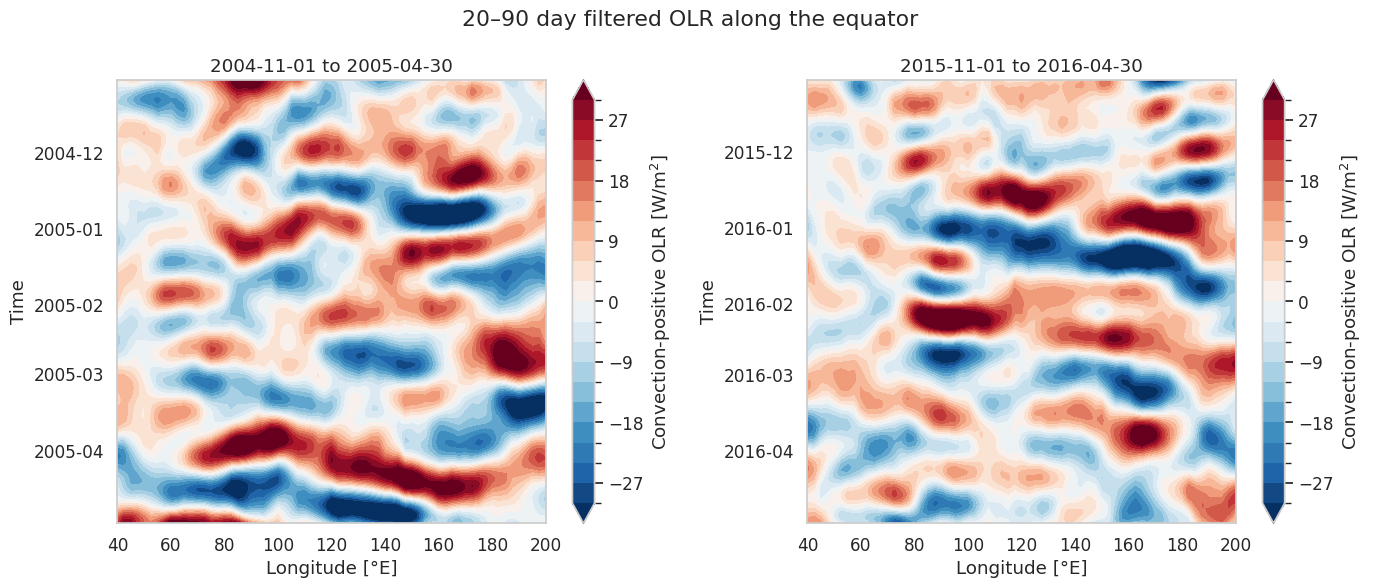
Each diagram shows alternating negative (enhanced convection) and positive (suppressed convection) anomalies tilted from west to east, the propagation signature of the MJO. The MJO is intermittent: not every winter shows equally organized propagation.
Summary
We applied a suite of spectral and time-series tools to diagnose tropical subseasonal variability in OLR, U850, and U200:
Welch’s method gives a smoother, more interpretable spectrum than a raw periodogram by averaging over windowed segments.
AR(1) red noise provides a useful null hypothesis; Monte Carlo simulations turn it into a 95% confidence level for the spectrum.
Butterworth bandpass filtering (20–90 days) isolates MJO-like variability while suppressing both weather noise and the seasonal cycle.
Lead-lag correlation with an effective sample size adjustment quantifies how convection and circulation are phased.
Hovmöller diagrams of latitude-mean fields reveal the eastward propagation that area-mean spectra cannot show.
What’s next?
These tools generalize well beyond the MJO. The next notebook, Multivariate EOFs: extracting the MJO signal, builds on this analysis with the classical multivariate-EOF approach of Wheeler & Hendon (2004) to construct an RMM-like MJO index.
- Zhang, C. (2013). Madden–Julian oscillation: Bridging weather and climate. Bulletin of the American Meteorological Society, 94(12), 1849–1870.
- Lee, H.-T., & others. (2014). NOAA climate data record (CDR) of daily outgoing longwave radiation (OLR), version 1.2. (No Title).
- Kanamitsu, M., Ebisuzaki, W., Woollen, J., Yang, S.-K., Hnilo, J. J., Fiorino, M., & Potter, G. L. (2002). Ncep–doe amip-ii reanalysis (r-2). Bulletin of the American Meteorological Society, 83(11), 1631–1644.
- Wilks, D. S. (2019). Statistical Methods in the Atmospheric Sciences: An Introduction (4th ed). Elsevier.
- Wheeler, M. C., & Hendon, H. H. (2004). An all-season real-time multivariate MJO index: Development of an index for monitoring and prediction. Monthly Weather Review, 132(8), 1917–1932.